Selecting Frames for Watercolor Prints with Soft Pastel Hues
Selecting frames for watercolor prints with soft pastel hues is less about matching every wall and more about protecting a delicate, translucent-looking palette. A frame can make blush, mist blue and pale sage feel calm and collected, or it can turn those same shades into a washed-out mismatch. The right moulding, mat and glazing should work with the paper rather than compete with it.
Start by studying the actual print, then build outwards from its lightest and darkest tones. This guide covers proportion, materials and practical choices for Australian homes, from compact city apartments to bright coastal rooms. It also explains how framing can support the artwork while maintaining a relaxed, gallery-style interior.
Begin with the artwork’s colour and surface
Examine the print in neutral daylight before choosing a frame. Notice whether one hue dominates, whether the paper is warm or cool, and whether the edges are crisp or deckled. A pale wooden moulding can echo the quiet warmth of a peach or sand-coloured wash, while a white frame creates a crisp boundary around cooler blues and greys. Avoid choosing solely according to the wall colour, as the artwork should remain the focal point.
Proportion matters just as much as colour. A slim moulding suits a delicate composition, whereas a broader profile can give a small print more presence. Soft pastels generally benefit from generous breathing room, particularly when the image contains only a few translucent shapes. Consider the mat board part of the frame itself: its tone should either complement the palest passage in the painting or provide a subtle contrast without creating a hard border.
Build a frame suited to Australian rooms
Australian homes often display art where the architecture is compact: in a narrow Sydney or Melbourne apartment hallway, above a Brisbane bedroom desk or beside a kitchen. A generous mat can make a modest print feel intentional without requiring a large wall. Local framers commonly stock pale oak, black-stained timber and metal profiles in standard A-series and 30-by-40-centimetre sizes, while custom timber mouldings are also available across Australia.
Summer sunlight deserves careful consideration because strong UV exposure can gradually fade coloured pigments. Position sensitive works away from west-facing windows or add curtains, blinds and UV-filtering glazing. Renters may also prefer removable hanging strips or adhesive hooks, allowing artwork to move between rooms without patching painted walls. These simple habits make it easier to experiment with different frames as the collection develops.
Custom framing is a service as well as a product, and Australian Consumer Law requires suppliers to provide goods of acceptable quality and services with reasonable care and skill. This makes it sensible to ask about materials, glazing and turnaround times, keep written quotations and inspect the completed frame before accepting it. Local independent framers can often be more flexible than a standard shop when unusual paper dimensions or delicate edges are involved.
Protect the paper and soften the presentation
Glazing protects the print from dust, handling and accidental contact, but the choice between glass and acrylic affects appearance and maintenance. A quick glass and acrylic differences comparison is useful here, especially for framed works displayed in a children’s room or a busy hallway. Acrylic is lighter and less prone to shattering, while conventional glass tends to provide a clearer, more reflective finish.
Behind the glazing, use an acid-free mat and archival-quality backing to reduce the risk of staining or chemical damage over time. Museum glass can reduce reflections, although it may slightly alter the colours of very pale washes. A glazing spacer also prevents the sheet from resting against the glass, protecting both the surface and any delicate pencil details. Test the combination in different lighting before settling on it, as artificial light can make pastel colours look cooler than they do in daylight.
Check size, mat and hanging details
The mat window should reveal the complete painted area without cutting into the composition. It can conceal uneven paper edges, but a hand-deckled sheet may be worth displaying instead. Measure the artwork rather than relying on the nominal frame size, and check whether the moulding’s rebate will accommodate a thick mat, backing and glazing. Good measurements also simplify comparison between local framing quotes.
Use this checklist when assessing a frame:
- Choose a moulding that repeats one subtle tone already present in the print.
- Show the full image within the mat opening without trimming painted details.
- Use acid-free mat board, archival backing and UV-filtering glazing where needed.
- Check that the frame feels balanced against the wall and surrounding furniture.
- Inspect colours under daylight, evening light and nearby artificial lighting.
- Confirm the hanging weight, fixings and wall condition before installation.
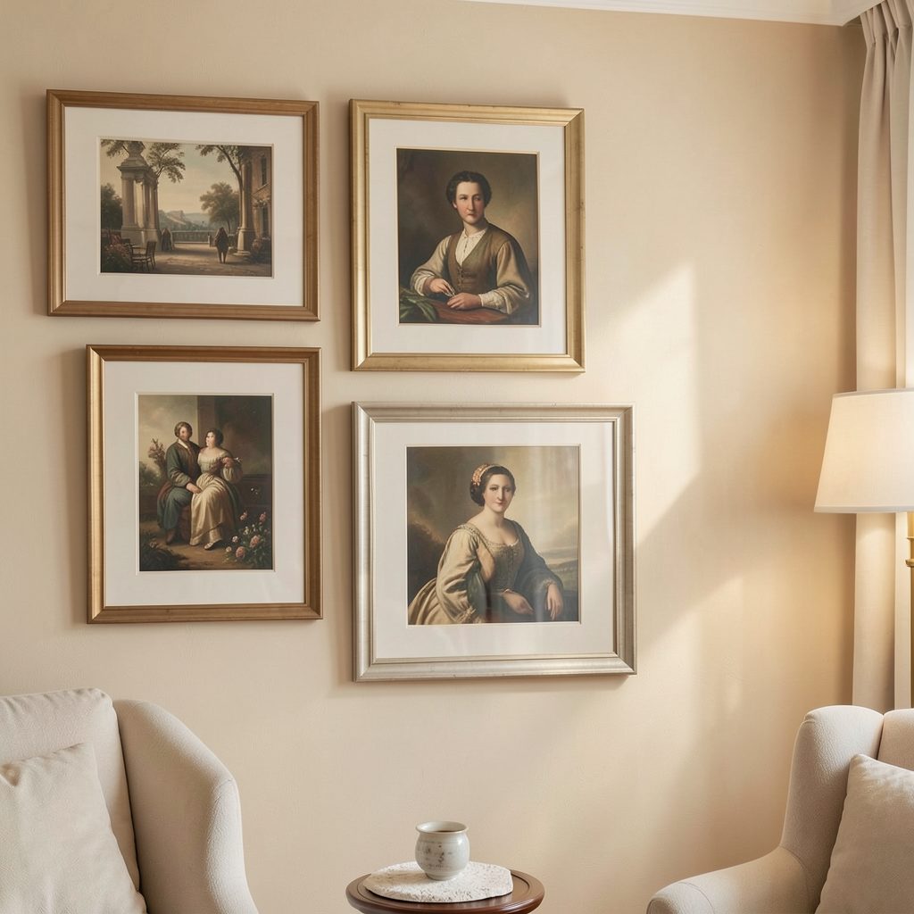
Artwork can feel too formal when every element is tightly cropped or surrounded by a very wide border. For a softer bedroom scheme, combine restrained framing with textiles, lamps and natural materials; these bedroom styling ideas show how artwork can sit comfortably within a restful room. If displaying several prints, keep the mat style and frame depth consistent while allowing the artwork sizes to vary.
Finish with spacing, labels and final details
A gallery-style arrangement depends on spacing as much as on the frames themselves. Leave enough room between pieces for each image to remain distinct, and align the frames according to a clear visual structure rather than the edges of the wall. Labels can be useful in a salon-style display or a home gallery; the gallery label sizing guide helps keep the typography neat without drawing attention away from the work.
Bring the scheme together by viewing the finished display from across the room and again from the doorway. Remove any frame that feels heavy, crowded or disconnected from the surrounding palette. Choose one print, compare two or three frame options beside it and live with the strongest combination for a few days before adding more pieces. Subscribe to Focus LDN for fresh ideas on gallery walls, artwork display and stylish home living.