How to Create a Grid Gallery Wall with Matching Frames and Mats
A grid gallery wall brings order to a collection of photographs, prints or small paintings. Its appeal comes from repetition: consistent spacing, similar frames and mats that give every piece room to breathe. The finished arrangement feels considered without making the room look overly formal.
This approach works especially well in Australian homes, where open-plan living areas, high ceilings and plenty of natural light often call for a strong visual anchor. A neat arrangement above a sofa, sideboard or hallway console can define the space while keeping the overall mood calm.
Before reaching for a hammer, decide how much wall you want the display to occupy and how closely it should relate to the furniture below it. A grid needs accuracy, but it should still suit the relaxed way many Australian interiors are lived in, from a Brisbane townhouse to a Melbourne terrace.
Choose The Right Grid
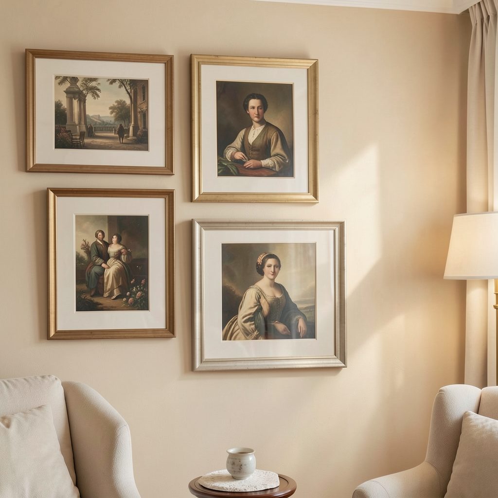
Start by deciding how many works you want to display. A two-by-two arrangement feels compact and balanced, while a three-by-three grid makes a stronger statement over a wide sofa or dining table. Keep the artwork sizes identical if you want a crisp, modern look; varied images can still work when the outer frame dimensions match.
Square and rectangular layouts create different energy. A square grid feels architectural and symmetrical, while a portrait-oriented grid can make a narrow wall appear taller. For a long passage in a Sydney apartment, a single horizontal row may be more practical than a large block.
Select images with a visual relationship. Black-and-white family photographs, botanical studies, architectural prints or a restrained palette of Australian landscapes can create cohesion. If the artwork is colourful, use the frames and mats to quieten the display rather than competing with it.
Measure The Wall And Artwork
Measure the available wall width, then mark the furniture beneath it. A gallery usually looks most connected when its overall width is around two-thirds to three-quarters of the furniture width. Leave enough space above a sofa or console for the display to feel attached to the room rather than floating.
The gaps between frames should be consistent. A spacing of 5 to 8 centimetres suits most home-scale grids, although smaller gaps can make a compact display feel more unified. Use the same distance horizontally and vertically; even a small variation becomes obvious across several rows.
Measure each frame from its outside edge, not the artwork opening. Add the frame width and chosen gap to calculate the full footprint. In an older Melbourne rental with uneven walls, check the skirting boards and ceiling line before finalising the layout, since these features may make a perfectly level grid appear slightly misaligned.
Make Matching Frames Feel Intentional
Matching frames provide the structure, while mats create breathing space around the art. White or warm-white mats suit timber frames and pale walls, whereas soft grey or cream can connect more naturally with darker paint colours. The mat should generally be wider than the frame edge so the artwork remains the focus.
A black frame with a clean white mat gives a gallery-like finish and works well against both white plaster and bold colour. Natural oak or walnut introduces warmth in a minimalist room. For coastal homes around the Gold Coast or Perth, pale timber can echo the relaxed surroundings without making the wall feel themed.
Consistency does not require every image to look identical. You can vary the photographs or prints while keeping the frame profile, mat colour and glazing consistent. For rooms where colour is important, explore these ideas for using colourful mats while keeping the outer dimensions uniform.
Prepare The Layout Before Hanging
Create paper templates for every frame using newspaper, butcher’s paper or lightweight cardboard. Mark the centre point and hanging hardware on each template, then attach them to the wall with removable tape. Stand back from different parts of the room to assess the scale before making holes.
Use a spirit level across each row and compare the vertical gaps as you go. A laser level is useful for a larger display, especially on broad walls in a new-build home. If you are working with plasterboard, identify the studs or use appropriate picture hooks rated for the frame weight.
A grid should sit at a comfortable viewing height. The centre of the whole arrangement is often positioned around 145 to 155 centimetres from the floor, but furniture and ceiling height matter more than a rigid rule. Above a low sideboard, leave a clear visual gap; in a hallway, avoid placing the lowest frames where they may be brushed by bags or coats.
A Practical Grid-Wall Checklist
Prepare the components before drilling so the installation feels controlled rather than rushed. In Australia, local hardware shops such as Bunnings carry picture hooks, wall plugs, removable tape and small spirit levels, making it easy to gather the essentials in one visit.
- Confirm the wall width and furniture position
- Check that every frame has the same outside dimensions
- Choose a consistent gap between frames
- Test the arrangement with paper templates
Once the templates are in place, inspect the wall in daylight and at night. Strong Queensland sun can change how bright mats and glazing appear, while a dim hallway may need lighter borders to prevent the display from looking heavy.
- Use UV-protective glazing for valuable or sunlit artwork
- Leave room around switches, vents and door trims
- Keep a record of each artwork’s position
- Clean glass and frames before the final installation
Finish The Display With The Room
The surrounding decor should support the grid without copying it too literally. Repeat one or two colours from the artwork in cushions, ceramics or a rug, then keep larger furniture pieces relatively quiet. This gives the wall presence while preserving a comfortable, lived-in atmosphere.
A grid can work in unexpected rooms. In a bathroom, choose sealed frames, moisture-resistant backing and artwork that can tolerate humidity; this guidance on styling a bathroom offers useful direction for balancing display with practical finishes. Avoid placing paper-based originals directly beside a shower or bath.
Lighting completes the arrangement. Picture lights, adjustable wall sconces or carefully directed ceiling spots can bring out texture and colour without creating reflections. In a rental, removable lighting and lightweight frames may be the safest choice, while homeowners can plan concealed cabling during a renovation.
Take time to align every edge, wipe away fingerprints and remove the templates only after the frames are secure. A well-planned grid gallery wall rewards precision with a polished, personal focal point. Explore more artwork display ideas through Focus LDN and subscribe to the email updates for considered inspiration for stylish home living.