Make small artwork feel larger with colorful mats
A small print can disappear on a wall, especially when it is surrounded by oversized furniture, a deep-colored backdrop, or a collection of larger frames. The right mat changes that relationship. By adding color and breathing room around the artwork, it gives a modest image greater visual authority without changing its actual dimensions.
A mat, also called a mount, is the paperboard border between the art and the frame. Its practical purpose is to protect the piece from touching the glazing, but its decorative role is just as important. A carefully chosen mat can create contrast, emphasize a palette, and make a compact work feel like a considered focal point.
The effect works particularly well in bedrooms, narrow hallways, small bathrooms, and minimalist gallery walls. The key is to treat the mat as part of the composition rather than as empty space around the art.
Why a mat changes the scale
Color creates a visual boundary, and boundaries help the eye register the full footprint of a framed piece. A small illustration with a narrow white border may read as a tiny rectangle. Give it a generous mat in ochre, moss, or dusty blue, and the eye begins to perceive the complete framed area as the artwork’s presence.
This is a form of visual expansion rather than physical enlargement. The mat adds proportion, pause, and contrast. It can also separate a detailed image from a busy wall, allowing the artwork to remain legible at a distance.
The strongest results usually come from restraint. A wide mat in a deliberate shade feels architectural, while several bright colors competing around one image can make the frame look fussy. Choose one dominant mat color and let the artwork provide the smaller accents.
Choosing a color that supports the artwork
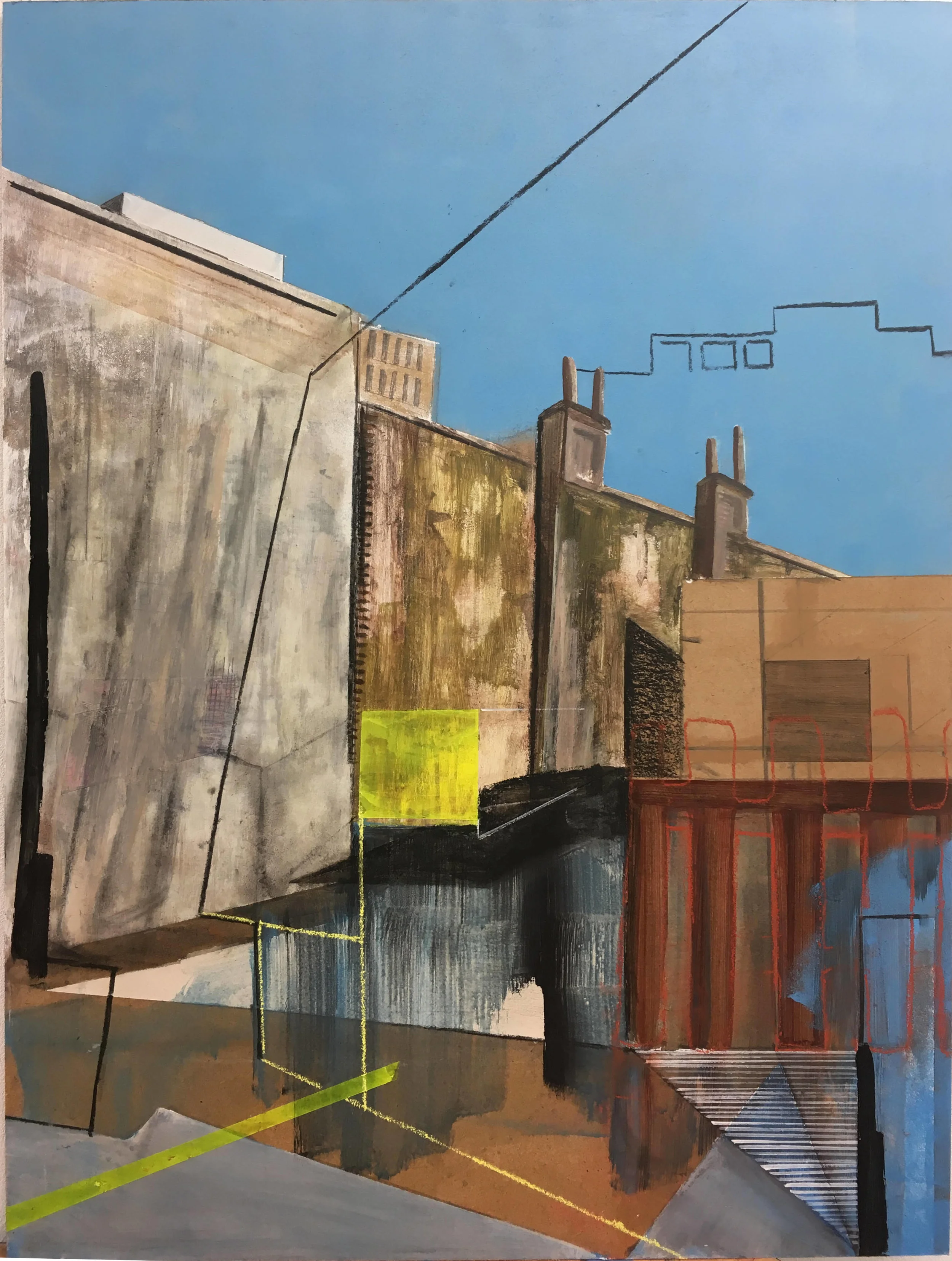
Start by identifying a secondary color within the image rather than matching its most obvious feature. A muted green hidden in a landscape, a soft pink in a portrait, or a warm blue in a city scene can become an elegant mat shade. This approach creates cohesion without making the frame look overly coordinated.
Consider the wall color as well. On a white wall, a saturated mat creates a crisp block of color. Against a pale gray or beige wall, a slightly deeper, softened shade may offer enough definition without appearing harsh. Dark walls benefit from brighter or warmer mats that keep small art from receding.
Finish matters too. A chalky, uncoated surface often looks more sophisticated than a glossy one, particularly in a calm interior. For rooms with strong natural light, choose conservation-quality board and glazing to reduce fading and reflections.
Balancing width, frame, and wall space
The mat needs enough width to make a visible contribution. A slim border can work for a tiny print in a compact frame, but a generous margin is usually more effective when the goal is to make small art feel larger. As a starting point, the mat can be as wide as the frame itself, then adjusted according to the image and available wall space.
A slightly wider lower margin can lend the piece a gallery-like proportion. This traditional detail gives the eye a stable base and works well for portrait-oriented prints, botanical studies, and photographs. For contemporary interiors, equal margins on all sides create a cleaner, more minimalist effect.
The outer frame should support the mat rather than compete with it. A simple wood, painted, or metal profile allows a colorful mount to lead. If the frame is already expressive, use a quieter mat shade and reduce the number of surrounding decorative elements.
Pairing colorful mats across a wall
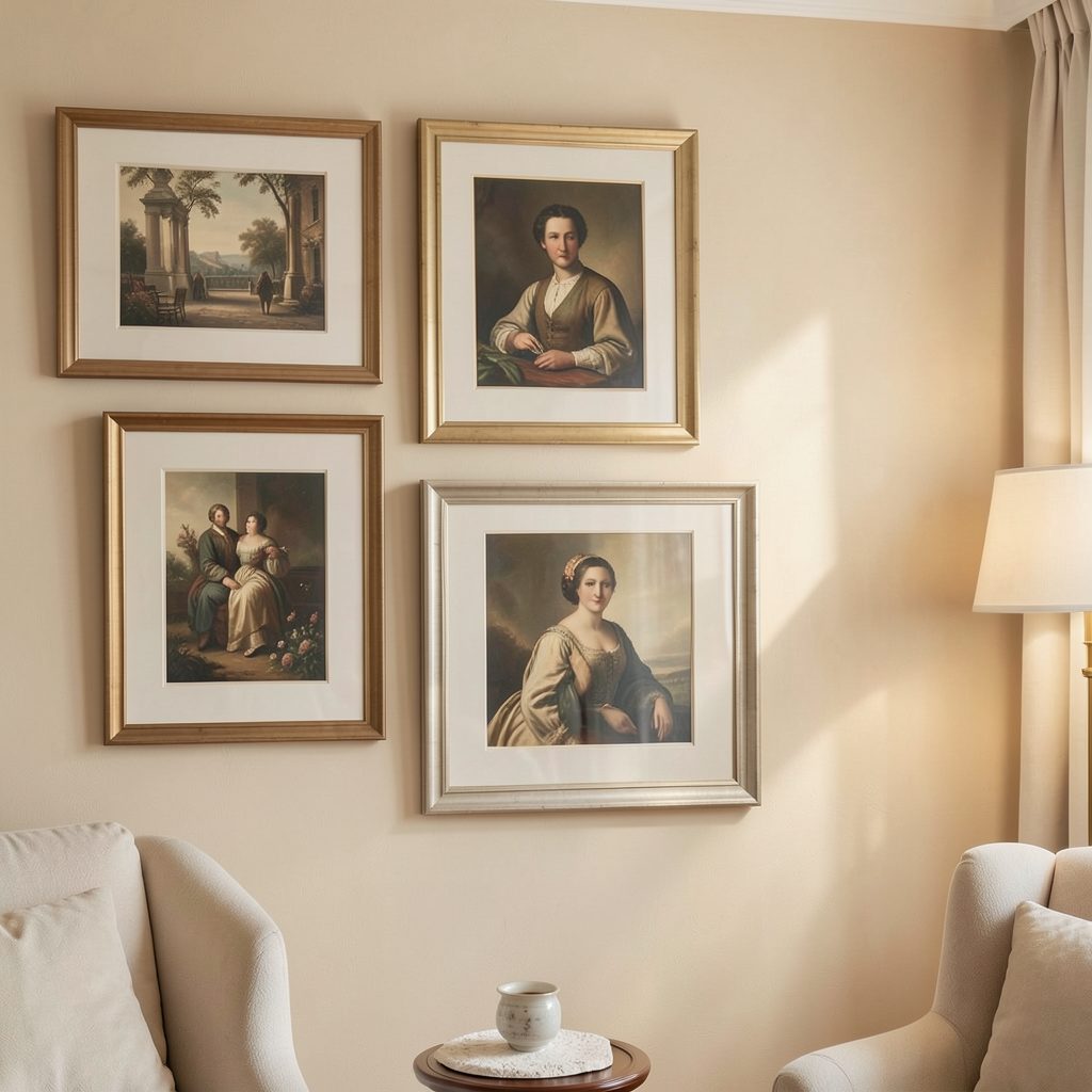
Colorful mounts become especially effective when several small works are displayed together. They can unify unrelated prints while preserving individuality. Use a shared color family—such as clay, rust, coral, and muted rose—or repeat one exact mat color across frames of different sizes.
For a cohesive display, keep one or two details consistent: frame finish, mat width, or spacing. The artwork itself can vary in subject and scale. This is useful when building a collection around architecture, collected postcards, family photographs, or holiday sketches. Ideas for a travel-led arrangement can be found in this guide to a travel-memory gallery wall.
Avoid arranging every mat in a perfect rainbow unless the room has a deliberately playful character. A limited palette usually looks more polished. Let one vivid color act as an accent, then support it with two or three softened companions.
| Artwork character | Mat color direction | Frame approach | Best setting |
|---|---|---|---|
| Black-and-white photograph | Cobalt, saffron, or terracotta | Slim black or natural wood | Hallway or office |
| Soft botanical print | Sage, olive, or dusty blue | Light wood or warm white | Bedroom |
| Graphic abstract | Coral, tomato, or electric blue | Simple painted frame | Living room |
| Vintage illustration | Mustard, tobacco, or faded rose | Walnut or antique-style wood | Reading corner |
| Pale watercolor | Deep teal, aubergine, or forest green | Narrow metallic or dark wood | Bathroom or landing |
Using scale to create a gallery effect
A colorful mat can make one small piece feel substantial, but the surrounding arrangement still determines how powerful it appears. Hang the framed work at a comfortable viewing height and give it enough clear wall area to read as intentional. Crowding it beside a large mirror or bulky shelf can cancel out the extra visual weight.
For a small salon wall, vary the dimensions of the outer frames while keeping the inner mounts generous. This produces rhythm without making the artwork look undersized. Aligning central points or bottom edges can also give a collection a quiet sense of order.
A single tiny work can work beautifully above a bedside table, beside a mirror, or within a built-in shelf. In these locations, the mat acts almost like a small architectural surround. See examples of integrating artwork at home for ways to give framed pieces a stronger relationship with furniture and room structure.
Practical decisions before ordering
Measure the artwork itself, including whether it has a paper border that should remain visible. Decide whether the print should float inside the opening or sit behind a clean, standard aperture. A floating mount can reveal deckled edges or uneven paper, while a conventional opening gives a sharper, more formal finish.
Use acid-free, archival board for valuable or sentimental work. The opening should not overlap the image, and the glazing should be separated from the artwork by the mat. These details protect the paper while keeping the display crisp over time.
Before committing to a custom color, place paper swatches beside the artwork and view them in both daylight and evening light. A shade that looks gentle near a window may become much stronger under warm lamps.
A simple color-matching checklist
- Pick up a quiet secondary color from the artwork rather than copying its dominant shade.
- Match the mat’s intensity to the room’s overall mood and wall color.
- Use a wider mount when the artwork needs more visual presence.
- Repeat a color across a gallery wall to create connection.
- Keep the frame profile simple when the mat is bright or highly saturated.
A small image does not need to be enlarged to become more noticeable. With the right colored mount, generous proportions, and a frame that stays in the background, it can occupy the wall with confidence. Experiment with removable paper swatches first, then order the final mat once the color feels right in the room. Subscribe to Focus LDN for more ideas on gallery walls, art display, and stylish everyday interiors.