The best gallery wall layouts for a wall behind a desk
A wall behind a desk should energise the room without competing with the monitor, task lamp or daily work. A gallery-style arrangement creates a focal point, but it should frame the workspace rather than crowd it.
Before choosing frames, decide what the wall should contribute. A calm backdrop can make a home office feel orderly, while an eclectic display can show a creative personality. The pieces should also hold up when viewed from your chair.
Start with the largest artwork you already own, then work outward. Remove anything that feels visually heavy or unrelated to the desk. One shared colour, material or motif makes a mixed group feel deliberate.
In compact apartments across Sydney, Melbourne and Brisbane, proportion matters more than quantity. A narrow strip can hold several small works; a broad wall may need fewer, larger pieces. Choose a display that feels generous without making the room feel crowded.
Measure the real display zone
Begin by defining the usable display zone. Keep the lower edge about 10–15cm above the desktop, though the monitor may require more clearance. Balance the arrangement across the desk rather than centring it over a single side.
If the desk meets a short partition, decorating a half wall offers useful principles for turning a limited surface into a deliberate focal point instead of leftover space.
Match a layout to the wall
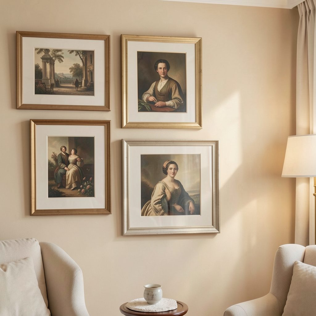
Three layouts work especially well: a grid, a salon mix and an asymmetrical composition. A grid feels precise; a salon mix welcomes different frame shapes; an asymmetrical wall adds movement and gives one larger work extra authority. The best choice reflects the art and the wall, not a trend.
Because the display sits within arm’s reach, test the visual height from your chair. Leave enough open space for the monitor, keyboard and papers, and avoid hanging low pieces where they can be knocked. Clear breathing room is usually more useful than filling every gap.
Local gallery openings can also set the visual mood; the composed, personal style associated with gallery-opening attire is a useful reference for making a small home office feel finished.
Build balance through frame size
Frame size establishes the rhythm. A3 prints at 30 × 42 cm and A4 works at 21 × 30 cm are easy to mix, while a few larger originals can anchor the group. Use the outer frame dimensions when spacing, and vary sizes by roughly 20–30% so small frames do not disappear.
Visual weight matters more than exact matching. A dark, heavily detailed frame can balance two pale prints, while several ornate frames may make a modest wall feel formal. Keep frame mouldings slim, and repeat one finish—such as black, timber or natural oak—to unify the composition.
Create one visual thread
Connect the pieces through colour or subject rather than trying to make every artwork identical. Repeat a warm neutral from the room, echo a blue in the chair, or group botanical prints with one larger landscape. Three visual links are usually enough to make a collection feel coherent.
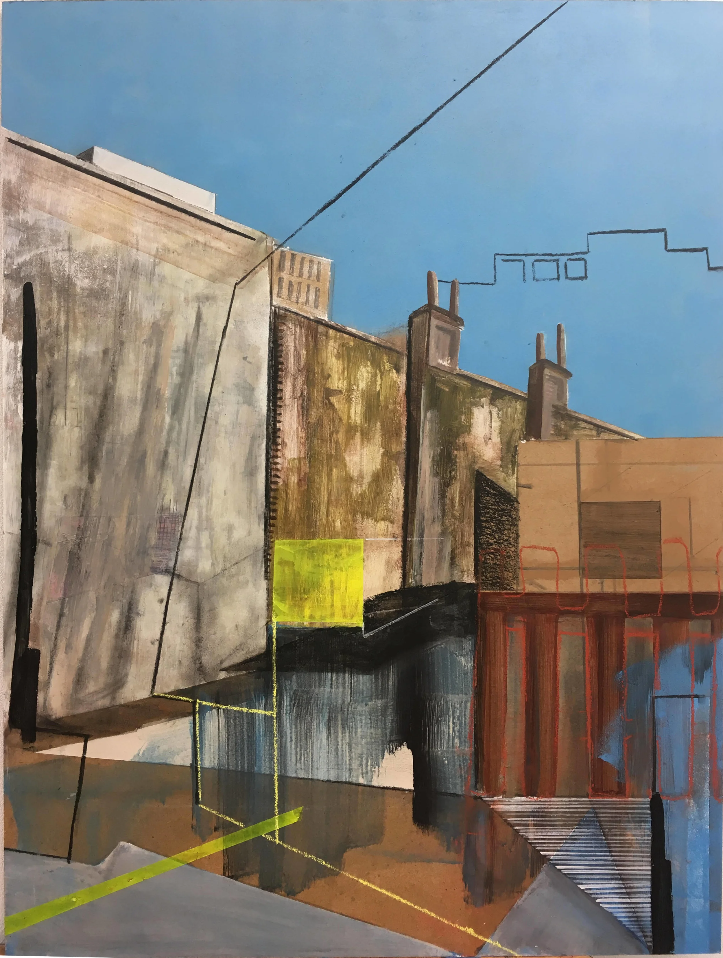
The Australian market offers prints and originals from local artists, from coastal studies to bold geometric work. Buying through an Australian gallery or artist gives you clearer provenance and supports the maker. For Aboriginal and Torres Strait Islander art, purchase through reputable, artist-authorised sources and display the artist’s attribution with care.
Plan for Australian light and rental life
Australian sunlight needs planning. Direct sun and strong summer glare can fade paper and stress glazes, so keep vulnerable works away from windows or use UV-filtering glass. Warm lighting around 2700–3000K flatters timber frames and makes art feel inviting after sunset.
If you rent, check any strata or building rules before drilling. Removable hanging strips can work for light frames on smooth plasterboard, but they are less suitable for brick or masonry. Ask the agent about approved fixings, and protect the wall when moving the display.
Compare the main arrangement options
The right arrangement depends on wall shape, available width and how many meaningful pieces you own. Compare these options before measuring the nail positions.
| Arrangement | Best for | How to build it | Desk impact |
|---|---|---|---|
| Grid | Narrow, symmetrical space | Use equal-sized frames in aligned rows | Calm and orderly; the monitor needs central clearance |
| Salon mix | Varied artwork | Layer different sizes around a central piece | Flexible and informal; avoid crowding |
| Asymmetrical | A statement work | Anchor with one large frame, then step down in size | Adds movement; keep the busiest area off-centre |
| Linear row | Wide, shallow wall | Align one row or paired stacks | Clean and easy to balance above a long desk |
For most home offices, an asymmetrical composition offers the most freedom, while a linear row suits a long desk. Choose the arrangement your existing art can support, then add frames only if the spacing still feels balanced.
Install the display and make it yours
Hang the largest or most visually dominant piece first. Use a paper template on the wall, mark its centre, and check the height from your seated position before driving a nail. Level every frame and keep gaps consistent, even when the outer shapes differ.
Finish with one small, practical object, such as a clip-on lamp or a narrow shelf, but give it breathing room. Step back from the doorway and from the chair to check the overall balance. Photograph the finished wall so you can recreate it if frames or furniture move.
Choose one layout tonight, list the pieces you already own, and measure the usable wall before you buy anything. Subscribe to Focus LDN for more practical ideas on gallery walls, framing and stylish apartment living, then build a display you will enjoy seeing every workday.