A Half Bath With One Print And A Bold Color
The smallest bathroom in a home can support the strongest decorating idea. With limited floor space and few surfaces to style, a half bath benefits from a clear visual focus rather than a collection of competing accessories. A saturated wall color and one carefully chosen artwork can make the room feel deliberate, intimate, and highly finished.
The appeal of decorating a half bath with a single framed print and a bold color lies in its restraint. A compact room gives dramatic paint, expressive artwork, and beautiful materials enough presence without requiring a large renovation. The key is to make every visible element earn its place.
Set The Visual Direction
Begin by deciding which feature should lead. In most powder rooms, the wall color creates the atmosphere while the print supplies personality. Deep green, oxblood, cobalt, ink blue, and warm terracotta can all work well, especially when balanced with white porcelain, pale stone, or brushed metal.
Think about the room from the doorway. The artwork should be visible almost immediately, but it should not compete with the mirror, vanity, or light fixture. If the sink wall is narrow, place the print above the toilet or on the largest uninterrupted section of wall. A simple composition often looks more luxurious than a busy arrangement.
The surrounding architecture matters, too. Panel molding, a narrow picture rail, or a painted ceiling can give a bold color a more integrated appearance. When the room has little natural light, test paint samples under the actual bulbs before committing, since artificial lighting can shift blue into violet or make red appear noticeably warmer.
Choose A Color With Staying Power
A bold bathroom color does not have to be neon or overly theatrical. The most adaptable choices are complex shades with muted undertones. A smoky teal, chalky aubergine, or forest green can feel dramatic in the evening while remaining comfortable in daylight.
Use the fixtures as a guide. Chrome and polished nickel sharpen cool colors, while aged brass and bronze bring warmth to earthy shades. White fixtures create crisp contrast, whereas a colored basin or patterned floor may call for a quieter wall treatment.
| Wall color direction | Best frame finish | Artwork mood | Overall effect |
|---|---|---|---|
| Deep green | Aged brass or dark wood | Botanical or architectural | Rich and collected |
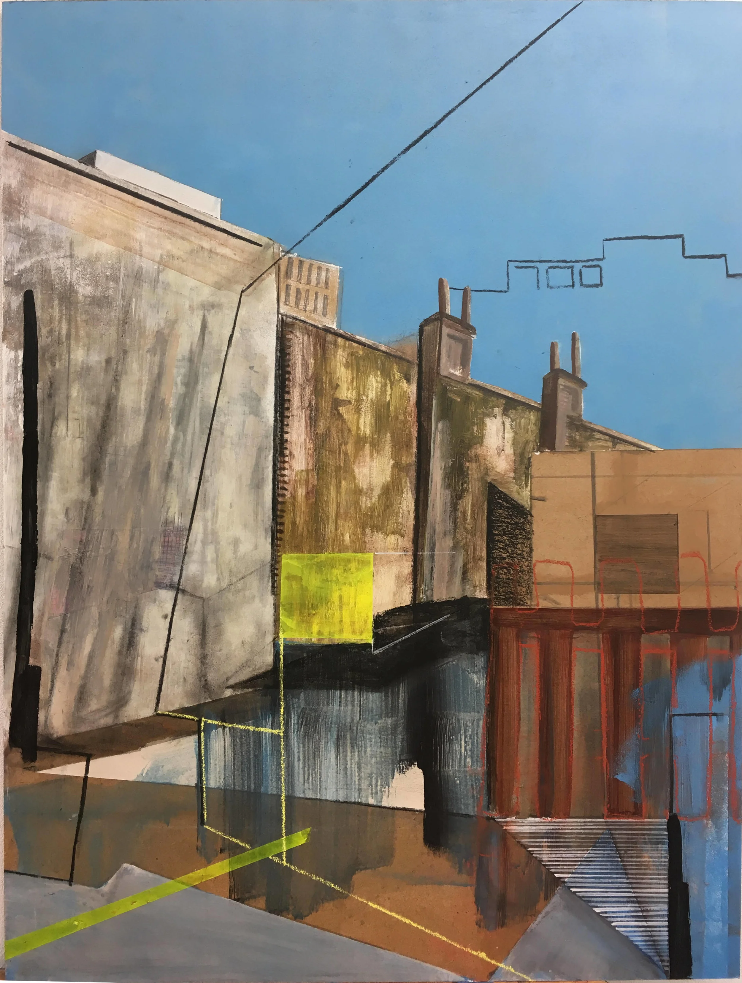
| Cobalt blue | Black or brushed silver | Graphic or abstract | Crisp and energetic |
| Terracotta | Natural wood or bronze | Landscape or warm-toned still life | Relaxed and inviting |
| Aubergine | Gold or black | Expressive portrait or line drawing | Moody and elegant |
| Charcoal | Light oak or polished metal | Pale, high-contrast image | Minimal and gallery-like |
A strong wall can support a print with plenty of white space. That contrast prevents the powder room from feeling visually compressed. If the artwork is colorful, choose a wall shade that appears in a small detail of the image rather than matching its dominant tone exactly.
Select One Print That Feels Intentional
The print should be large enough to register as a focal point but scaled to the wall. Above a compact toilet, a portrait-oriented work usually feels natural. Above a wider vanity, a landscape format or square print can echo the proportions of the furniture without requiring a second piece.
Consider the emotional character of the room. A black-and-white photograph adds sophistication to a jewel-toned wall, while a loose botanical drawing softens a dark green backdrop. An abstract work introduces energy, but a restrained composition is usually easier to live with in a small space.
A frame gives the artwork its architectural presence. Thin black metal feels contemporary, pale oak adds softness, and a substantial painted wood frame can make a modest print appear more important. Leave enough breathing room around the work so it reads as an object rather than an afterthought squeezed between fittings.
Make The Frame Work Harder
Bathrooms require practical framing choices. Keep valuable originals away from direct splashes, and use glazing that protects the image from humidity. Acrylic is lighter and safer in a tight room, while specialist conservation glass offers a more refined finish if the budget allows. Seal the back of the frame carefully and avoid hanging artwork directly above a frequently used sink if condensation is significant.
The frame should connect the print with at least one other element. Its metal finish might repeat the tap, mirror edge, or wall light. A wooden frame can relate to a vanity shelf or woven basket. These small echoes create cohesion without adding more decoration.
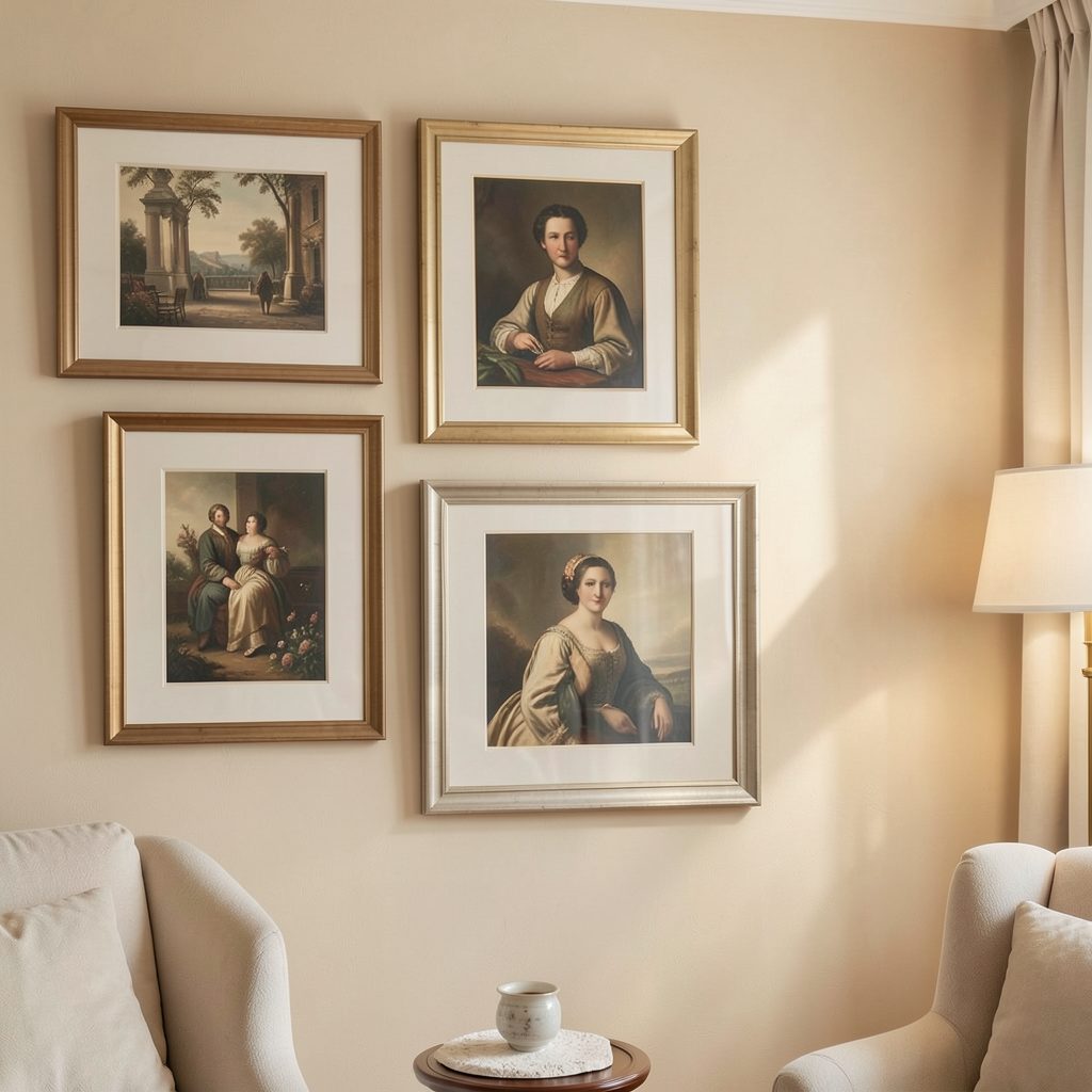
For a graphic, curated atmosphere, study the principles behind a monochrome gallery wall, even if the final design uses only one piece. Repetition of tone, margin, and frame proportion can make a single artwork feel like part of a considered collection.
Balance The Supporting Details
Once the print and paint are chosen, keep the remaining additions quiet. A sculptural soap dispenser, a small hand towel, and one useful object may be enough. Too many vases, signs, candles, and decorative boxes can weaken the central idea and make cleaning more difficult.
Lighting deserves particular attention. A wall light on either side of the mirror provides flattering illumination, while a ceiling fitting can add a small moment of design overhead. Choose warm white bulbs so a saturated color feels enveloping rather than harsh.
Use this short editing guide before finishing the room:
- Keep the artwork at a comfortable eye level, generally with its center around 57 to 60 inches from the floor.
- Repeat one finish between the frame, tapware, mirror, or lighting.
- Leave clear space around the print instead of filling every open wall.
- Choose washable paint in a low-sheen finish suited to bathroom humidity.
- Limit countertop styling to items that are useful or visually exceptional.
A little documentation can also elevate the gallery feeling. A discreet caption beside the print may suit an art-led interior, particularly when the work has an interesting story. Resources on gallery labels can help you create a polished museum-style detail without making the bathroom feel themed.
Refine The Room Through Contrast
The best small powder rooms often combine opposing qualities: dark paint with pale ceramics, expressive art with simple hardware, and a compact footprint with a confident decorating decision. Contrast gives the space depth, so the single framed print does not need to carry every visual responsibility.
Pay attention to the view from adjacent rooms. A half bath door that opens toward a hallway can become a framed scene, with the artwork acting as a small destination at the end of the sightline. If the bathroom connects to a neutral interior, the bold color will feel intentional when echoed subtly in a nearby rug, vase, or piece of furniture.
Step back after installation and remove anything that interrupts the composition. The finished room should feel complete without appearing overworked. One strong color, one memorable print, and a few carefully matched details can transform a functional washroom into a compact expression of personal style.
Turn the smallest bathroom into a focused design moment by selecting the paint, print, and frame as a single composition. Measure the wall, test the color in evening light, and hang the artwork with enough space to let it command attention. A thoughtful edit can make a half bath feel as distinctive as any larger room in the home.