Using art to define a dining area in a converted garage
A converted garage can feel like a useful annex rather than a proper dining room. Roller doors, masonry walls, polished concrete and a practical ceiling often make the space feel hard and undefined. The aim is not to disguise those features, but to create a clear place for sitting, sharing meals and slowing down.
Using art to define a dining area in a converted garage provides the missing architecture without the cost of building another wall. A considered arrangement gives the eye somewhere to land, connects the table to the ceiling and makes the dining zone feel intentional. In an Australian home, where the garage may open directly to a deck or courtyard and host everything from weekday dinners to summer gatherings, that visual cue matters.
Read the room before choosing art
Begin with the strongest sightlines, particularly the view from the main entrance and the position of the garage door. If the door remains visible and functional, artwork beside the opening can soften its industrial appearance without blocking access. If the door has been replaced or insulated, the wall around it may become a useful display surface.
Think about where people naturally gather. A dining table positioned in the centre of the garage may need surrounding visual cues, while a table placed against a solid wall can rely on one strong artwork. The best arrangement should attract attention from the doorway and remain visible from the adjacent kitchen, lounge or outdoor entertaining area.
Create a focal point at the right scale
Artwork needs enough presence to establish a dining zone, but it should not compete with the table. For a single horizontal piece, look for a width around two-thirds of the table’s overall width. This proportion feels connected without creating a crowded wall, especially in a room where the ceiling may already be tall.
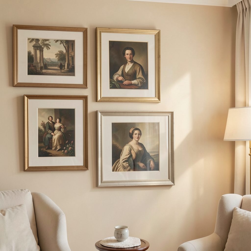
A salon-style arrangement can work well when the architecture is plain. Keep the frames visually consistent and vary the sizes of the works, with larger pieces near the centre. In an open-plan Australian home, remember that artwork may be seen from several rooms at once, so a clear silhouette and stronger colour can be more effective than delicate detail.
Let the architecture shape the style
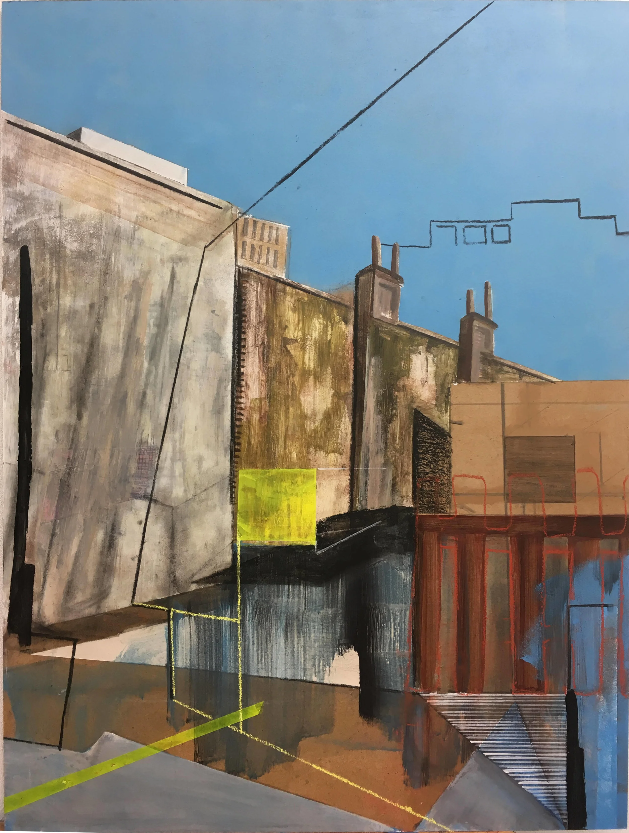
Many Australian garages have brick or concrete walls, Colorbond roller doors and a utilitarian finish. Rather than trying to make the room feel soft from the outset, choose artwork that introduces warmth, texture or colour while acknowledging the structure. Timber-toned frames and earthy prints complement hard surfaces, while bold abstract works can give a monochrome shell a confident focal point.
Pay attention to sunlight as well as style. A west-facing garage can become extremely hot during an Australian summer, and direct afternoon sun may fade prints or damage vulnerable materials. UV-filtering glazing or acrylic can protect valuable work, while a blind, shade or appropriately positioned artwork helps control glare. Check the room at different times before deciding on a permanent placement.
Test the layout before you hang
Before any holes go into the wall, map the composition by using washi tape or with full-size paper templates. This makes it easy to test the balance, spacing and relationship between the artwork and dining table. Photograph the arrangement from your normal entrance viewpoint so you can compare options before committing.
Garage walls may contain brick, block, timber framing or drywall, so choose fixings that suit the construction and the weight of each piece. Masonry anchors and suitable wall plugs are available at Australian hardware chains such as Bunnings and Mitre 10. Renters often prefer removable gallery rails, hanging systems or carefully rated adhesive hooks to avoid damaging a converted garage they may need to restore later.
Coordinate colour, frames and lighting
Pull two or three colours from the artwork and repeat them through the table linen, chairs, ceramics or rug. This creates a connected room without making every element match exactly. Frames should also relate to the architecture: slim black frames sharpen the industrial feel, pale timber frames warm up brick and concrete, and deep timber adds a grounded contrast.
Lighting helps establish the dining zone as well as reveal the artwork. Hang a dimmable, warm-white pendant around 30 to 40 centimetres above the tabletop, allowing it to illuminate the meal without shining into seated guests’ eyes. A separate picture light or directional wall washer can highlight the display, provided it is positioned to avoid reflections on glass and glare across the table.
Make the display feel personal and finished
A coordinated collection can feel more interesting than a single generic picture, particularly when the pieces share a colour, subject or mood. Keep the outer edges of the arrangement consistent and avoid filling every available gap. If the room also functions as a small gallery, draw on gallery label ideas for discreet ways to identify artists, titles or the story behind a series.
For a distinctly Australian sense of place, consider work featuring local landscapes, native flora or coastal colours. Collectors in Melbourne, Sydney, Brisbane and other cities can also explore limited editions from Australian artists through gallery openings, artist studios and established print publishers. That approach often provides access to collectible work at different price points than a large original painting.
Bring the room together
The strongest converted garages achieve balance through restraint. They keep the garage’s honest materials, introduce one clearly defined artwork arrangement and let lighting, furniture and accessories complete the dining area. Art works here because it quietly directs movement, anchors the table and gives the room an identity that is both practical and personal.
Explore more gallery-wall and room-defining inspiration on Focus LDN home ideas and subscribe for fresh decorating ideas for your next Australian home project.