How to arrange a salon-style gallery wall from floor to ceiling
A salon-style gallery wall turns a blank wall into a layered composition of art, prints and objects. Rather than a strict grid, it borrows from a hung salon: varied sizes, close visual relationships and a deliberate path from one piece to the next. A floor-to-ceiling treatment can make a compact room feel taller, provided the arrangement has one clear anchor.
In Australia, this look must often suit apartments, rental properties and character homes. Renters should check lease and strata rules, while brick terraces need fixings suited to masonry. Strong sun through north-facing windows can fade paper, and humid bathrooms call for moisture-aware products. Australian print shops commonly stock A-series sizes, so planning in those dimensions can simplify sourcing.
In Australian homes, a salon wall usually means a rich, slightly eclectic arrangement rather than a museum-perfect display. Start with the wall's proportions, not a pile of frames. Sketch the layout, check where doors, vents and furniture sit, and decide what can be moved before anything is drilled or taped.
Plan the composition before you hang
Measure the full wall, including skirting, cornice, door swings, vents and nearby furniture. Leave about 15–25 cm below the ceiling and 15–30 cm above the skirting or a substantial sideboard, then adjust to the room's architecture. The aim is generous height, not artwork touching every surface. Photograph the wall and mark fixed points before moving pieces.
Choose one anchor work, ideally the largest or most visually distinctive, and build outward from it. Place every frame, print and small object on the floor with roughly 5–8 cm between edges. Keep the centre of that anchor near eye level, around 145–160 cm, while allowing smaller pieces to rise and fall around it.
Check permissions and substrate before choosing fixings. In apartment-heavy cities such as Sydney and Melbourne, written approval may be needed before penetrating a wall, and adhesive strips are usually best reserved for light, unglazed pieces. The practical decorating guides offer useful context for testing proportions without making permanent changes.
Build a balanced salon-style arrangement
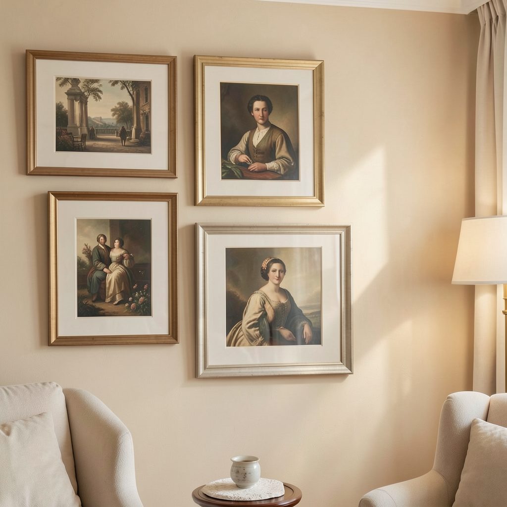
Treat the anchor as the centre of gravity, not the centre of a rigid grid. Add a tall piece nearby, then a smaller work that bridges the gap, followed by one deliberately low or high piece. This creates an uneven rhythm while keeping the eye moving across the wall. Repeat a colour, line or material two or three times to tie contrasting works together.
Mix scale and orientation without making the wall feel accidental. Pair a large print with a cluster of modest works, and combine portrait and landscape formats. Avoid matching every frame exactly: one dark timber frame, one pale frame and one metallic accent can provide variety. Matting can separate busy images from their frames and prevent a crowded wall from becoming visually noisy.
Source works from local makers and gallery openings in Sydney's Surry Hills, Melbourne's Brunswick or Adelaide's East End, then build around pieces you already own rather than forcing a catalogue order. In a brick terrace, a small custom brick engraving can add texture and a personal story. Let one odd object be the memorable interruption.
Compare layouts for your wall
The best layout depends on the wall's width, the furniture below it and how much visual breathing room you want. Use the following options as starting points, then alter the proportions to suit your actual space.
| Layout | Best suited to | Visual rhythm | Main consideration |
|---|---|---|---|
| Tall central spine | Narrow walls and hallways | Strong vertical pull | Keep the lower zone clear |
| Staggered salon cluster | Medium walls and mixed artwork | Informal but balanced | Anchor the largest piece |
| Grid with one oversized work | Wide, understated rooms | Structured with a focal point | Avoid a rigid top edge |
| Freeform mosaic | Broad walls and many small pieces | Dense, collected feel | Maintain a shared visual path |
For a sofa, place the artwork's visual centre slightly above the backrest and let the composition extend beyond the sofa if the wall allows. For a stairwell, follow the rise with a loose diagonal. A true salon arrangement may be asymmetrical, but it should never look as though frames were placed at random.
Refine spacing, frames and lighting
Good spacing makes individual works readable while preserving the sense of one composition. Keep most gaps close, then use a slightly wider interval around a major piece to create a pause. Frames should relate through colour or finish without all repeating the same profile. Check how glazed pieces catch glare before finalising positions, especially under downlights.
Australian sunlight needs special consideration. UV-filtering glazing or acrylic can protect works near north-facing windows, while curtains and careful placement reduce exposure. Use picture lights or a slim wall washer with warm light around 2700–3000K, and position them to skim the wall rather than create hot spots on glass.
If the display continues into a bathroom or powder room, keep ordinary tape and household hooks away from splash zones. Tile needs suitable anchors, and a humid room needs frames and glazing rated for changing moisture levels. The bathroom decor ideas can help you coordinate nearby finishes without turning the gallery into a bathroom-storage project.
Install safely and make it feel lived in
Choose fixings for the actual wall: picture-hanging strips suit only suitable lightweight items, while masonry plugs, timber screws or a two-point hanging system can carry heavier frames. In older Australian properties, locate studs where possible and avoid brittle mortar. Have a second person steady large pieces, keep children and pets clear during installation, and never hang glass directly above a bed or sofa.
Translate your floor sketch to the wall with removable tape marks, then check the view from the doorway before drilling. Hang the anchor first, level it, add the next-largest works, and fill smaller gaps last. Measure rather than guess, especially in period rooms where wall surfaces may not be perfectly flat.
Finish by styling the furniture rather than adding more to the wall. A narrow console, one plant or a small lamp can ground a floor-to-ceiling arrangement, but leave enough space to prevent the display and the room from competing. Regularly check hooks, clean the glass and rotate vulnerable pieces as seasons change.
Choose one anchor piece, map the remaining works on the floor, and build your salon-style gallery wall one confident frame at a time.