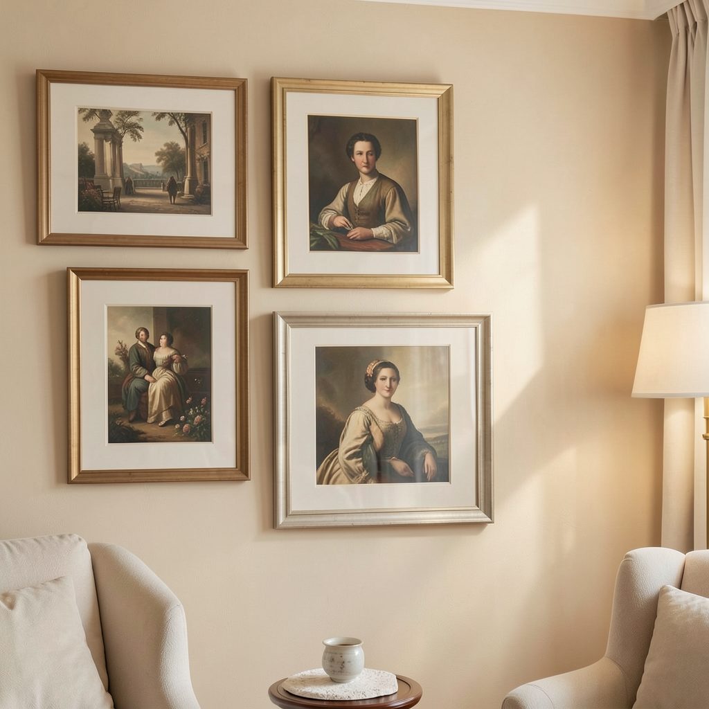
Choosing the right frame width for your wall color and trim
Frame width is a visual balancing act, not a rule tied to a paint code. The moulding should support the artwork, agree with the room’s architecture and make the composition feel intentional against the wall behind it.
A narrow black frame can give a large print a crisp, contemporary presence, while broad timber moulding can make a small work feel settled and substantial. The best width depends on the artwork, mount, room scale and nearby doors or windows, so measurements are only the beginning of the decision.
Use the wall colour as a starting point, then test one narrow and one broader frame in the actual space. View each from the doorway and at seated eye level, preferably in morning and evening light, because reflections and shadows can change how wide a frame appears.
| Wall and trim pairing | Frame treatment | Visual effect |
|---|---|---|
| Pale wall, white trim | Slim charcoal or natural timber | Defines the artwork without competing with the trim |
| Mid-tone wall, white trim | Medium-width off-white or timber frame | Softens the contrast and creates a calm focal point |
| Dark wall, white trim | Narrow light frame or floating canvas | Keeps the edge visible without adding visual weight |
| Wall and trim in one colour | Tonal or lightly contrasting frame | Blends the architecture and lets the artwork lead |
| Feature wall with little trim | Restrained frame or frameless canvas | Avoids a second competing shape |
Start with the proportions already in the room
Frame width usually means the visible face of the moulding, not the outside dimensions of the frame. Measure that face and compare it with the width of your door architraves, skirting and any picture rail. This creates a useful scale reference before you choose a colour or profile.
The outside size matters just as much. A 40 mm moulding around a 300 by 400 mm print without a mount produces a much larger object than the same print behind a narrow frame. As a broad starting range, 20–40 mm of visible face suits most contemporary print-and-mat combinations; above about 50 mm, the frame becomes an architectural feature and needs larger artwork or a generous mat.
Let wall colour guide the contrast
A frame that contrasts strongly with the wall becomes part of the room’s graphic pattern. This can be effective around a single large work, especially with a slim profile, but a broad, high-contrast frame may make a small artwork feel boxed in. Tonal frames reduce visual noise and suit layered, gallery-style displays.
Pay attention to undertones rather than colour names alone. Warm grey walls tend to sit comfortably with natural oak or walnut, while cool white or blue-grey walls can make black, white and pale timber appear sharper. Paint finish also matters: a satin wall can reflect more light and make glossy frame surfaces look brighter than expected.
Coordinate with doors, windows and skirting
Trim colour is often a stronger cue than moulding width. If the architraves are white and the wall is coloured, repeating the white in a medium-width frame can visually connect the artwork to the room. Matching the trim exactly is not essential; matching its brightness and finish can be enough.
When nearby trim is particularly broad, an equally wide frame can look heavy unless the artwork is large. A slightly narrower frame in the same finish creates continuity without repetition. In a bathroom, use sealed or moisture-resistant materials and avoid ornate mouldings that trap dust; in a bedroom, softer timber tones can complement bed frames and bedside tables.
Choose a profile that suits the artwork
Slim aluminium creates clean separation between prints and works well in apartments, while timber moulding adds warmth and suits a relaxed or traditional interior. White frames can look crisp against a dark wall, and frameless canvases create the lightest possible edge. Ornate profiles need generous artwork or a mat, otherwise their detail competes with the image.
For oversized canvases, irregular formats or pieces needing specialist handling, check dimensions and glazing before ordering. Our guide to framing oversized artwork explains the process and helps prevent an expensive mismatch between frame size and artwork.
Plan for Australian rooms and buying conditions
Melbourne terraces often have broad painted architraves and decorative cornices, while many Sydney apartments use simpler, narrow trim. Brisbane’s stronger sunlight can reveal glare, fading and uneven wall texture. Australian homes also favour open-plan family rooms and bedrooms that double as studies or guest rooms, so frames often need to work from a distance as well as up close.
Ready-made frames from retailers such as Bunnings and Mitre 10 suit standard sizes, while specialist framers offer broader moulding and made-to-measure matting at higher cost. Our guide to sourcing frames explains where to compare local and online options, including differences in price, finish and turnaround time before a custom order.
For rental properties, seek the landlord’s consent before painting or fixing permanent fittings. Apartment owners should check their owners’ corporation by-laws and installation rules, especially in common areas. Melbourne’s heritage controls mainly affect exterior work, so owners of period terraces should confirm proposed external alterations with council or a qualified local professional.
Use a practical frame selection checklist
Begin by measuring the artwork, the visible trim and the distance between nearby architectural features. Then compare frames at actual size rather than judging small samples. Place them against the wall temporarily and note how the frame changes through the day.
A reliable selection sequence helps prevent an expensive second order:
- Match the frame’s weight to the artwork’s size, allowing small works to use broader profiles.
- Compare narrow, medium and broad samples under the room’s real lighting.
- Echo one trim colour or finish without making the frame look like part of the joinery.
- Check that a mat, glazing and mount suit the medium as well as the wall.
- Confirm the outside dimensions, hanging weight and fixing method before purchase.
- For a gallery wall, repeat a consistent width while varying only artwork and mat borders.
Bring the pieces together
Start with the room’s strongest architectural line, then use the wall colour to determine how much contrast the frame should carry. The goal is not perfect matching but a deliberate relationship: the frame should belong to the space, while the artwork remains the focal point.
Choose your frame width, colour and profile, then view the complete grouping from the entrance and the main seating position. Subscribe to Focus LDN for more practical ideas on artwork, gallery walls and considered home decorating.