Choosing art for a navy blue accent wall
Navy gives a room a strong, quiet presence, but it can swallow delicate artwork or make an already busy piece look louder. Choosing art that matches a navy blue accent wall without clashing comes down to balance: the blue should anchor the room, while the artwork remains a focal point rather than competing with it.
Start with relationships rather than an exact colour match. A print, painting or photograph does not need to contain navy to sit comfortably beside it. Its proportions, mood, frame and surrounding furniture all influence whether the pairing feels intentional.
This matters in Australian interiors, from Sydney’s compact apartments to Melbourne’s converted warehouses, where one accent wall often works alongside pale timber floors, white walls and an assortment of practical furnishings. A considered artwork choice can define the space without adding clutter.
Read the blue before you buy
Test the wall in different lights before choosing anything. Look at it in morning daylight, afternoon sun and under the lamps you normally use. A small paint sample on card is more revealing than a tiny swatch, particularly when the blue shifts between inky, greenish and slightly purple undertones.
Once you understand the undertone, use it to guide the artwork. Cool navy works beautifully with crisp whites, soft grey, dusty blue and pale pink. If the blue leans towards green, earthy ochre, muted terracotta and natural brown create a warmer connection. Keeping one clear relationship is usually more effective than trying to incorporate every shade.
Build a palette around the wall
Let the navy remain the strongest colour in the room. White, oatmeal, warm grey and pale timber can occupy the visual background, while artwork introduces texture, pattern and a secondary accent. This gives the wall authority without making the space feel heavy or overly enclosed.
Choose one supporting hue and repeat it in small doses through a frame, cushion, ceramic vessel or rug edge. The repetition need not be exact. An artwork containing soft green can work with sage upholstery, for example, while a mostly monochrome print might pair with charcoal accessories. If the artwork is intensely colourful, keep the surrounding palette especially calm.
Choose colour that feels connected
High-contrast black-and-white photography can look striking against navy, provided the rest of the room includes enough lighter tones to prevent the combination from feeling severe. Tonal landscapes, misty abstractions, botanical studies and understated geometric works also sit well because they relate to the wall’s depth without duplicating it.
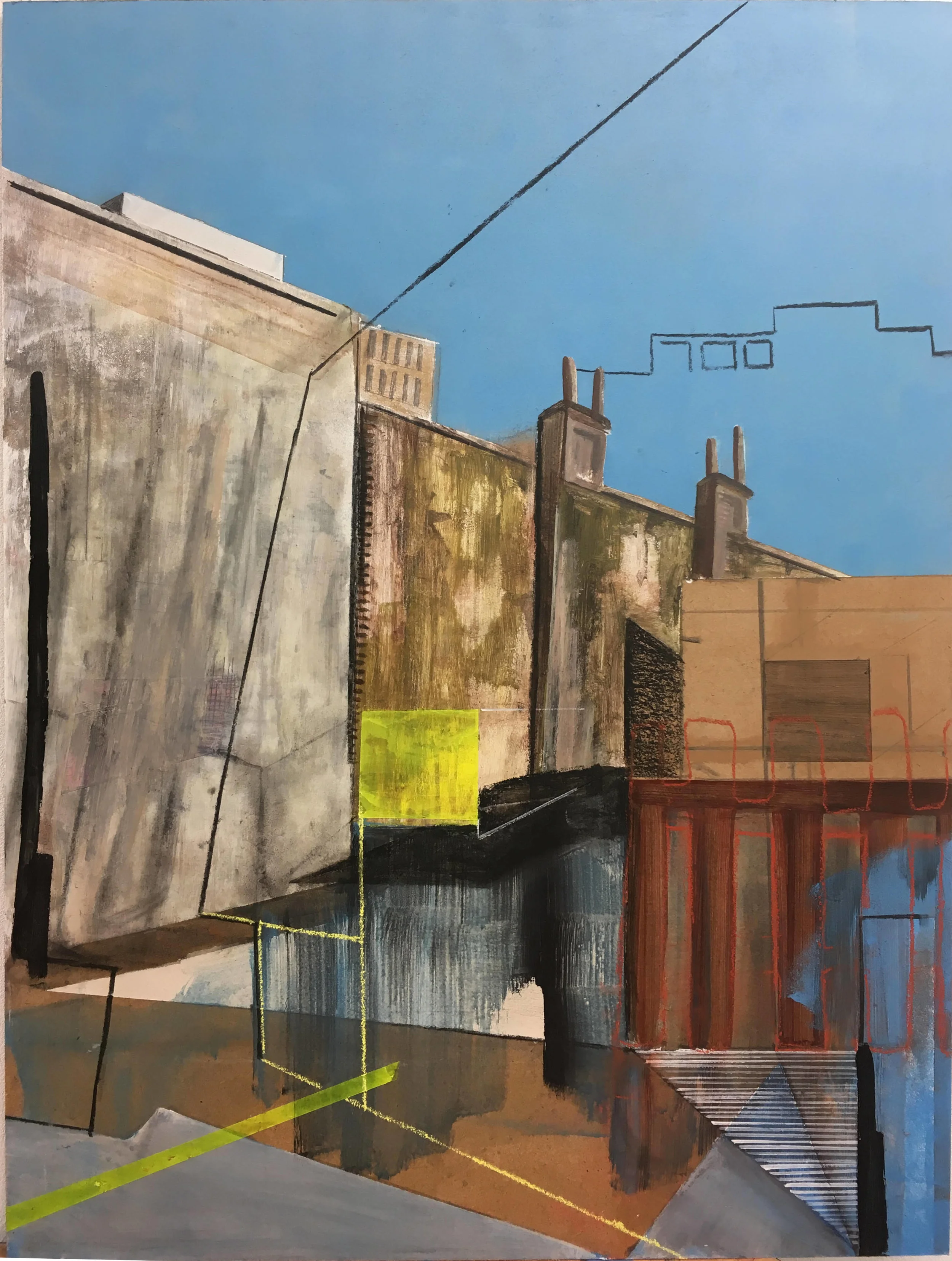
The Australian art market offers many options, from blue-grey eucalyptus landscapes by local printmakers to bold studio pieces and photographic editions. A coastal subject may complement the blue naturally, but a warm, earthy image can be just as effective when it has strong lines or a clear focal point. Judge the work in the room rather than relying on its subject alone.
Match scale and spacing to the room
Artwork should feel proportionate to the furniture beneath it. A single large piece can span roughly two-thirds of a sofa, while a pair can sit within the same overall width if you prefer a symmetrical arrangement. Hanging starts too high is common; position the centre around eye level, then step back and assess the whole composition.
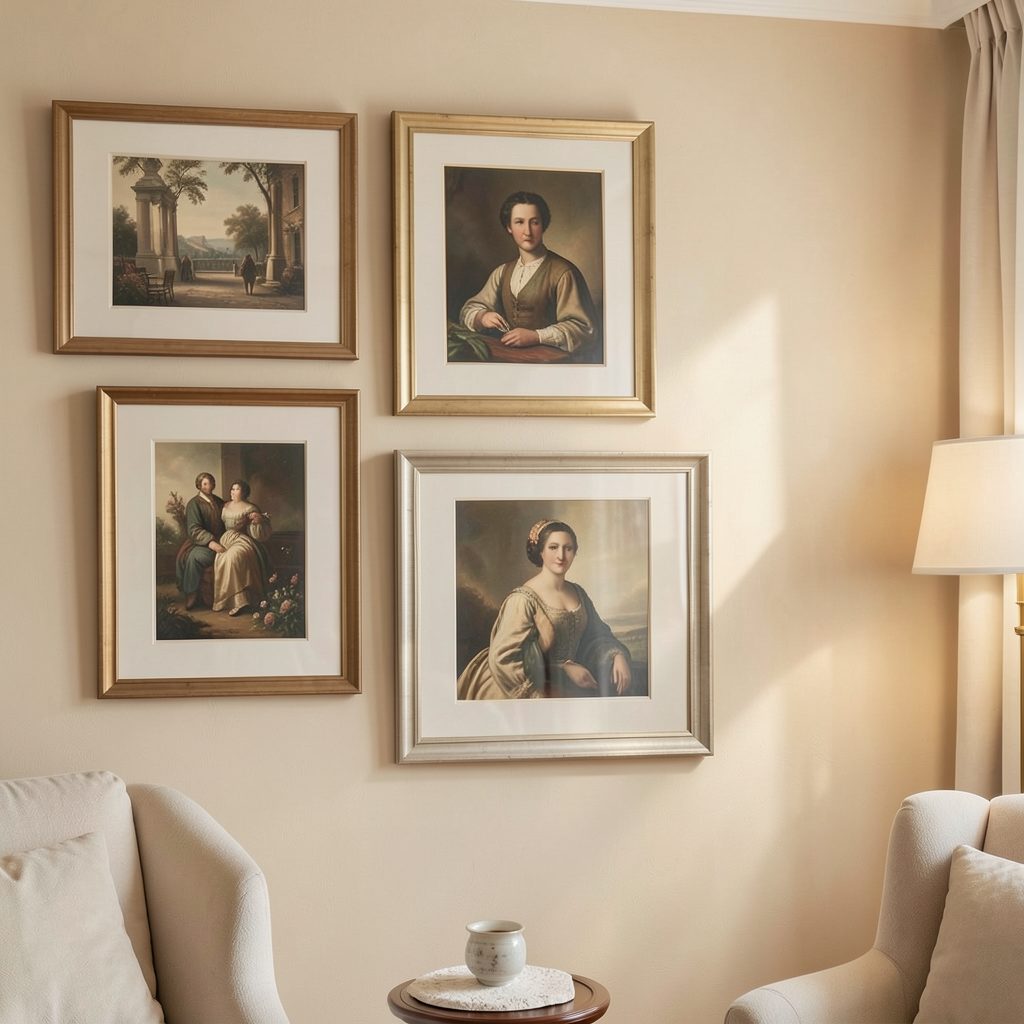
If a gallery grouping is your aim, the art of six offers a useful guide to balancing repetition and variety before you commit to hanging. For a high-ceilinged room, consider a vertical arrangement. In Australian rentals, check the wall material and use removable hanging strips rated for plasterboard where drilling is not permitted, avoiding damage that could affect your deposit.
Give every frame a deliberate finish
Frame colour changes how strongly the artwork relates to the navy wall. Natural oak and walnut bring warmth, black creates a crisp graphic outline, and a white or pale frame introduces brightness and visual space. A thin black frame can make a small work feel precise, while a broad timber moulding suits larger, traditional pieces.
When several works belong together, consistent frames establish unity even if the subjects vary. Clear gallery labels can also help a display feel composed, giving each work equal attention instead of making one piece dominate by default. In Brisbane’s strong northern light, consider UV-filtering glazing and archival mounts to reduce fading, especially for photographs or works on paper.
Connect artwork with the rest of the room
Repeat one colour, shape or texture from the artwork elsewhere in the room. A striped cushion might echo the brushwork in a painting, while a brass lamp could pick up its golden details. For the floor, rugs and decor offer practical ways to soften navy walls and anchor furniture without introducing another competing pattern.
Watch the balance of textures. Linen curtains, wool upholstery, smooth timber and matte ceramics bring variety without requiring more colours. In a compact apartment, too many decorative objects can crowd the accent wall and weaken the artwork. Edit until the room contains a few clear anchors: the artwork, the main seating and one or two supporting elements.
Make the final choice
Arrange candidate pieces on the floor or prop them against the wall before committing. Photograph them from the doorway and from your normal seated position, then check the arrangement in both daylight and artificial light. Leave enough breathing room around the display, especially above a sofa, where a dense grid can feel crowded and a single small image can look undersized.
Choose the artwork you would still enjoy without the navy wall behind it. That ensures the pairing works on the work’s own merit rather than relying on the colour to carry it. Explore more gallery-wall inspiration on Focus LDN and subscribe to the email list for practical decorating ideas, fresh artwork features and new inspiration for your home.