The art of hanging a gallery wall in a staircase landing
A staircase landing is a passage, a pause point and often an overlooked piece of architecture. Its walls can transform an awkward corner into a curated display, but the arrangement needs to work with movement, changing viewpoints and limited wall depth.
The best gallery walls in transitional spaces feel intentional without appearing stiff. Artwork should relate to the scale of the landing, sit safely away from shoulders and hands, and create a sense of rhythm as someone moves up or down the stairs.
A successful display does not require a large collection. A few well-chosen prints, photographs or small paintings can give the staircase the atmosphere of a private gallery while keeping the surrounding home calm and practical.
Read the landing before choosing artwork
Begin by studying the architecture rather than laying every frame on the floor immediately. Identify the main wall, the turning point of the stairs and the places where the eye naturally pauses. A landing with a low ceiling may benefit from a vertical arrangement, while a broad upper wall can support a wider salon-style composition.
Measure the usable wall area, excluding handrails, door casings, switches and corners where frames could be knocked. On a stairway, the display should never interfere with the handrail or narrow the walking route. Keep heavier pieces on the most secure wall sections, and avoid placing fragile glass directly beside a busy bend.
The height of the arrangement should be considered from both directions. Instead of centering everything at standing eye level in one spot, follow the movement of the staircase. The middle of the composition can sit around 145 to 155 centimetres from the floor on a landing, then subtly rise or fall if the wall follows the stair line.
Build a layout that follows movement
A staircase landing usually works best with a clear visual axis. This might be a vertical column of frames that echoes the rise of the stairs, a diagonal arrangement that follows the handrail, or a compact rectangular grid on a level wall. The right choice depends on whether the architecture feels narrow and tall or open and horizontal.
Lay the frames on kraft paper and trace around them. Cut out the shapes, label each piece, and attach the paper templates to the wall with low-tack tape. Live with the arrangement for a day, viewing it from the bottom step, the landing and the upper floor. These changing perspectives often reveal spacing problems that are invisible when planning from straight ahead.
Aim for consistent gaps, usually between five and ten centimetres, unless the collection is deliberately dense. The outer edge of the arrangement should have enough breathing room from door frames and corners. A gallery wall can feel expansive, but it should not appear to spill accidentally into adjoining architecture.
For a more detailed method of balancing scale, colour and negative space, use this guide to arrange a gallery wall like a curator before committing to drill holes.
Match frames and artwork to the setting
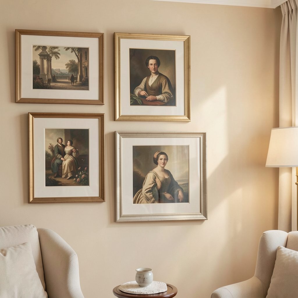
Frame selection has a major effect on how a staircase display relates to the rest of the home. Slim black frames create a graphic, contemporary effect, while oak or walnut introduces warmth against white or pale walls. A mixed collection can look sophisticated when one element remains consistent, such as matching mounts, a restrained colour palette or a shared frame depth.
Consider the landing’s natural light. Strong daylight can fade works on paper and create reflections across glass, particularly when the wall faces a window. UV-filtering glazing is worthwhile for valuable prints, while acrylic glazing is lighter and safer for a high-traffic stairwell. Textured works and unglazed canvases can reduce glare but need more careful dusting.
| Display approach | Best for | Visual effect | Key consideration |
|---|---|---|---|
| Vertical column | Narrow landings and tall walls | Elongates the space | Keep the centre line precise |
| Diagonal arrangement | Walls beside rising stairs | Echoes architectural movement | Check each frame from both levels |
| Compact grid | Wide, level landing walls | Calm and orderly | Keep gaps consistent |
| Organic salon layout | Eclectic collections | Relaxed and collected | Balance size and colour carefully |
| Single statement piece | Minimal interiors | Quiet and dramatic | Choose artwork with strong scale |
Artwork does not need to match perfectly. A black-and-white photograph can sit comfortably beside an abstract print if the works share a tonal link. Repeating one colour from a rug, runner or nearby room can make the collection feel integrated rather than isolated.
Install securely and light the display
Once the layout is approved, use fixings suited to both the frame weight and the wall construction. Masonry walls may require plugs and screws, while plasterboard needs appropriate anchors or a fixing point connected to a stud. Two fixing points on wider frames prevent rotation when doors close or people pass close by.
Avoid relying on a single lightweight picture hook for substantial framed work. Staircases experience more vibration than quiet rooms, and a loose frame can become a safety risk. Add discreet rubber bumpers to the lower corners to protect the paintwork and keep frames sitting flush.
Lighting should reveal the artwork without turning the landing into a bright corridor. A directional wall light, adjustable ceiling spotlight or small picture light can create a gentle pool of illumination. Choose warm white bulbs around 2700K to 3000K for a residential feel, and angle fittings away from glass to limit reflected glare.
Edit the collection with a clear visual rhythm
A considered staircase gallery wall usually has a dominant piece, a few supporting works and enough open space to let the eye rest. Before hanging everything, remove any frame that repeats an idea too closely or competes with a stronger work. The goal is a sequence that feels connected as it is viewed in motion.
Use these principles when making the final edit:
- Start with one anchor piece at the visual centre or turning point.
- Repeat one colour, material or subject to connect different artworks.
- Mix portrait and landscape formats without creating an uneven edge.
- Keep the busiest images away from the tightest part of the staircase.
- Leave enough wall visible to preserve a sense of air and proportion.
Small objects can add personality, but they need restraint in a narrow landing. A shallow ledge may support a few unframed works if it does not project into the route, while sculptural pieces are better reserved for a secure console or alcove. In most stairwells, framed art provides the strongest combination of impact and practicality.
Let the landing connect with the rest of the home
A gallery wall should feel like part of the home’s wider decorating language. Draw frame finishes from nearby furniture, repeat a shade found in the bedroom or hallway, or choose artwork that picks up the texture of a runner. This creates continuity without requiring every room to look identical.
The same principle applies to quieter spaces. If you prefer a restrained display elsewhere, the approach in styling a minimalist bedside table with one piece of art can help you decide where simplicity will have more impact than abundance.
After installation, step back and observe the wall at different times of day. A piece that seems perfectly placed in daylight may need a slight adjustment once evening lighting changes the shadows. Keep a few spare prints nearby so the arrangement can evolve naturally rather than becoming permanently fixed.
A staircase landing offers a rare opportunity to make everyday movement feel more considered. With careful measurements, secure hanging methods, balanced spacing and artwork chosen for the architecture, the wall becomes a graceful visual link between floors. Explore more gallery styling ideas through the Focus LDN journal and subscribe to the email updates for fresh inspiration on displaying art at home.