Choosing frame widths for every art style
Frame width changes how artwork feels before anyone studies the image itself. A slim profile can make a print appear light and contemporary, while a broad moulding gives even a small work greater presence. The right choice depends on the art, the wall, and the visual weight you want to create. Learn more about The Role Of Negative Space In Minimalist Decor.
The best frame widths for different art styles are rarely determined by a single rule. Photography, abstract painting, vintage posters, line drawings, and decorative textiles each benefit from a slightly different balance between image, mount, and border. Room proportions and neighbouring pieces matter just as much. Learn more about Brick Engraving.
A useful starting point is to consider the frame as part of the composition rather than a protective edge added at the end. Its colour, depth, material, and width should support the artwork without competing with it.
Start with the artwork’s visual weight
Minimal line art and delicate botanical drawings usually look strongest in narrow frames between 6 and 15 millimetres wide. A thin black, white, or natural wood profile preserves the open quality of the image and works especially well in calm bedrooms, hallways, and minimalist interiors.
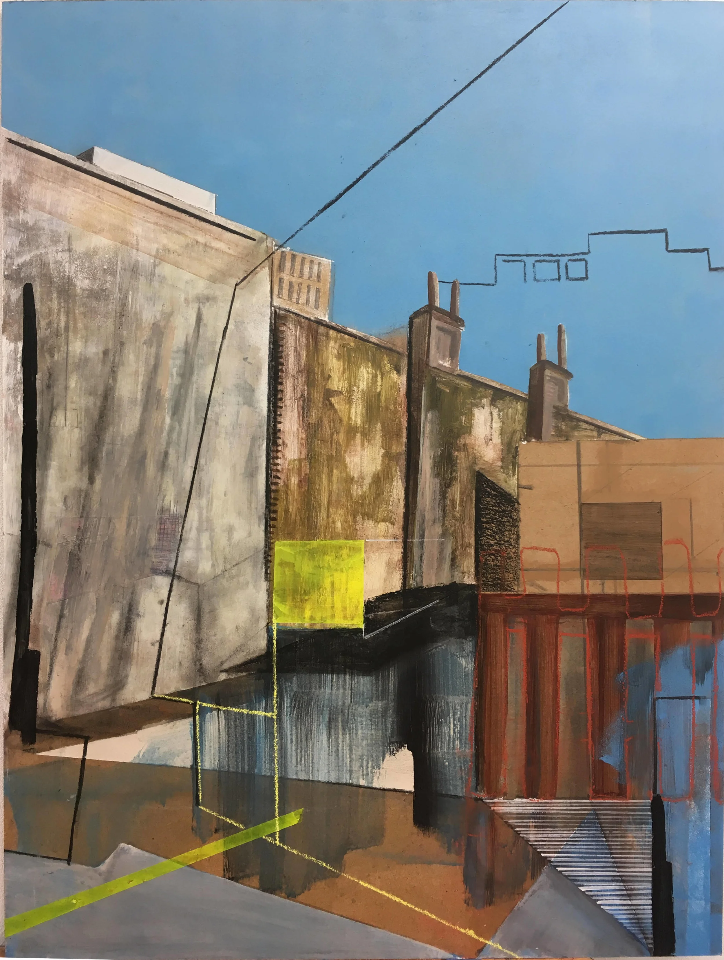
Bold abstracts, expressive oil paintings, and richly coloured prints can carry a wider frame. Profiles around 20 to 40 millimetres provide enough visual authority to balance saturated colour and energetic brushwork. If the artwork already contains strong shapes, avoid an ornate frame unless the room has a deliberately traditional character.
The surface of the art also affects the decision. A glossy photograph may benefit from a clean, moderately wide frame that creates a clear boundary, while a textured canvas often suits a deeper profile or a floating frame that allows its edges to remain visible.
Match the frame to the art style
The width should echo the language of the artwork. A simple image does not always need a simple frame, but the relationship should feel intentional. For example, a vintage travel poster can handle a wider stained-wood border, while a contemporary geometric print may look sharper in a flat metal or narrow painted frame.
| Art style | Recommended frame width | Best visual effect | Useful considerations |
|---|---|---|---|
| Fine line drawing | 6–12 mm | Light and unobtrusive | Add a generous mount for breathing room |
| Black-and-white photography | 10–20 mm | Crisp and architectural | Black, white, or brushed metal works well |
| Contemporary abstract | 20–40 mm | Grounded and gallery-like | Keep the profile simple if colour is intense |
| Vintage poster | 20–45 mm | Collected and substantial | Match the frame to one muted tone in the print |
| Watercolour | 12–25 mm | Soft and considered | Wood or painted frames complement delicate pigments |
| Textile or collage | 25–50 mm | Structured and tactile | Use a deep profile or shadow box when necessary |
| Small decorative artwork | 15–30 mm | More presence on the wall | A mount can prevent the frame from overwhelming it |
These ranges refer to the visible face of the frame, not its overall depth. A deep frame can look elegant even when its front edge is relatively narrow. For unusual pieces, mock up the proportions with masking tape on the wall before ordering.
Black-and-white art is particularly adaptable. A narrow black frame creates a refined, graphic effect, while a wider white or pale-oak frame makes the composition feel softer. For a room with strong tonal contrast, the guidance in this feature on black-and-white art offers useful inspiration for keeping the surrounding scheme balanced.
Let the room scale guide the choice
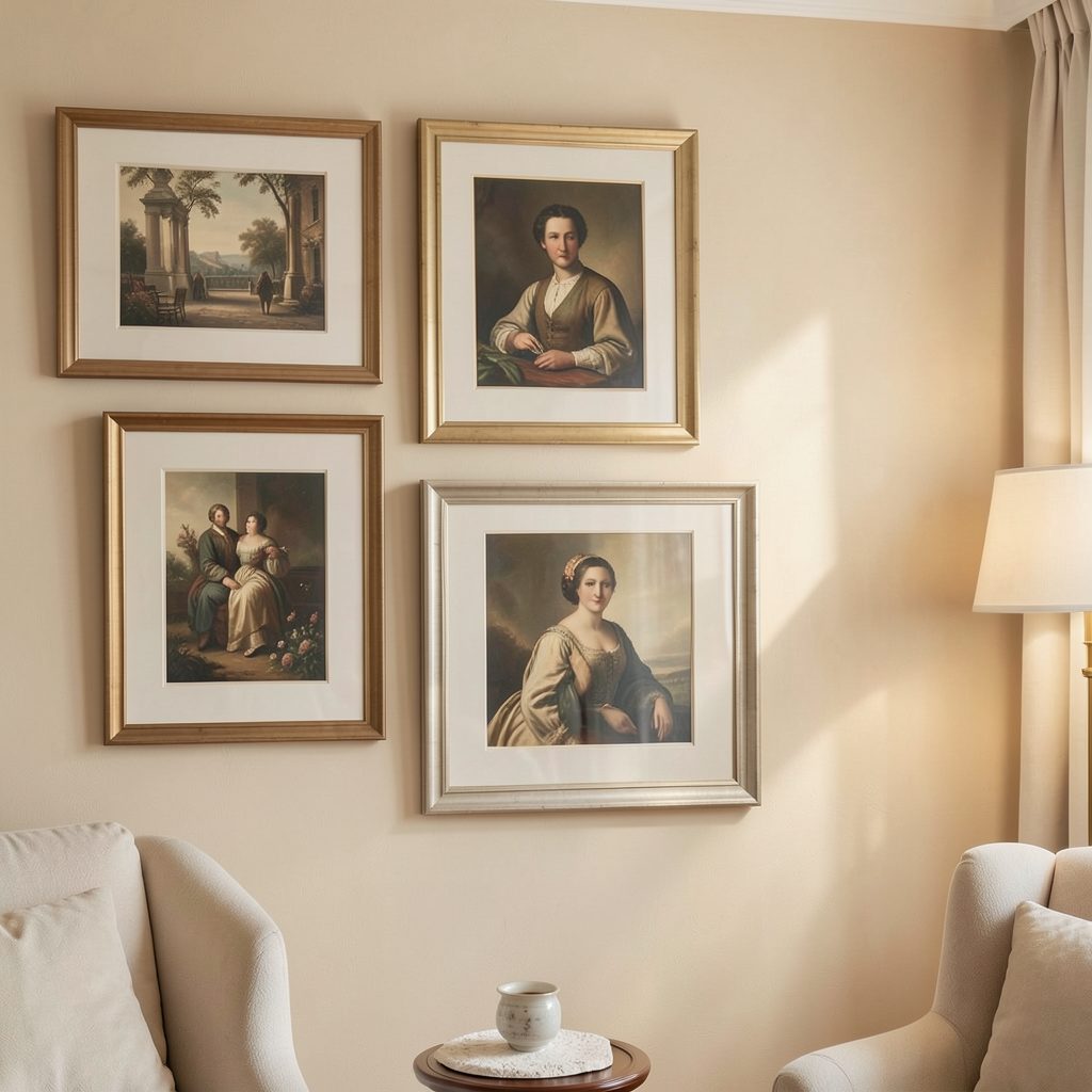
A frame that looks perfect in a shop can feel undersized above a sofa or too heavy beside a narrow console. Large furniture generally needs artwork with enough combined width to hold its position. Several slim frames can achieve this through grouping, while one substantial piece may need a broader border to feel anchored.
In a compact room, a narrow profile often prevents the walls from looking crowded. This is especially effective when the artwork has a wide mount, because the pale space around the image adds visual scale without adding another heavy object. In a large room with high ceilings, wider mouldings help artwork retain presence from a distance.
Consider the distance between the frame and nearby architectural details. A thick profile beside a door casing, shelf, or mirror can create awkward congestion. Leave enough breathing room for each object to read clearly, and use the wall’s negative space as an active part of the arrangement.
Balance frame, mount, and negative space
The mount can change the apparent width of a frame more dramatically than expected. A narrow frame with a generous mount often appears more sophisticated than a wide frame pressed tightly around the image. This approach suits photographs, prints, and delicate