The best colorful frame combinations for a neutral room
Neutral rooms create a calm backdrop for art, but they can also make a display feel unfinished if every frame is white, black, or natural wood. Introducing color around the artwork adds rhythm, personality, and visual warmth without disturbing the room’s quiet character.
The key is to treat frames as part of the composition rather than as separate accessories. A painted border can echo a cushion, pick up a small detail in a print, or create contrast against a beige wall. With a restrained palette and thoughtful spacing, colorful frames can make a gallery wall feel curated instead of chaotic.
Choose a quiet color base
Begin by identifying the dominant neutral in the room. Warm whites, cream, taupe, oatmeal, and greige work especially well with terracotta, olive, ochre, rust, and muted pink. Cooler gray or blue-gray interiors can support cobalt, forest green, plum, and soft blue.
A room with several neutral finishes does not need many frame colors. Choose one main shade and one supporting accent, then repeat them across the arrangement. Repetition gives even bold colors a sense of purpose and helps the gallery wall connect with the wider decor.
Create contrast without visual noise
Colorful frames are most effective when they vary in intensity rather than competing at equal volume. For example, pair a deep teal frame with dusty blue and pale sage, or combine burgundy with blush and warm wood. This creates depth while keeping the palette cohesive.
You can also use a single saturated frame as an anchor among quieter borders. A red, yellow, or cobalt frame placed near the center can draw attention to an important artwork. If the surrounding pieces have simple compositions, the frame becomes an intentional design detail rather than a distraction.
For a more polished result, start an art gallery with a limited palette before buying frames individually. Seeing the artwork together makes it easier to judge whether a color feels connected or merely attractive on its own.
Match the frame to the artwork
The artwork should guide the frame choice, especially when prints contain several colors. Pick a shade that appears in a small but meaningful detail, such as the leaves in a botanical print, the shadow of a portrait, or a thin line in an abstract composition. This technique makes the frame feel integrated with the image.
Consider the visual weight of both pieces. A delicate line drawing may suit a slim painted frame, while a dense abstract work can carry a wider border. Mixing profiles adds variety, but keep one element consistent, such as a similar finish, depth, or inner edge.
| Neutral room palette | Colorful frame pairing | Suitable artwork |
|---|---|---|
| Warm white and oak | Terracotta, olive, muted yellow | Botanicals, landscapes, woven art |
| Soft gray and stone | Cobalt, lilac, forest green | Abstracts, photography, graphic prints |
| Beige and linen | Rust, blush, dark teal | Portraits, vintage posters, still lifes |
| Cream and brass | Burgundy, ochre, dusty blue | Classic illustrations, typography, eclectic art |
| Charcoal and pale wood | Coral, emerald, butter yellow | Minimal line art, monochrome prints, modern abstracts |
Use color across different rooms
In a bedroom, softer combinations encourage a restful mood. Try dusty rose with sage, pale blue with ochre, or lavender with warm white. Keep the most vivid frame away from the bed’s central sightline if you want the display to feel peaceful rather than energetic.
Bathrooms can handle sharper contrast because their surfaces are often compact and highly functional. A small gallery of white, navy, and tomato-red frames can enliven a tiled wall, while green and yellow work beautifully with terrazzo, marble, or unlacquered brass.
In living rooms, coordinate the frame palette with textiles instead of matching furniture exactly. A rust frame may echo a wool throw, while a dark green border can relate to a plant or velvet cushion. These subtle links make the artwork feel embedded in the space.
Plan the arrangement before hanging
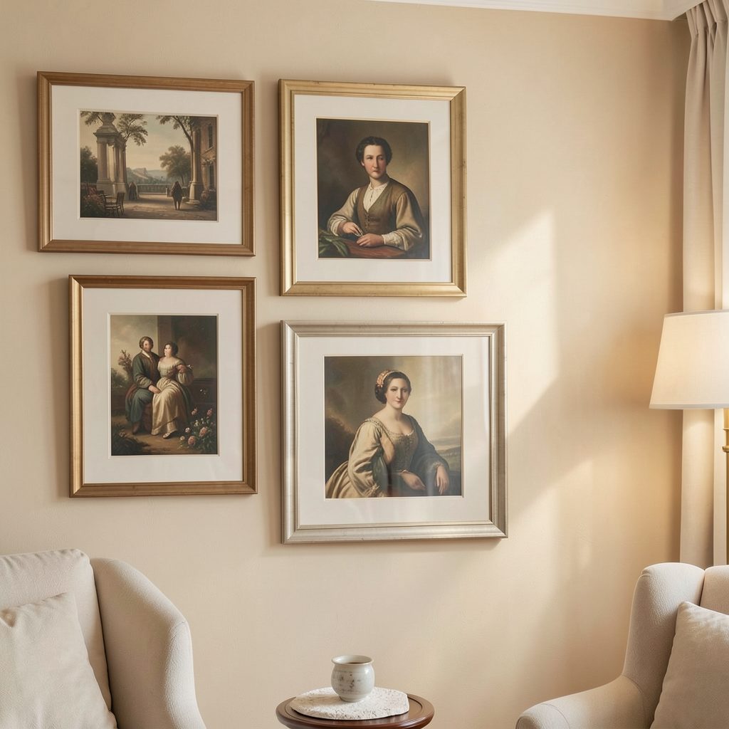
A colorful frame combination needs breathing room. Lay every piece on the floor and test several arrangements, keeping heavier or darker frames balanced by lighter pieces. Avoid placing all the strongest colors along one edge, as this can make the wall feel visually tilted.
Use consistent spacing between neighboring frames, usually around five to eight centimeters for a compact display. Larger gaps can suit oversized artwork or a more relaxed salon-style arrangement. If the wall is narrow, build upward with a vertical sequence; over a sofa or console, a wider horizontal grouping usually feels more stable.
For a more deliberate result, follow this curator-style arrangement approach: establish a focal piece, support it with contrasting sizes, and allow the eye to move naturally through the collection. A paper template on the wall can prevent unnecessary holes and reveal awkward gaps before installation.
Shop with a clear palette
Before purchasing new frames, photograph the room in daylight and collect small color references from rugs, curtains, ceramics, or upholstery. These details help you select shades that belong in the space. Paint chips or fabric samples are useful when online colors appear different from those on screen.
Mixing finishes can make the display richer. Glossy lacquer catches light and feels contemporary, while matte paint looks softer and more architectural. Natural wood, brushed metal, and painted borders can coexist when their proportions are balanced. Try to avoid adding too many frame shapes if the colors are already varied.
Use this checklist when refining your selection:
- Choose one dominant frame color and one or two supporting accents.
- Repeat each important color at least twice across the arrangement.
- Balance saturated borders with natural wood, white, or slim neutral frames.
- Match frame width to the scale and visual density of each artwork.
- Check the complete grouping in daylight before fixing anything permanently.
A neutral room gives colorful frames room to make an impression, so there is no need to fill every wall. Start with a small, well-balanced arrangement, then add pieces only when they strengthen the overall composition. Explore more gallery wall inspiration on Focus LDN and create a display that brings color, character, and structure into your home.