The Best Art to Pair with Houseplants for a Lush Gallery Wall
A gallery wall becomes more inviting when artwork and greenery are styled as one composition rather than treated as separate decorations. Plants soften hard frames, add movement to quiet spaces, and bring an organic quality to prints, paintings, and photographs.
The most successful arrangements combine contrast with repetition. A trailing plant can echo a flowing line in a botanical drawing, while a sculptural pot can balance the geometry of a bold abstract print. The aim is a layered display that feels collected, calm, and connected to the room around it.
Before choosing individual pieces, consider the light, wall color, furniture scale, and care needs of the plants. A beautiful arrangement should remain easy to water, dust, rearrange, and enjoy throughout the year.
Choose a Visual Language
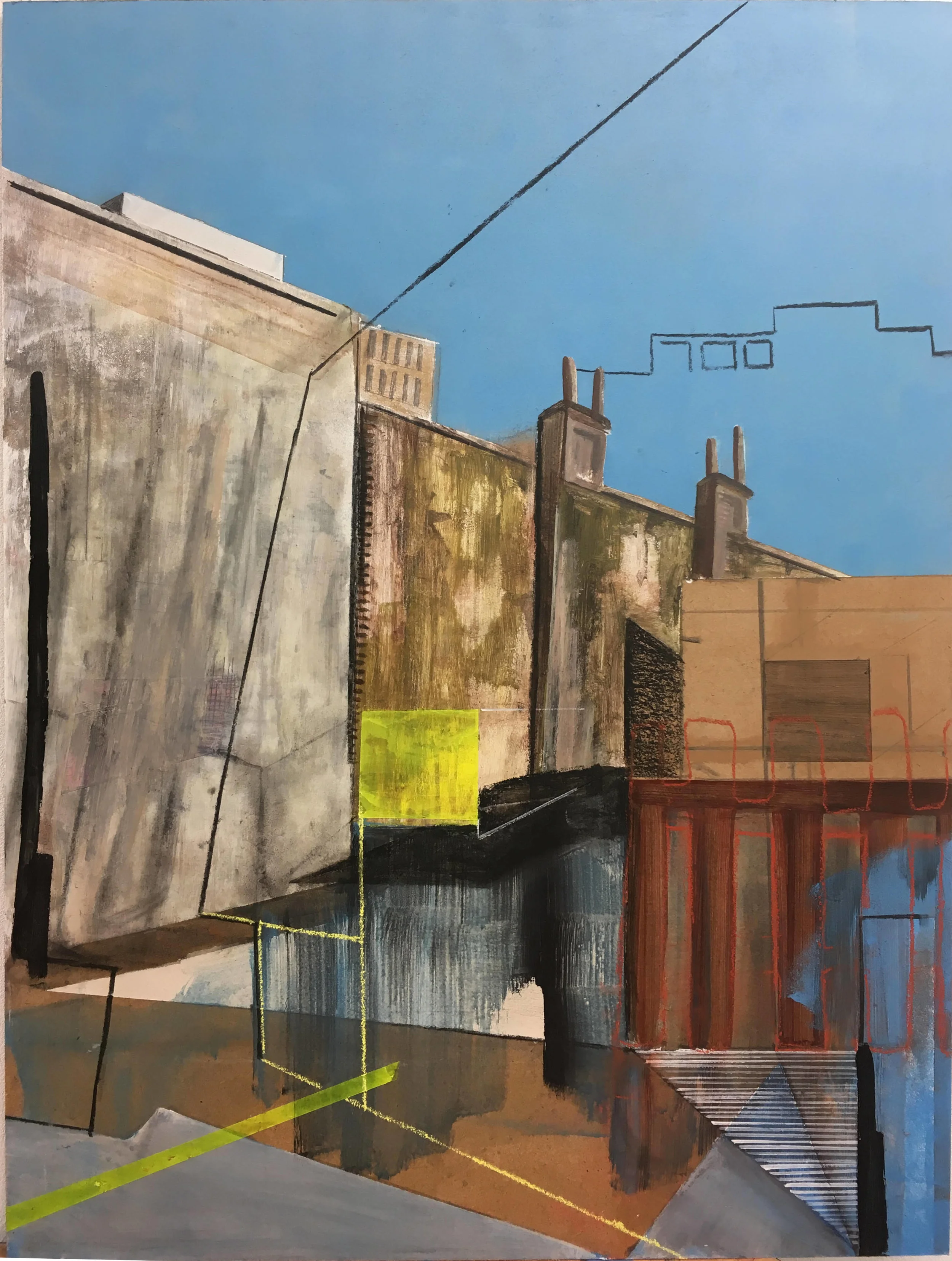
Start by deciding whether your gallery wall should feel botanical, modern, eclectic, or quietly architectural. Fern studies, pressed-flower prints, landscape photography, and vintage garden illustrations create a natural theme without making the arrangement feel overly coordinated. For a contemporary interior, pair one or two organic images with line drawings or abstract artwork.
Color is an easy way to connect art with foliage. Olive, sage, moss, terracotta, cream, and muted blue work naturally with most houseplants. You do not need green in every print; a repeated warm neutral or earthy accent can create the same visual relationship while giving the wall more variety.
Texture also contributes to the mood. A handmade paper print, linen mount, woven wall piece, or lightly distressed frame can complement the tactile character of leaves and stems. If the room already contains plenty of texture, use smoother frames and crisp artwork to keep the display controlled.
Match Artwork to Plant Shapes
Look at the silhouette of each plant before selecting its neighboring artwork. Plants with broad, rounded leaves pair well with fine-line illustrations, narrow typography, and small geometric prints. Their generous shapes provide visual weight, so delicate art prevents the grouping from becoming too dense.
Tall plants such as fiddle-leaf figs, snake plants, and palms can frame a gallery wall from the floor. Hang smaller works near the upper leaves, allowing the foliage to overlap the composition slightly without hiding important details. This creates depth and makes the arrangement appear integrated into the room.
Trailing plants are especially useful beside angular frames because their stems introduce a relaxed diagonal. Place a pothos or string of hearts on a nearby shelf, then repeat a curved line in a landscape, abstract brushstroke, or vintage botanical print. The shared movement will make the display feel intentional.
Build Balance with Frames
Frame selection determines whether a plant-and-art arrangement feels polished or cluttered. Black frames sharpen colorful artwork and suit minimalist interiors, while pale oak and walnut frames reinforce a warm, natural palette. Use one dominant finish and introduce a second sparingly for contrast.
Varying frame sizes adds rhythm, but keep a consistent gap between pieces. A spacing of roughly two to four inches usually feels cohesive, depending on the scale of the wall. Start by arranging the largest work near the center, then build outward with medium and small pieces.
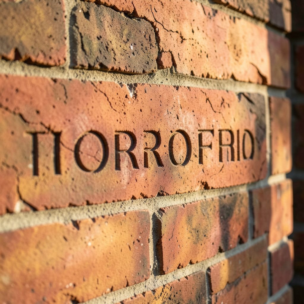
For a more architectural effect, consider unusual surfaces and relief-based artwork. A small piece inspired by brick engraving ideas can add tactile interest beside leafy plants, especially in a loft, hallway, or room with exposed masonry. The rougher material creates a useful counterpoint to delicate foliage.
Compare Art and Plant Pairings
Different combinations create different atmospheres. A restrained palette of monochrome prints and glossy green leaves suits a minimalist home, while colorful art and varied plant forms produce a more collected, bohemian look. Use the surrounding furniture as a guide: simple furnishings can support a busier wall, whereas patterned upholstery may call for quieter artwork.
Scale matters as much as style. A large plant beside several tiny frames may make the wall appear visually weak, while one oversized print can overwhelm a delicate shelf garden. The pairings below offer a starting point for matching artwork, foliage, and room mood.
| Artwork Style | Plant Pairing | Best Frame Finish | Overall Effect |
|---|---|---|---|
| Botanical line drawings | Ferns or maidenhair plants | Light oak | Airy and natural |
| Bold abstract prints | Snake plants or rubber plants | Matte black | Graphic and modern |
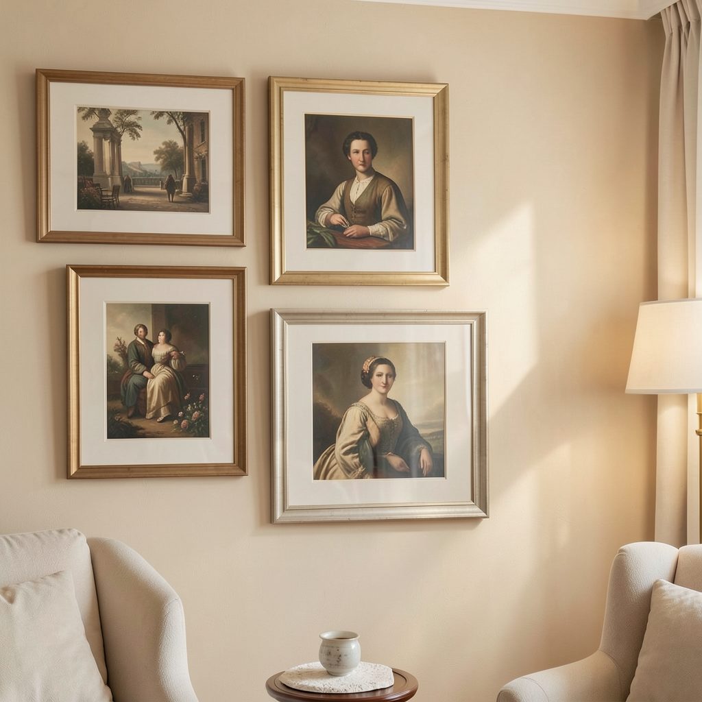
| Vintage landscapes | Pothos or ivy | Aged brass or walnut | Collected and warm |
| Black-and-white photography | Monstera or palms | Black or dark wood | Sophisticated and dramatic |
| Textured handmade art | Succulents or sculptural cacti | Natural wood | Earthy and tactile |
Keep the largest visual mass low or slightly off-center to avoid a top-heavy display. A substantial plant on the floor can anchor a cluster of smaller artworks, while a plant on a floating shelf can bridge the gap between furniture and wall art.
Style the Display for Its Room
In a bedroom, choose calming artwork such as soft landscapes, tonal abstracts, or delicate plant studies. Keep thorny or highly spiky plants away from areas where they might catch on bedding, and use low-maintenance varieties if the gallery wall is above a bedside table.
Bathrooms benefit from moisture-resistant prints, sealed frames, and artwork with a clean, graphic quality. Small plants such as ferns, peperomia, and trailing vines work well where natural light is available. Avoid placing valuable paper artwork directly above a bath or sink, where steam and splashes may cause damage.
For hallways and living rooms, use height to create a sense of progression. A sequence of framed works can lead the eye toward a doorway, while a tall plant at the end of the arrangement gives the display a clear visual finish. In compact spaces, a narrow ledge with layered frames is often more flexible than a tightly fixed grid.
Protect the Art and the Plants
Plants need light, but direct sun can fade prints, dry out paper, and heat frames. Check how sunlight moves through the room before hanging artwork, especially near south-facing windows. Sheer curtains or UV-protective glazing can help preserve both the art and the foliage.
Leave enough clearance to water plants without brushing against frames. Choose saucers, cachepots, or waterproof trays for plants displayed on shelves, and wipe leaves regularly so dust does not settle onto nearby artwork. Stable pots are essential when a display is installed above seating or in a busy passage.
When photographing the finished arrangement, remove temporary watering tools, straighten frame edges, and capture the relationship between the wall and the surrounding furniture. These gallery wall photography tips can help you present the composition clearly, whether you are documenting a home project or sharing it with friends.
A Practical Styling Checklist
- Select one dominant frame finish and one supporting material.
- Repeat at least one color found in the plants across two or three artworks.
- Mix vertical, horizontal, and square frames to create a natural rhythm.
- Keep trailing stems clear of important artwork and walking routes.
- Test the arrangement on the floor before making holes in the wall.
A finished gallery wall should feel lived-in rather than frozen. Allow plants to grow beyond their original shape, rotate seasonal artwork, and replace a print when the room’s palette changes. Small adjustments can preserve balance while keeping the display personal.
Bring together a few meaningful artworks, healthy plants, and frames that suit your interior, then build the arrangement gradually. Subscribe to Focus LDN for more ideas on gallery walls, stylish rooms, and thoughtful ways to display art at home.