Art sizes that suit a compact sofa wall
Choosing artwork for a small living room is a matter of proportion, not simply finding the largest piece that fits. The wall above a sofa has a strong visual relationship with the seating below it, so the artwork should feel anchored without making the room appear crowded.
The best art sizes for above a sofa in a compact living room usually depend on the sofa’s width, ceiling height, and the amount of breathing room around the display. A well-scaled arrangement can make a modest room feel considered, spacious, and personal.
Before buying a frame or printing a favourite photograph, measure the sofa, mark the intended hanging area, and consider how the artwork will relate to nearby shelves, windows, lamps, and doorways. A few minutes of planning can prevent an expensive sizing mistake.
Start with the sofa width
As a reliable guideline, artwork should span around two-thirds to three-quarters of the sofa’s width. For a 180-centimetre sofa, that means choosing one large piece between 115 and 135 centimetres wide, or creating a grouped display within those dimensions.
A single artwork that is too narrow may look disconnected from the seating. One that extends almost from arm to arm can dominate a compact room, especially when the sofa sits against a short wall. Leave some visible wall on either side so the arrangement feels framed by the architecture.
The sofa’s back also matters. A low-profile sofa can accommodate a taller artwork, while a high-backed design usually needs a shorter piece or a greater gap between the furniture and frame. Keep the bottom edge of the artwork approximately 15 to 25 centimetres above the sofa, adjusting slightly for scale.
Select a shape that supports the room
A horizontal print or panoramic painting is often the easiest choice above a sofa because its proportions echo the furniture. It creates a calm visual line and works particularly well in minimalist interiors. A wide artwork around 100 by 60 centimetres can provide presence without using excessive wall space.
Vertical artwork can work when the room has high ceilings or a narrow wall. Rather than placing one very tall canvas directly above the sofa, consider two slim pieces with matching frames. This gives the wall height while keeping the composition balanced.
Square art is useful when the surrounding room contains strong horizontal lines, such as a long media unit or low shelving. A 70-by-70-centimetre piece can act as a central anchor, although it may need smaller objects or wall space around it to avoid appearing undersized.
Match the artwork to the available wall
Use painter’s tape to outline the intended dimensions before committing to a purchase. This simple test reveals whether a 90-centimetre print feels substantial enough and whether a 120-centimetre canvas leaves comfortable margins beside the sofa.
For a compact living room, the following measurements offer a practical starting point. They are flexible rather than fixed rules, since frame thickness, matting, ceiling height, and visual weight all influence the final result.
| Sofa width | Single artwork | Grouped arrangement | Recommended orientation |
|---|---|---|---|
| 140–160 cm | 85–105 cm wide | 2–3 pieces across 90–115 cm | Landscape or square |
| 170–190 cm | 110–135 cm wide | 3 pieces across 115–145 cm | Landscape |
| 200–220 cm | 130–155 cm wide | 3–5 pieces across 140–170 cm | Landscape or mixed |
| Under 140 cm | 65–90 cm wide | 2 small pieces across 75–100 cm | Square or portrait |
When measuring a gallery wall, calculate the full outside dimensions, including gaps and frame edges. The individual prints may be small, yet the composition as a whole should relate to the sofa in the same way a single oversized artwork would.
Build a small gallery wall
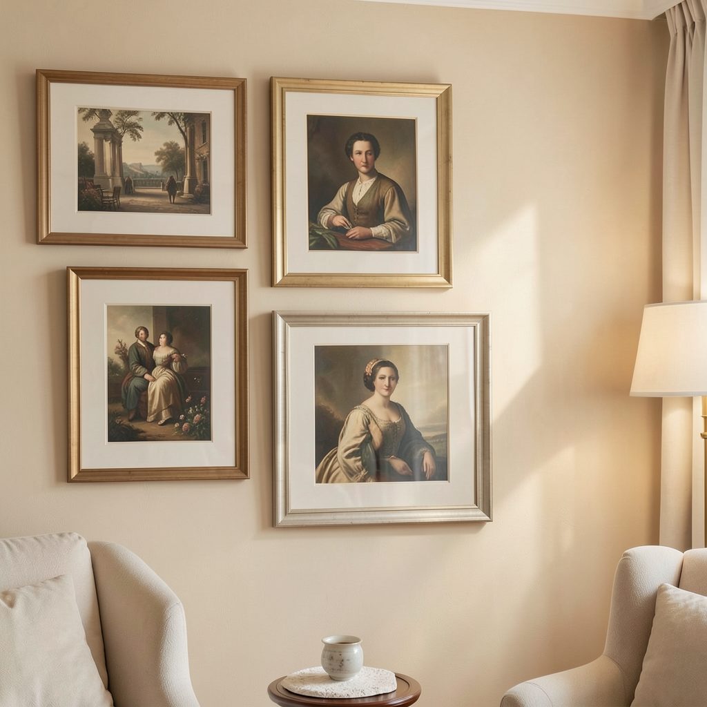
A gallery wall is a strong alternative when one statement piece feels too formal or when you want to display several styles of art. In a compact room, keep the arrangement tightly edited. Three medium pieces often create more impact than seven small frames scattered across the wall.
Try arranging the artwork on the floor first. Begin with the largest print, then place smaller works around it while maintaining consistent gaps of roughly 5 to 8 centimetres. A central axis keeps the display orderly, even when the artwork varies in colour or subject.
For a family-oriented approach, the principles used in a child’s bedroom gallery wall can translate beautifully to a living room: repeat one frame finish, align key edges, and allow personality to come through the art rather than through visual clutter.
Give frames and spacing a clear role
Frame choice changes the apparent size and weight of a piece. A wide oak frame adds warmth and substance, while a slim black frame creates a sharper outline with less visual bulk. In a small living room, narrow profiles often help a generous artwork feel lighter.
Matting can make a modest print appear more substantial. A wide white or warm-neutral mount creates breathing room around the image and introduces a quiet gallery quality. If the room already contains patterned cushions or textured upholstery, a simple mount can prevent the wall from becoming overly busy.
Keep the visual language consistent across a collection. Frames do not need to match exactly, but they should share a relationship through colour, material, or thickness. For displays that include captions or identifying details, these ideas for gallery labels can help create a polished, exhibition-inspired finish.
Balance scale with the rest of the room
Artwork above a sofa should coordinate with nearby furniture rather than being judged in isolation. A large floor lamp, tall bookcase, or strong pendant light may already occupy visual space, so a quieter print or compact triptych could be more effective than an oversized canvas.
Colour is another useful scaling tool. Pale artwork in a light frame tends to recede, allowing a larger size without feeling heavy. Dark, saturated, or highly detailed work carries more visual weight and may need additional wall space around it, even when its physical dimensions are modest.
Look at the display from the main seating position and from the room’s entrance. The arrangement should feel centred in relation to the sofa, not necessarily to the entire wall. If the sofa is offset because of a doorway or radiator, align the artwork with the furniture while maintaining enough clearance from architectural features.
Practical choices for a polished display
A compact room benefits from deliberate restraint. Before hanging anything, make a full-size paper template, check the viewing height, and photograph the mock-up from several angles. This makes it easier to compare a single statement print with a multi-piece arrangement.
Use these recommendations when finalising the display:
- Choose artwork spanning roughly two-thirds to three-quarters of the sofa width.
- Keep the lower edge around 15–25 centimetres above the sofa back.
- Use three coordinated pieces for an easy, balanced gallery wall.
- Select slim frames and generous mounts when the room already feels visually full.
- Repeat one colour or material from the sofa, rug, or lighting to connect the composition.
The most successful arrangement will feel proportional at first glance and rewarding at closer range. Explore more considered gallery display ideas for ways to bring artwork, framing, and everyday living spaces into a cohesive visual rhythm.
Measure the sofa, test the shapes with tape, and choose the artwork that gives the wall both presence and room to breathe. A carefully scaled display can turn even a compact seating area into a distinctive focal point.