The art of using negative space in a gallery wall layout
A successful gallery wall depends on more than the artwork itself. The gaps between frames give each piece room to register, establish visual rhythm, and prevent a collection from feeling crowded. This breathing room is the quiet structure that turns separate prints, paintings, and photographs into one considered composition.
Negative space can be generous and airy or compact and energetic. The right amount depends on the size of the wall, the furniture beneath it, the artwork’s visual weight, and the atmosphere you want to create. A minimalist interior may benefit from wider intervals, while a characterful salon-style display can support tighter spacing.
The goal is balance rather than mathematical perfection. When the eye can move comfortably from one piece to the next, the arrangement feels intentional. When every gap is identical without considering scale or subject matter, the layout can look rigid.
Why empty space matters
The area around an artwork affects how important it feels. A small drawing with a generous border may become a focal point, while several large works placed close together can read as one bold block. Space acts almost like an invisible frame, separating competing colors, textures, and subjects.
A useful gallery wall has visual pauses. These pauses let the eye rest before moving toward another image, creating a rhythm similar to punctuation in a sentence. Without them, a collection may lose its individual character and become a dense patchwork.
Think of spacing as part of the artwork’s presentation rather than leftover wall. A wide gap can emphasize calm and simplicity; a narrow gap can add intimacy and movement. Both can work when they reflect the mood of the room.
Start with the wall and furniture
Before choosing precise intervals, study the wall as a complete architectural area. Notice doors, windows, shelves, light switches, and the ceiling height. A gallery wall should relate to these boundaries without appearing trapped by them.
Furniture provides an important lower edge. Above a sofa, sideboard, or bed, leave enough visual connection for the artwork to feel anchored rather than floating. The overall display generally works best when its width relates to the furniture below, though an intentionally narrow arrangement can create a more vertical, sculptural effect.
Lay the frames on the floor and photograph several versions before making holes. Mark the outer edges with painter’s tape, then assess the arrangement from across the room. This reveals whether the negative space is balanced around the entire grouping, not just between neighboring frames.
Build rhythm through spacing
Begin with the largest or most visually dominant piece. Place it near the center, slightly off-center, or at a natural point of emphasis. Smaller works can then support it, creating a hierarchy that guides the eye across the wall.
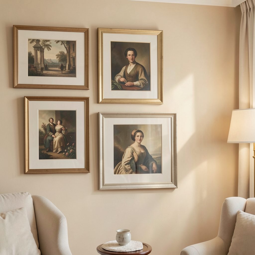
Equal spacing is a dependable starting point, especially for a minimalist gallery wall. Gaps of roughly two to four inches often create cohesion, but the correct distance depends on frame dimensions. A large arrangement may need larger intervals to avoid looking compressed, while petite works can feel disconnected if spread too far apart.
Varying the distance slightly can produce a more collected appearance. Keep the variation controlled: a few tighter relationships can link related works, while wider gaps can mark a transition between different themes or formats. For an evolving collection, a growing gallery wall benefits from leaving deliberate pockets of space rather than filling every area at once.
Compare layout styles
Different arrangements use negative space in different ways. A grid relies on consistent intervals and alignment, while an organic salon layout allows the gaps to shift according to each artwork’s size and character.
Use the following guide to choose a structure that suits your room and collection:
| Layout style | Spacing approach | Visual effect | Best suited to |
|---|---|---|---|
| Symmetrical grid | Consistent gaps on all sides | Calm, ordered, architectural | Matching frames and similar artwork |
| Salon arrangement | Flexible gaps with strong overall balance | Layered, collected, expressive | Mixed sizes, vintage pieces, eclectic rooms |
| Linear row | Even baseline or centerline | Clean, elegant, easy to expand | Hallways, sideboards, narrow walls |
| Clustered grouping | Tighter gaps within smaller units | Intimate and graphic | Sets of prints or related photographs |
| Vertical column | Regular intervals along one axis | Tall, focused, sculptural | Staircases, narrow wall sections, high ceilings |
A grid should be judged by its outer silhouette as well as its internal spacing. Even a carefully aligned layout can feel awkward if one side extends much farther than the other. In an organic arrangement, imagine a loose shape around the collection and check that its visual weight is distributed across that boundary.
Use frames and mats strategically
Frame color, profile, and finish strongly influence perceived space. Heavy dark frames create stronger visual edges, so they may need more room around them. Slim natural wood or pale metal frames recede slightly and can sit closer together without appearing as dense.
Matting adds another layer of negative space inside the frame. A generous white or neutral mat can separate a small image from a larger neighboring piece, giving it presence without requiring a larger frame. Consistent mats can also unify artwork with different colors, media, or proportions.
Avoid allowing every frame to compete for attention. If the wall contains bold art, ornate frames, and saturated mats, increase the gaps to create relief. If the pieces are quiet and restrained, a closer arrangement may provide the energy the composition needs.
Let the arrangement change with the room
A gallery wall is part of a living interior, so its composition can shift as the room changes. Seasonal light, textiles, and furniture placement may alter how much visual density feels comfortable. A display that works in bright summer light might benefit from fewer, stronger pieces during a darker season.
Rotating selected works creates new negative space without requiring a complete redesign. Keep the main anchors in place and exchange smaller pieces around them; guidance on seasonal art rotation can help make this process feel deliberate rather than random.
Leave some flexibility for future additions. Empty areas can become part of the design, signaling that the collection is still developing. When adding a new frame, remove another temporarily and compare both versions from multiple distances before committing.
Refine the wall with a simple edit
Stand several steps away and look at the arrangement through a doorway or from the room’s main seating position. The display should feel balanced at a distance, while the details reward closer attention. If one gap immediately attracts attention, it may be too wide, too narrow, or positioned beside a particularly strong image.
Use these final checks before hanging the frames:
- Keep the visual center aligned with the room’s furniture and main sightline.
- Give heavy, dark, or highly detailed pieces extra breathing room.
- Group related works with slightly tighter spacing to create visual families.
- Check the outer shape of the whole arrangement, not only individual gaps.
- Leave at least one area open if you expect the collection to grow.
A few minutes of editing can transform a wall from crowded to composed. Negative space should support the art, the architecture, and the way people move through the room. Once the spacing feels intentional, the gallery wall becomes easier to live with and easier to evolve.
Take a fresh look at your own display today: remove one piece, shift two frames, or widen a single gap, then observe how the entire room responds. Subscribe to Focus LDN for more practical ideas on artwork display, apartment decorating, and creating gallery-style interiors with lasting character.