Styling a gallery wall with vintage postcards and stamps
A gallery wall made from vintage postcards and stamps brings travel, history, and personality into an apartment without requiring expensive original artwork. Small paper pieces can fill an awkward stairwell, enliven a bedroom wall, or add character to a quiet bathroom when they are arranged with care.
The appeal lies in their variety. A faded seaside postcard, an illustrated railway card, and a small block of botanical stamps can feel connected through color, age, or subject even when they come from different places. The result is collected rather than overly coordinated.
Before reaching for a hammer, decide whether the display should feel like a tidy salon wall, a relaxed scrapbook, or a minimalist arrangement with generous space around each item. That choice will guide the frames, spacing, backing paper, and number of pieces you need.
Start with a clear visual direction
Begin by selecting a loose theme. Travel routes, coastal scenes, architecture, botanical illustrations, and old advertisements all offer strong starting points. A theme does not need to be literal; a shared palette of faded blue, cream, rust, and olive can unify unrelated postcards.
Gather more material than you expect to use, then spread everything across the floor or a large table. Remove pieces that look too bright, damaged, or visually dominant unless they are intended to become a deliberate focal point. Editing is what keeps a vintage collage from appearing cluttered.
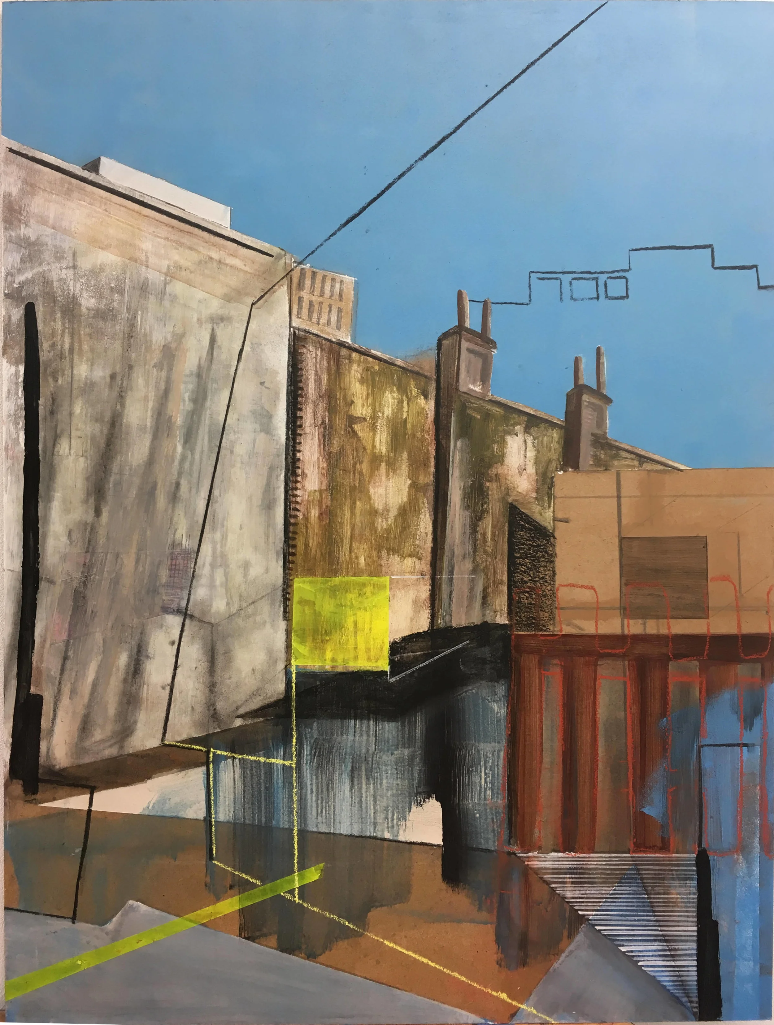
For further inspiration, browse gallery art ideas to see how artwork groupings, scale, and negative space can influence a room. The same principles apply to ephemera, even when every piece is much smaller than a conventional print.
Choose postcards and stamps that belong together
Condition matters, but perfection is not essential. Gentle creases, softened edges, and slight discoloration often give antique paper its charm. Avoid items with active mould, deep damp staining, or brittle surfaces that may deteriorate when handled.
Use stamps as accents rather than trying to make them compete with the postcards. A single stamp can occupy a narrow frame, sit beside a handwritten message, or create a small visual pause between two larger images. Clusters of three or five stamps can work well when their colors or motifs are related.
Look for repeated details: red lettering, blue borders, botanical forms, boats, buildings, or matching cancellation marks. These links create rhythm across the wall. If every item has a different color and subject, introduce consistency through the frame finish or mount board.
Select frames, mounts, and backing colors
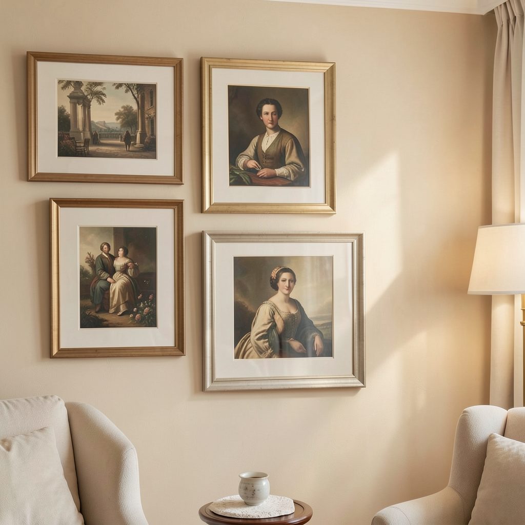
A mixed-frame gallery wall can look sophisticated when the variety is controlled. Combine slim black frames with aged brass, natural wood, or simple white profiles, but repeat each finish at least twice. Too many unrelated frame styles can make small postcards disappear into visual noise.
Mounts are especially useful for fragile or narrow pieces. A wide ivory border gives a tiny stamp presence, while a charcoal or deep green backing can make pale postcard illustrations feel richer. For a softer vintage look, choose warm white rather than stark gallery white.
Use acid-free paper and archival-quality mounts wherever possible. These materials reduce the risk of yellowing and help separate delicate paper from glass or acrylic. A floating mount, which leaves a slim border around the postcard, can highlight irregular edges without trimming them.
Plan the composition before hanging
Measure the wall and mark its usable area with painter’s tape. Arrange the largest postcards first, then place smaller cards and stamps around them. Keeping the center of the composition near eye level generally makes the display feel comfortable, although a low arrangement can work above a console or bedside table.
A structured grid suits architectural postcards and clean interiors. An organic salon arrangement feels better for travel memories, handwritten cards, and varied frame sizes. Leave enough breathing room for each piece to remain legible; crowded displays are particularly difficult to read when the artwork is small.
| Arrangement style | Best for | Spacing guide | Frame approach |
|---|---|---|---|
| Compact grid | Matching postcards and stamps | 5–8 cm | Consistent black or wood |
| Relaxed salon | Mixed travel cards and ephemera | 8–14 cm | Coordinated eclectic frames |
| Vertical column | Narrow hallways and corners | 6–10 cm | Similar proportions |
| Floating cluster | One large card with small accents | 10–16 cm | Wide mounts and simple profiles |
Create paper templates for every frame and attach them to the wall with low-tack tape. Adjust the arrangement from across the room, then check it from nearby. This simple step prevents unnecessary holes and reveals whether one bright postcard is pulling the composition off balance.
Protect the collection from everyday damage
Sunlight is one of the main threats to vintage paper. Display the wall away from strong direct rays, or choose UV-filtering glazing for pieces with valuable color, handwriting, or historical significance. In a bathroom, keep postcards away from steam and use sealed frames with moisture-resistant backs.
Never laminate original postcards or attach stamps with ordinary glue. Photo corners, archival hinges, or removable mounting strips are safer choices. If a card is particularly rare, scan it and frame a high-quality reproduction while storing the original in an acid-free sleeve.
Dust frames with a soft, dry cloth and inspect the paper occasionally. If you notice curling, new spots, or a musty odor, remove the item and address the storage conditions before returning it to the wall.
Make the display feel intentional
The most successful vintage postcard gallery walls balance discovery with restraint. A few blank spaces allow the eye to rest, while repeated colors guide it from one piece to the next. Consider placing a small ceramic object, travel book, or vintage-style lamp nearby to connect the wall with the rest of the room.
Keep the surrounding decor relatively calm if the collection is colorful. Plain bedding, linen curtains, or a simple painted wall can provide an elegant backdrop. In a minimalist apartment, one narrow row of framed postcards may have more impact than a full floor-to-ceiling installation.
For a coherent finish, use these practical principles:
- Limit the main palette to three or four recurring colors.
- Repeat at least one frame finish throughout the arrangement.
- Mix horizontal and vertical postcards to create movement.
- Give stamps generous mounts so their details remain visible.
- Place the most personal or visually striking piece near the center.
When the arrangement is ready, photograph it from several angles and make small adjustments to height, spacing, or balance. Treat the wall as an evolving collection rather than a permanent display; postcards can be rotated seasonally, and new finds can replace pieces that no longer suit the room.
If the process inspires a wider interest in collecting and displaying art, explore how to start an art gallery for broader ideas about curation, presentation, and creating a memorable visual experience. A thoughtfully arranged wall can become a small private exhibition, bringing everyday history into the home one paper fragment at a time.