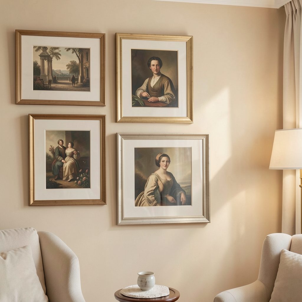
Styling a bedroom with art that echoes the bedspread pattern
A patterned bedspread can give a bedroom its strongest visual cue. Whether the design features loose botanicals, orderly stripes, abstract shapes, or small geometric repeats, it offers a useful starting point for selecting artwork. The goal is not to duplicate the bedding across every surface, but to create a quiet relationship between fabric, wall colour, and image.
Artwork can echo a bedspread through colour, rhythm, texture, or mood. A print may share one muted shade from the coverlet, while a painting might repeat its sense of movement without resembling the pattern literally. This approach makes the room feel considered rather than overly matched.
The most successful bedroom gallery walls usually include variation. Repeated tones create cohesion, while different subjects, frame profiles, and proportions keep the arrangement relaxed. With a little editing, the bed becomes part of a complete visual composition.
Decode the pattern before choosing artwork
Begin by looking at the bedspread as a collection of elements rather than one dominant print. Identify its background colour, strongest accent, secondary shades, and overall scale. A navy quilt with cream leaves calls for different wall art than a blush coverlet scattered with tiny marks, even if both are floral.
Notice the pattern’s character as well. Organic motifs pair naturally with landscape photography, botanical studies, and softly painted abstracts. Linear bedding can work with architectural sketches, graphic posters, or artworks built around bands and grids. The connection should feel intuitive, not exact.
Build a restrained bedroom colour palette
Choose two or three colours from the bedspread to carry into the artwork. One can appear prominently, while the others work as small details across several pieces. If the bedding is colourful, select art with a quieter base so the room retains a restful atmosphere.
For neutral bedding, introduce visual interest through warm whites, charcoal, ochre, clay, or faded green. Matching the exact shade is unnecessary; similar undertones are often more elegant. A cool grey bedspread may sit comfortably beside blue-black ink, while a warm beige coverlet benefits from sepia, terracotta, or cream.
Match visual rhythm and scale
Pattern scale affects how artwork should be sized. A bedspread with a large, open motif can support bold artwork above the headboard, while a small repetitive print may need one larger image or a group of varied pieces to prevent the wall from feeling fussy.
Keep the arrangement connected to the bed’s width. Artwork that is too narrow can look lost, and a collection that extends far beyond the bedside furniture may make the bed seem undersized. Leave enough breathing room around the display so the pattern remains visible as a grounding layer.
| Bedspread character | Artwork direction | Framing approach | Best display |
|---|---|---|---|
| Large botanical forms | Landscapes, expressive florals, broad abstracts | Simple wood or slim painted frames | One substantial piece |
| Fine geometric repeat | Graphic prints, line drawings, architectural studies | Black, white, or metal frames | Two or three aligned works |
| Soft, low-contrast pattern | Tonal photography, textiles, delicate sketches | Light wood or cream frames | Calm symmetrical pair |
| Bright multicolour design | Minimal abstracts or monochrome images | Consistent neutral frames | Edited gallery arrangement |
| Stripes or checks | Organic artwork that softens the lines | Natural wood or textured frames | Asymmetrical grouping |
Select frames that support the bedding
Frames act as a visual bridge between the wall and the bed. For a relaxed bedroom, pale oak, walnut, or painted timber can add warmth without competing with a patterned duvet. A slim black frame gives sharper definition to modern bedding and works especially well with monochrome line art.
Using identical frames creates order, though it is not the only option. A coordinated mix can feel more collected when the artwork includes several related colours. Keep one feature consistent, such as the frame finish, mount colour, or overall level of contrast.
The mount deserves attention too. A generous white or off-white border gives busy artwork room to breathe and prevents it from merging with a lively bedspread. For a softer look, use a warm mount that relates to the bedding’s background rather than stark white.
Arrange the wall around the bed
For a single artwork, centre it over the headboard and position it low enough to feel connected to the bed. A useful starting point is to leave roughly 15 to 25 centimetres between the headboard and the bottom of the frame, adjusting for the height of the artwork and the room’s proportions.
A pair of prints can echo a symmetrical bedroom layout, especially when bedside tables or matching lamps are already in place. For a more informal result, vary the sizes and allow the arrangement to lean slightly to one side, balancing it with a lamp, plant, or tall piece of furniture.
If the collection may expand, use this guide to build a gallery wall gradually. Start with the strongest piece above the bed, then add related works when you find them rather than filling every space at once.
Keep the styling calm and intentional
A patterned coverlet already contributes plenty of detail, so edit the rest of the wall carefully. Avoid choosing artwork that repeats every colour and motif in equal measure. One or two echoes are enough to make the relationship apparent.
Use this checklist before hanging anything:
- Pick one dominant bedding colour and one supporting accent for the artwork.
- Vary image size while keeping the overall arrangement within the bed’s visual width.
- Repeat a frame material or mount colour to create continuity.
- Leave clear wall space around the display so the pattern can breathe.
- View the arrangement from the doorway as well as from the bed.
Lighting also changes how the pairing feels. Warm bedside lamps bring out earthy tones and soften contrast, while daylight reveals whether cool colours feel too stark. Test paper templates on the wall before drilling, particularly when arranging several frames above a headboard.
Finish with texture and a personal note
Artwork that echoes fabric does not need to be flat or purely pictorial. Woven wall hangings, raised paper pieces, small ceramic works, and textured canvases can repeat the tactile quality of a quilt or knitted throw. These materials add depth while keeping the colour story connected.
Add only a few supporting details: a cushion that picks up a minor artwork colour, a ceramic lamp with a similar finish, or a book whose cover complements the scheme. For further ideas on gallery-style interiors and thoughtful home decoration, explore Focus LDN.
Let the bedspread remain the anchor, and allow the artwork to interpret it rather than imitate it. Choose the pieces that make the bedroom feel personal, arrange them with generous spacing, and refine the display until the whole room feels restful, layered, and ready to live in.