Small kitchen wall ideas that don’t compete with cabinet space
A compact kitchen has to perform several jobs at once: storing cookware, preparing meals, hosting guests, and adding warmth to the home. Wall decor can easily become an afterthought, yet the right artwork or styling detail makes the room feel considered without taking away valuable storage.
The best approach is to work with the architecture already in place. Narrow strips, empty corners, the space above a breakfast nook, and even the side of a cabinet can support visual interest when the scale, colour, and mounting method are carefully chosen.
A small kitchen can feel polished without becoming busy. Repeated materials, slim frames, and a restrained palette create the gallery-style atmosphere associated with larger rooms while keeping work surfaces and cabinet doors clear.
Start with the wall space you actually have
Before choosing artwork, map the usable areas around your cabinets. Measure the gap between an upper cabinet and the ceiling, the wall beside a refrigerator, and any exposed section above a counter that does not contain a sink or hob. These overlooked spaces often provide enough room for one strong piece.
Avoid filling every blank patch. A small kitchen benefits from visual breathing room, especially when the cabinetry has open shelving, glass fronts, or a pronounced grain. One framed print on a narrow wall may have more impact than a cluster competing with dishes and appliances.
Pay attention to practical boundaries as well. Artwork placed close to a cooker can collect grease, while pieces above a sink may be affected by splashes and humidity. Choose safer locations first, then select decor that suits the available dimensions.
Use vertical compositions in narrow gaps
A slim vertical print works beautifully beside a tall cabinet or at the end of a run of cupboards. Botanical studies, architectural drawings, and simple line art give height to the room without spreading across cabinet fronts. A frame around 30 to 45 centimetres wide can fill an awkward strip while remaining visually light.
For a more collected look, stack two or three small works vertically. Keep the spacing consistent and use identical frames so the arrangement reads as one composition. This is especially effective on the wall beside a pantry cabinet, where a horizontal gallery wall would make the area feel crowded.
When floor space is limited, look upward. A high-mounted print can draw attention to ceiling height and leave the working zone untouched. Keep the bottom edge high enough to avoid splashes, but low enough that the artwork still feels connected to the room rather than floating near the ceiling.
Choose frames that keep the room calm
Frame colour has a major effect on how much visual weight a kitchen wall carries. Pale oak softens white or cream cabinetry, while black frames create definition against light walls. Metallic finishes can work in modern kitchens, though too much shine may compete with taps, handles, and appliances.
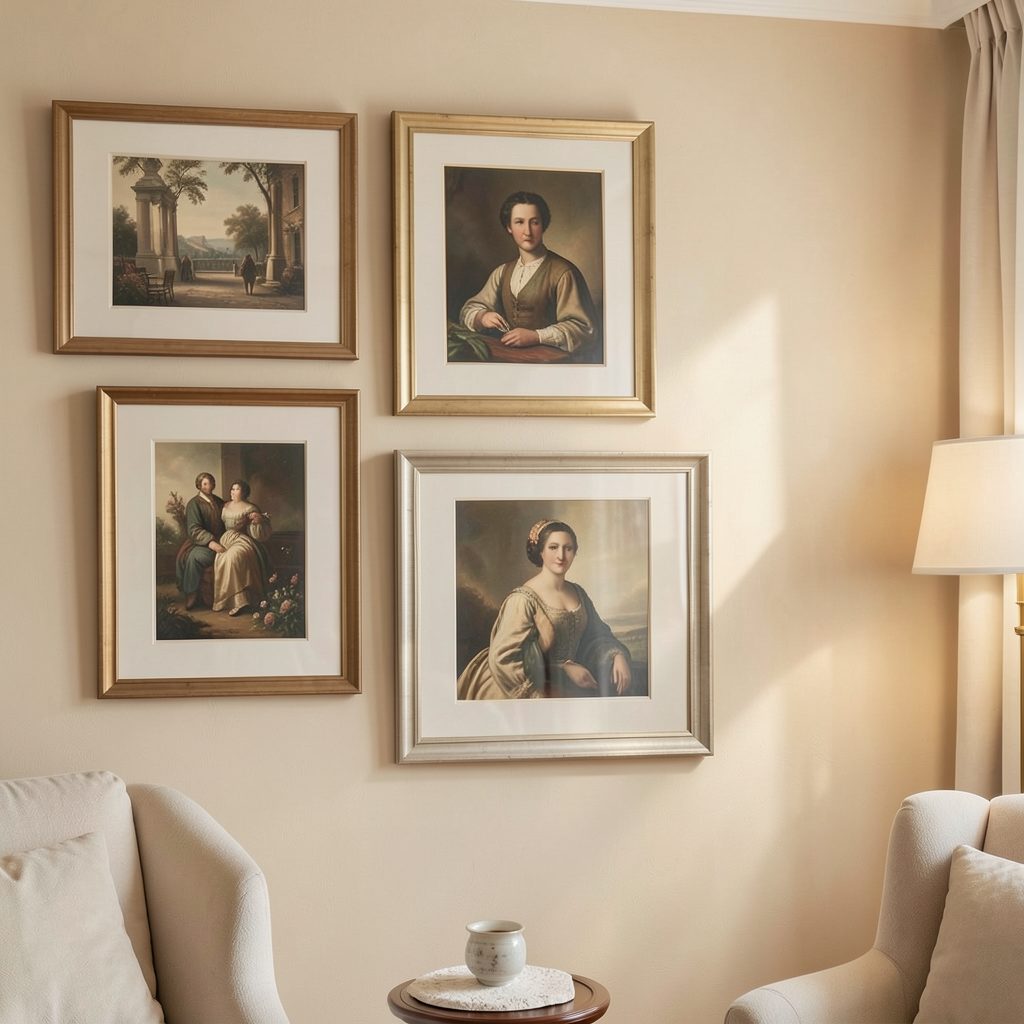
A consistent frame treatment is often more successful than matching every artwork. Two or three prints with different subjects can look unified when they share a slim black border or warm wood frame. For inspiration on building a cohesive arrangement, explore this guide to starting an art gallery before buying individual pieces.
Mounting also matters. A narrow frame with a generous white mount gives a small print a more spacious appearance. If the wall is already visually active, skip ornate moulding and choose flat-profile frames that sit close to the surface.
Make the table or breakfast nook the focal point
If your kitchen includes a dining corner, use the wall above it as a dedicated display area. This creates a natural focal point away from cabinet doors and counters. A single oversized print, a pair of coordinated works, or a compact arrangement of postcards can define the nook without interfering with storage.
Keep the artwork proportionate to the furniture beneath it. The display should generally be narrower than the table or bench, with enough space around it to feel intentional. For a small round table, a centred circular mirror or one square print may be all that is needed.
Artwork with food, botanical, or still-life references can reinforce the purpose of the space. Abstract pieces are equally effective when their colours pick up details from seat cushions, pendant shades, tiles, or ceramics.
| Wall location | Suitable display | Why it works | Practical note |
|---|---|---|---|
| Beside a tall cabinet | One vertical print | Uses a narrow strip efficiently | Choose a wipeable frame |
| Above a breakfast nook | Pair of small works | Creates a clear dining focal point | Centre the arrangement on the table |
| Above open shelving | Small framed piece | Adds softness without filling shelves | Leave room for shelf contents |
| Cabinet end panel | Slim rail or mini print | Decorates an overlooked surface | Avoid protruding frames |
| High wall near the ceiling | Vertical artwork | Emphasises height | Keep it away from steam and heat |
Consider rails, ledges, and removable displays
A picture ledge can provide flexibility in a kitchen where the decor may change with the seasons. Install one on an empty wall rather than above a busy counter, then layer a few slim frames, a small mirror, and one tactile object. Keeping the ledge shallow prevents it from becoming another storage shelf.
Picture rails are useful when drilling into tile or moving between rental homes is a concern. They also make it easy to adjust artwork height as furniture changes. Use lightweight frames and secure them with discreet museum putty if the kitchen is a high-traffic area.
For renters, removable adhesive hooks can support small prints, fabric banners, or lightweight decorative plates. Test the product on an inconspicuous surface first, and avoid hanging valuable or heavy pieces with temporary hardware.
Add texture without adding clutter
Wall decor does not have to mean a conventional framed print. A small woven panel, a slim peg rail, a vintage menu, or a carefully chosen ceramic plate can introduce texture while preserving a clean layout. These options are particularly useful in minimalist kitchens where a standard gallery wall might feel too formal.
Decorative plates work best when displayed selectively. One large plate can act as a focal point, while three small plates in a loose vertical line can fill a narrow wall. Keep the colours related to the cabinetry or worktop so the arrangement feels integrated rather than themed.
Mirrors can brighten a compact kitchen, especially when positioned opposite a window or light-coloured wall. Choose a modest size and a simple frame; an oversized mirror near reflective appliances may create too much glare. For further ideas on making art feel at home in everyday spaces, browse this approach to displaying art at home.
Keep the styling practical and edited
The most successful kitchen wall arrangements leave the room easy to use. Limit displays near food preparation areas, keep frames clear of cupboard hinges, and check that artwork does not obstruct lighting or ventilation. A beautiful arrangement should support the rhythm of the room rather than create another obstacle.
Use these simple guidelines when editing your display:
- Select one focal wall instead of decorating every available surface.
- Repeat one frame finish or accent colour for visual unity.
- Leave clear space around cabinet doors, shelves, and switches.
- Choose wipeable or easily removable materials near cooking zones.
- Reassess the arrangement after adding appliances and everyday objects.
A compact kitchen does not need large-scale decoration to feel personal. A carefully placed vertical print, a restrained ledge, or a small collection above the dining nook can add character while preserving the clean lines that make the room function well.
Choose one underused wall area, measure it carefully, and begin with a single piece that connects to the colours already present. From there, build slowly and let each addition earn its place.