How to Use Art to Bring Warmth to a Room with Gray Walls
Gray walls offer a calm, versatile backdrop, but the wrong combination of furniture, lighting, and artwork can make a room feel cool or impersonal. Art is one of the most effective ways to introduce warmth without repainting, replacing every piece of furniture, or abandoning a minimalist interior.
The key is to treat the wall color as a starting point rather than a limitation. Warm-toned artwork, tactile frames, soft lighting, and carefully chosen accents can give a gray room depth and personality while preserving its refined character.
Start with the Gray Wall’s Undertone
Before selecting artwork, identify whether the gray leans warm, cool, blue, green, or beige. Hold a sheet of white paper against the wall at different times of day. A blue-gray backdrop usually benefits from ochre, rust, terracotta, camel, and warm wood, while a greige wall can support a broader range of earthy neutrals.
Natural light will affect your choices. North-facing rooms tend to make gray appear cooler, so artwork with sunlit yellows, reddish browns, clay shades, and creamy whites can balance the atmosphere. In a room with strong afternoon light, muted olive, dusty rose, and charcoal may create a more comfortable visual rhythm.
Choose Art with a Warm Palette
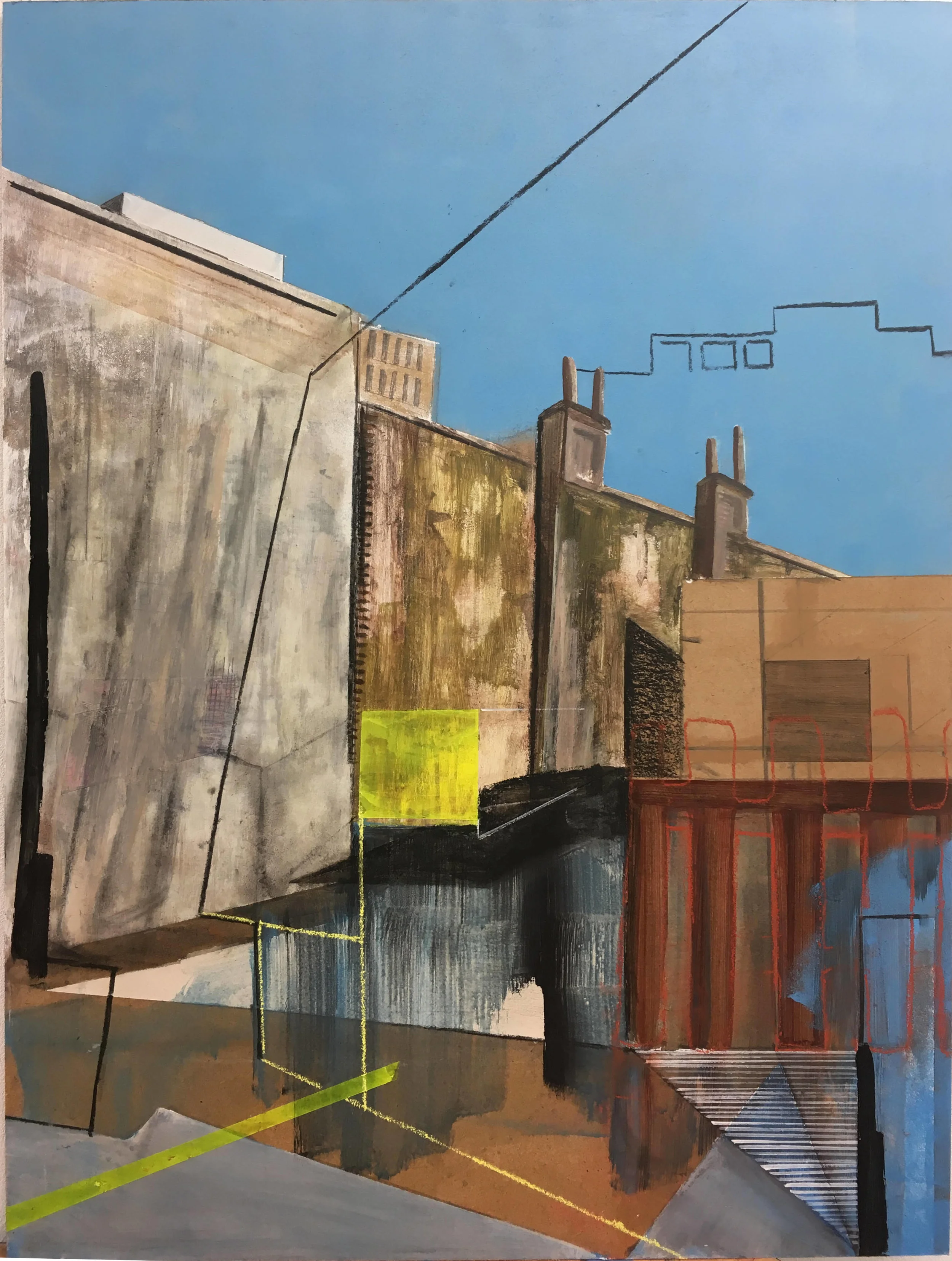
Warmth does not require bright or heavily saturated color. A quiet abstract painting with a small amount of ochre may have more impact than a large, vivid canvas. Look for artwork featuring sienna, amber, rust, blush, tobacco, olive, or warm ivory, then repeat one or two of those colors elsewhere in the room.
Photography can work beautifully against gray walls too. Landscapes with golden grass, architectural images in sepia tones, and portraits with warm skin tones soften a cooler scheme. For a more collected look, combine different mediums such as a textile piece, a small oil painting, and a graphic print rather than relying on a matching set.
Scale matters as much as color. One oversized artwork can create a confident focal point above a sofa or bed, while a compact salon arrangement adds intimacy to a narrow wall. Leave enough breathing room around each piece so the display feels intentional rather than crowded.
Use Frames as Decorative Warmth
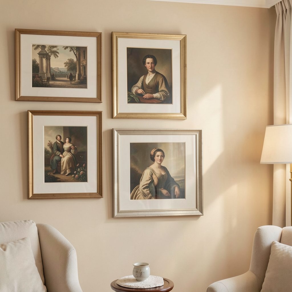
Frames are functional, but they also contribute color, texture, and visual temperature. Walnut, oak, honey-toned wood, and aged brass introduce warmth naturally. If the room already includes dark furniture, a medium wood frame can prevent the art from blending into the background without making the arrangement feel heavy.
For a streamlined gallery wall, use a limited frame palette. Two wood tones may be enough, especially when the artwork itself includes several colors. Thin black frames can still work in a gray room, but soften their graphic effect with a linen mount, warm paper, or an adjacent frame in wood.
The frame should relate to the room’s existing details. Echo the tone of a wooden side table, leather chair, brass lamp, or woven basket. These small connections help the artwork feel integrated into the interior rather than added as an afterthought.
Build a Balanced Gallery Wall
A gallery wall brings warmth through variation: different subjects, sizes, materials, and personal associations create a room that feels lived in. Begin with the largest piece, place it slightly off-center, and arrange smaller works around it. Keep the gaps consistent, usually between five and ten centimeters, for a composed appearance.
Mixing art with objects can make the display more tactile. Consider a shallow ceramic plate, a woven wall hanging, a small mirror, or a sculptural wooden object. These additions break up a flat sequence of framed prints and bring handmade character to a gray room.
| Art element | Warmth it adds | Best pairing |
|---|---|---|
| Walnut or oak frame | Natural depth and softness | Blue-gray or concrete-gray walls |
| Terracotta abstract | Earthy color and energy | Cream upholstery and woven textiles |
| Sepia photography | Vintage character | Brass lighting and dark wood |
| Textile artwork | Texture and quiet comfort | Minimal furniture and plaster-gray walls |
| Botanical print | Organic freshness | Olive, tan, and warm white accents |
When arranging a gallery wall, consider the furniture beneath it. A display should generally occupy around two-thirds of the width of a sofa, console, or headboard. Center the arrangement on the furniture rather than the entire wall, and keep the lower edge close enough to create a visual relationship without making the pieces feel cramped.
Layer Art with Soft Materials
Artwork feels warmer when it is supported by surrounding texture. Add a wool throw, linen curtains, boucle upholstery, a patterned rug, or cushions in tobacco, caramel, cream, and muted rose. These materials absorb light and prevent gray walls from dominating the room’s atmosphere.
You can also create contrast by placing smooth framed artwork near tactile surfaces. A glossy ceramic lamp beside a rough linen canvas, or a polished brass sconce near a handmade print, gives the space a layered quality. The aim is not to fill every surface, but to combine enough textures that the room feels comfortable at a glance.
Lighting deserves equal attention. Warm LED bulbs around 2700K to 3000K are usually flattering for art and furnishings. Use a picture light, directional wall light, or adjustable lamp to illuminate the display in the evening. Gentle pools of light make warm colors appear richer and give the room a more intimate character.
Refresh the Display Through the Year
Art can change the mood of a room without a major redecoration. In spring, introduce botanical studies, pale ochre, soft green, and airy line drawings. During autumn and winter, swap in deeper reds, smoky landscapes, textured works, or richer wood frames. A thoughtful seasonal art rotation keeps the space responsive to changing light and routines.
Store unused pieces flat or upright in a dry, protected place, with glassine or acid-free paper between artworks where appropriate. Photograph each arrangement before taking it down, particularly if you have found a gallery wall composition that works well. This makes future changes easier and prevents the display from becoming a source of unnecessary effort.
You can also rotate smaller works between rooms. A print that feels too quiet in a large living room may be ideal above a bedside table, while a colorful piece from the bedroom might bring life to a gray hallway.
Make the Room Feel Personal
The warmest art choices often have a story attached to them. A sketch bought during a trip, a family photograph, an independent artist’s print, or a small work discovered at a local exhibition can give gray walls emotional depth. Browse a considered gallery art collection for pieces that complement your palette while still offering a distinctive point of view.
Keep the overall display edited. A room does not need every favorite piece on show at once, and open wall space can make the art feel more valuable. Use repetition thoughtfully: a rust-colored line in a print can echo a cushion, while a rounded shape in a painting can relate to a curved chair or lamp.
Practical Choices for a Warmer Display
- Match warm artwork to the wall’s undertone instead of choosing colors in isolation.
- Combine wood, brass, linen, and ceramic details for varied texture.
- Use one dominant artwork or a clear gallery-wall anchor to establish focus.
- Illuminate framed pieces with warm, adjustable light after sunset.
- Rotate smaller works seasonally so the room continues to feel fresh.
Gray walls provide a sophisticated foundation for layered decorating. With the right art, frames, lighting, and tactile accents, they can feel serene without becoming stark and elegant without losing comfort. Choose pieces with color, texture, and meaning, then arrange them so the room reflects the way it is actually lived in.
Begin with one artwork that makes the space feel warmer, build the surrounding palette from its strongest tones, and let the rest of the room follow its lead.