How art can add height to a low-ceiling room
A low ceiling can make a room feel compressed, especially when furniture, lighting and artwork all sit at the same horizontal level. The right art arrangement changes that perception by directing the eye upward and creating a stronger sense of vertical movement.
Artwork does not need to be oversized to make a ceiling appear taller. Placement, proportion, negative space and frame choice work together to stretch the visual boundaries of a bedroom, living room, hallway or bathroom.
The most effective approach is to treat the wall as part of the room’s architecture. Instead of filling its widest area, create a composition that rises gradually, leaves breathing room around key pieces and gives the gaze somewhere to travel.
Start with a vertical visual line
Portrait-oriented artwork is one of the simplest ways to add height. A tall print, narrow canvas or elongated photograph naturally pulls attention from eye level towards the ceiling. Place it where the wall is most visible, such as above a slim console, beside a doorway or at the end of a hallway.
A single vertical piece often works best when it has generous space around it. Crowding it with shelves or bulky accessories can weaken its effect. For a stronger architectural impression, align the artwork with a vertical feature already present in the room, such as a window edge, chimney breast or door casing.
Choose proportions that lift the eye
A group of smaller works can create the same effect as one large portrait piece when arranged in a tall format. Stack two or three prints, keeping the gaps consistent and the overall shape narrower than it is wide. This arrangement works particularly well above a compact chest of drawers or a low bedside table.
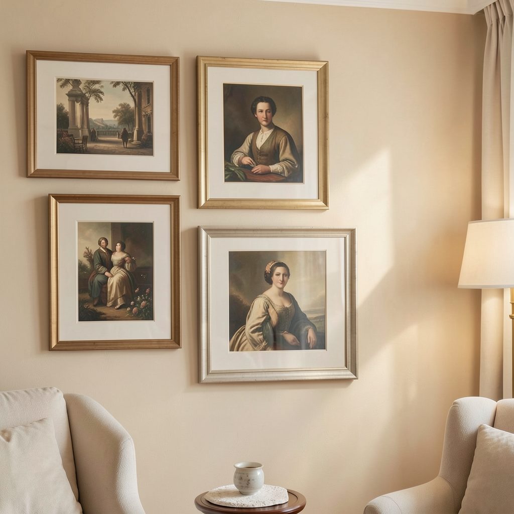
For a gallery wall, begin with the central artwork around eye level and extend the arrangement upwards rather than outwards. The lower edge should relate to nearby furniture, while the top edge can finish several inches below the ceiling. That final strip of wall prevents the display from feeling cramped and gives the room a little visual air.
Build a gallery wall with upward movement
A successful gallery wall in a low room needs a clear silhouette. Combine portrait prints, small square pieces and one slightly larger work, arranging them so the outside edges form a tall, gently irregular shape. Avoid creating a perfect rectangle that spreads equally across the wall, as this reinforces width rather than height.
You can also use a stepped arrangement, with the lowest piece nearest the furniture and each additional work rising towards one side. This is useful on stair landings or beside a sloping roofline. If you want a changing display without adding more frames, explore digital art displays that can rotate through portrait-format images on a discreet screen.
Match frames and wall color carefully
Slim frames usually support a sense of height better than deep, heavy mouldings. Black, dark-stained wood or brushed metal can create a crisp vertical outline, while pale oak and natural timber soften the arrangement. Keep the frame family consistent when the composition is busy; varied frames are easier to manage when the artwork itself is restrained.
Wall color also affects the perceived scale of a display. A tonal arrangement, where the frames and art sit close to the wall’s color, feels integrated and spacious. Strong contrast makes artwork more prominent, which can be useful for a single statement piece, but too many bold borders may visually lower the ceiling by adding weight.
The choices below can help determine which approach suits the room’s proportions.
| Art approach | Best placement | Height-enhancing effect | Detail to watch |
|---|---|---|---|
| Tall portrait print | Beside a door or above a narrow console | Creates a direct upward line | Leave clear space around it |
| Stacked small works | Above a low cabinet or bedside table | Builds vertical rhythm | Keep gaps even |
| Narrow gallery wall | On a broad blank wall | Adds movement without excessive width | Finish below the ceiling |
| Full-height picture ledge | In a bedroom or hallway | Encourages layered height | Use lightweight frames |
| Digital artwork | On a slim wall-mounted screen | Changes the focal point without bulky objects | Select portrait-oriented images |
Use lighting to reinforce the artwork
Lighting can make an arrangement feel taller after dark. A picture light positioned above a vertical piece emphasizes its upper edge and creates a soft column of illumination. Adjustable wall washers can do something similar across a group of prints, especially when the beam reaches from the lower artwork towards the ceiling.
Avoid placing a pendant light directly over the main artwork if its shade hangs low and becomes the dominant horizontal feature. A compact pendant can still work in the centre of the room, but pair it with wall-mounted lighting or concealed LED strips so the eye continues to move upwards.
Mirrors can support this strategy when they are tall and narrow. Position one beside the art rather than replacing it, allowing reflected light to expand the room while the artwork provides personality and focus.
Keep visual weight away from the ceiling
The top of a low room should feel light. Avoid heavy picture ledges, deep shelves and dense clusters that sit directly beneath the ceiling line. These features create a dark band around the room, making the upper boundary more obvious and visually lower.
Use the lower half of the wall for furniture and storage, then let artwork bridge the gap between those pieces and the ceiling. A narrow shelf can be useful if it carries only a few small works, while a slim ledge made from a pale material will recede more than a thick, dark unit.
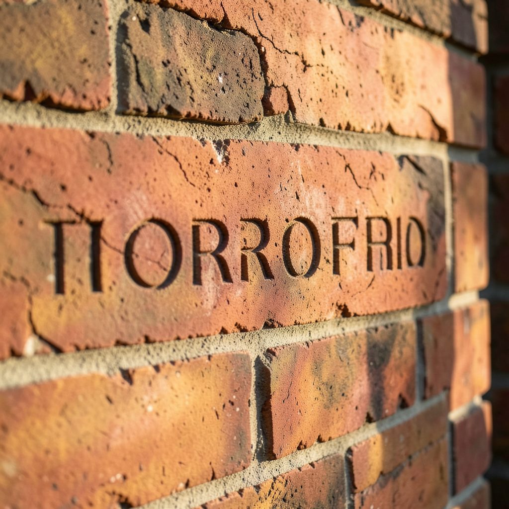
Unusual architectural details can become part of the composition rather than distractions. For example, a carefully placed brick engraving can bring texture to a vertical wall section, particularly in an industrial-style interior. Keep surrounding artwork simple so the detail feels intentional rather than competing with the entire display.
Plan the placement before making holes
Use paper templates cut to the size of each frame and attach them to the wall with low-tack tape. Stand back from several points in the room and check whether the arrangement rises naturally. This method also makes it easy to test a narrower composition before committing to a wide gallery wall.
Measure from furniture first, then assess the ceiling clearance. The lowest artwork should feel connected to the object beneath it, while the highest piece should have enough room to breathe. In a room with very little wall height, fewer artworks with stronger vertical proportions will usually look calmer than a crowded collection.
A practical styling checklist
- Choose at least one portrait-oriented artwork as the visual anchor.
- Stack or stagger smaller pieces to create an upward path.
- Keep the top of the arrangement comfortably below the ceiling.
- Use slim frames and restrained accessories around the display.
- Add picture lighting or a tall mirror to extend the vertical effect.
Art can reshape how a room’s proportions are read without construction work or major furniture changes. Select a clear focal point, build upwards with intention and keep the upper wall visually quiet. Browse Focus LDN for more gallery wall ideas and display inspiration, then give your low-ceiling room a taller, more considered character.