How to use art to add warmth to a white kitchen backsplash wall
Using art to add warmth to a white kitchen backsplash wall can transform a cool, practical space into somewhere more welcoming. The right piece adds colour, texture and personality without turning the cooking zone into a showroom. A considered display can become the room’s focal point while leaving the benches useful and uncluttered.
Artwork works best when it relates to the kitchen rather than appearing to have been added afterwards. Timber tones, natural fibres and earthy colours can soften glossy tiles, while a graphic print or strong photograph can give a minimalist interior a sharper sense of character. The goal is warmth through balance, not simply filling every available section of wall.
Many Australian homes are organised around open-plan living, with white cabinetry appearing beside timber benches, rendered walls or brick-veneer features. Standard 600 mm cabinet modules make the proportions familiar, while strong daylight can make a pale kitchen feel particularly crisp. If yours seems a bit stark, a warm artwork can provide the missing element without another major renovation.
Before choosing a piece, measure the wall, note the position of sockets and lighting, and see how the space changes throughout the day. Check the colour of the cabinetry, handles and benchtop as well as the tiles. A frame and artwork that reflect even one of those details will usually look more connected to the room.
Begin with a warm palette
Warmth does not have to mean orange. Ochre, terracotta, rust, olive, dusty pink and soft charcoal can all make white tiles feel richer, while a touch of deep blue or green can create an inviting contrast. These colours can come from abstract paintings, botanical prints, photographs of the Australian landscape or textured works in natural fibres.
Because white reflects colour around it, even restrained shades may appear more saturated above a splashback. Choose a focused palette of two or three dominant colours, then repeat one of them elsewhere in the room through a stool, bowl or tea towel. This creates continuity without making the artwork compete with everyday objects.
Australian sunlight can be particularly strong, so consider how pigments and paper will hold up near a window. UV-filtering glazing or acrylic helps protect vulnerable works, while a matte finish reduces glare. A dark frame creates definition against the tiles; a timber frame blends into a warmer, organic kitchen.
Scale the artwork to the wall
Measure the full backsplash rather than estimating from the benchtop alone. A small picture can disappear against a broad run of white tiles, while an oversized work may overpower a narrow preparation area. The artwork should feel proportionate to the cabinetry and remain distinct from the horizontal lines of the bench and splashback.
For a blank wall, position the centre of a single piece in relation to the main working zone rather than automatically centring it on the room. A composition placed between upper cabinets can create a calm, symmetrical effect. Keep it clear of the rangehood, direct splash zone and frequently used tap, and check that task lighting will not create an uncomfortable reflection.
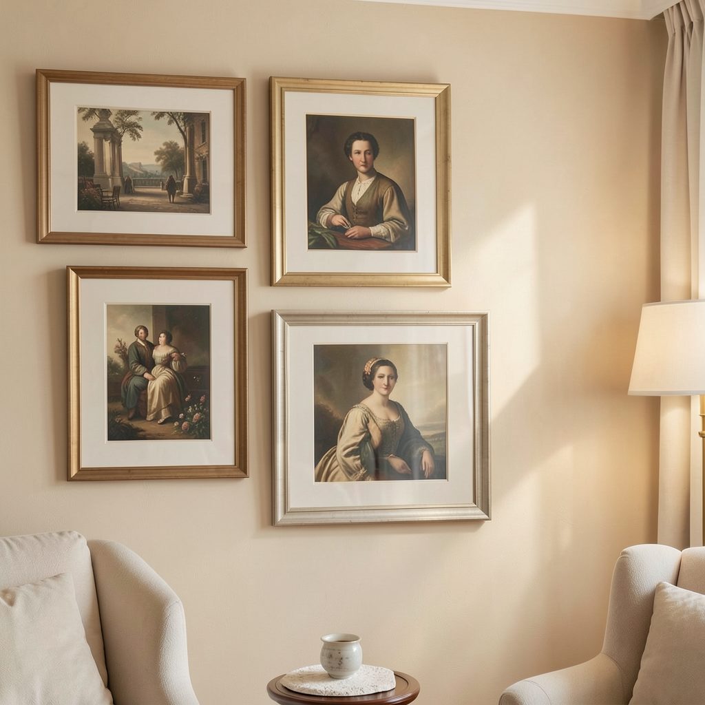
Several smaller works can work well too, provided they share a frame finish or visual rhythm. Try two balanced pieces, a symmetrical pair of vertical prints or a compact grouping of three to five works. Before committing to a format, browse gallery art ideas and compare how different scales and framing styles read in a bright kitchen.
Choose finishes that suit a working room
A framed artwork above a bench needs more consideration than one in a quiet hallway. Kitchen grease, dust and humidity can affect frames and glazing, so a sealed print or protected canvas is often more practical than an exposed mixed-media work. Acrylic glazing is lighter and less prone to breaking, making it a sensible option in an active cooking space.
Climate also matters. Brisbane’s humidity can affect vulnerable paper and some framing adhesives, while coastal homes may encounter salt-laden air through open windows. Strong UV exposure is a concern across much of Australia. Keep valuable work away from persistent dampness, use suitable fixings for brick veneer or plasterboard, and ask a qualified installer about anchors and load limits when needed.
Frames should be easy to maintain as well as attractive. A slim black or dark bronze frame defines the artwork sharply against white tile, while natural timber introduces another layer of warmth. Warm white or off-white moulding can disappear into the cabinetry when that suits a more understated kitchen, but the mat border should still give the image enough definition.
Connect the display to local materials
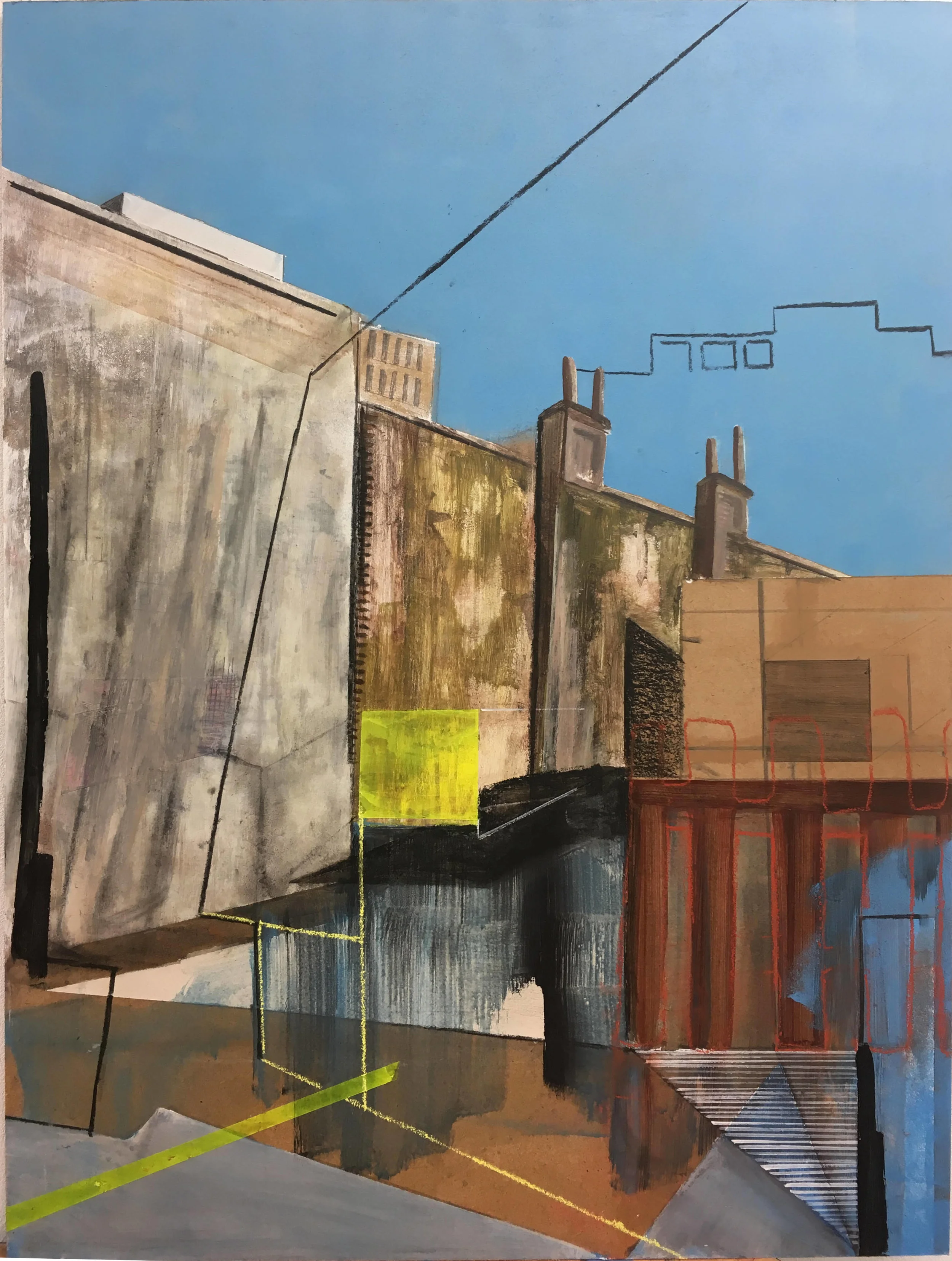
White cabinets and splashbacks pair easily with the timber, stone and metal used in many contemporary Australian kitchens. A print featuring eucalyptus, sandstone, desert hues or coastal vegetation can extend that connection, while an urban photograph may suit a renovated inner-city apartment. The most personal choice often reflects the landscape and architecture surrounding the home.
Sydney’s Chippendale and Melbourne’s Footscray are known for artist studios, independent galleries and direct-from-maker culture, while Adelaide’s SALA season brings additional work into public spaces. Australian buyers can compare original paintings, limited-edition prints and open editions sold through galleries, studios and online marketplaces, with prices usually quoted in Australian dollars.
Local art can also make a practical kitchen feel collected rather than styled. Look for a frame colour repeated in a timber bench or a shape echoed by a pendant light. Further home styling ideas can help you build a display that feels harmonious with the whole open-plan area, not simply confined to the cooking wall.
Light and refine the arrangement
Natural light will change the way artwork looks throughout the day. Check it in the morning, at midday and under evening lights before hanging anything. Warm-white LED lamps around 2700–3000K can complement earthy artwork, but the shade or glazing should be angled so the light falls across the image rather than straight into the viewer’s eyes.
Once the main piece is in place, step back and edit the surrounding elements. Leave some open bench space, group a few functional objects together and remove accessories that interrupt the artwork’s outline. A single vase, a wooden board or a neatly folded cloth can support the composition without competing with it.
The finished arrangement should feel generous around the art and purposeful everywhere else. Keep the palette limited, align frames cleanly and allow the white backsplash to remain part of the design. That negative space is what gives the artwork room to create warmth and makes the kitchen feel calm rather than crowded.
Choose one strong piece that suits the wall’s proportions and the room’s colour scheme, then build the rest of the styling around it. Subscribe to Focus LDN for practical guidance on artwork, frames and stylish home living.