How to Mix Metallic and Matte Frames in One Display
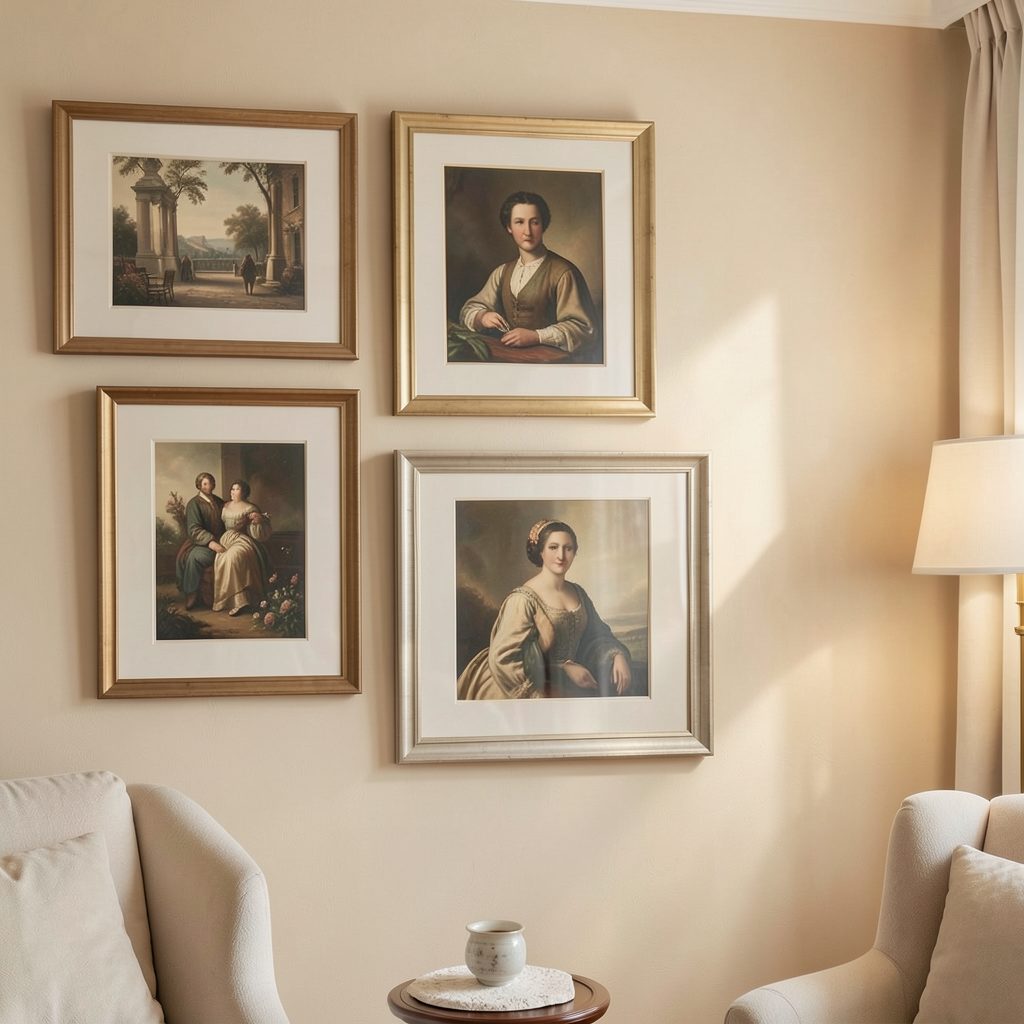
A gallery wall feels most considered when its frames share a visual conversation rather than matching perfectly. Combining metallic and matte finishes can add depth, warmth, and a subtle sense of movement to an arrangement of prints, photographs, mirrors, and collected objects.
The key is balance. Metallic frames catch and reflect light, while matte finishes absorb it and provide visual calm. Used together, they can make a display feel layered without becoming overly polished or disconnected from the rest of the room.
This approach works in minimalist interiors, bedrooms, hallways, and living spaces alike. With a restrained palette, consistent spacing, and a clear focal point, mixed frame finishes can look curated rather than accidental.
Start with a controlled frame palette
Choose two or three finishes before you begin arranging anything. Antique brass with soft black, brushed silver with charcoal, or aged bronze with warm wood are combinations that tend to feel cohesive. Too many unrelated finishes can make the wall look busy, especially when the artwork itself contains strong colors.
A useful ratio is to let matte frames form the foundation and metallic pieces act as accents. For example, six matte black or walnut frames could be balanced by two slim brass frames. The metallic pieces then draw the eye without dominating the display.
The finish does not need to be identical across every frame. Brushed brass and aged gold can sit comfortably together when their undertones are similar, while highly reflective chrome may feel too sharp beside heavily distressed bronze.
Match the finish to the room
Consider the existing materials in the space before selecting frames. A brushed brass frame can echo a lamp, cabinet handle, or curtain rod, making the gallery wall feel connected to the room. Matte black works well with steel furniture, dark lighting fixtures, and architectural details.
In softer interiors, champagne metal or muted bronze may be more flattering than bright silver. Warm metallics pair naturally with cream walls, oak furniture, linen upholstery, and terracotta accents. Cool metals suit white, gray, blue, and pared-back contemporary schemes.
The wall color matters too. Metallic surfaces stand out against deep green, navy, charcoal, or warm beige, while matte black and dark wood create definition on pale walls. Test small frame samples near the artwork and observe them in morning and evening light.
Build hierarchy with size and placement
Frame finish is only one part of the composition. Size, orientation, and position determine how the eye travels across the arrangement. Place larger matte frames toward the center or lower portion of the display, then use smaller metallic frames to create highlights around them.
A metallic frame works particularly well around a meaningful image or visually quiet artwork. Its reflective edge can give a small piece greater presence. Avoid placing every shiny frame together, since a concentrated cluster may create a distracting bright patch.
Keep the outer shape of the gallery wall in mind. A tall silver frame can balance a broad matte print on the opposite side, while a narrow brass frame may fill a small gap between two larger works. The arrangement should feel stable from a distance before you refine the individual details.
Combine artwork with reflective pieces
Mirrors can act as artwork when the frame has a distinct profile or finish. A small round mirror in an aged metal frame can break up a collection of rectangular prints, while a slim rectangular mirror can reinforce a clean, minimalist layout. For ideas on using reflective surfaces without overwhelming the composition, explore mirror placement ideas.
When introducing mirrors, reduce the number of other highly reflective elements nearby. A mirror already adds movement through reflected light and surrounding objects, so a matte print or textured paper beside it can restore balance.
You can also mix visual textures through the artwork itself. Pair glossy photographic prints with uncoated paper, fabric art, pencil sketches, or deckled edges. The contrast between surface finishes supports the contrast between metallic and matte frames.
Use spacing to keep the wall calm
Consistent spacing is essential when the frames vary in finish. Gaps of roughly five to eight centimeters often work well for medium-sized arrangements, although larger pieces may need more breathing room. Measure the distance between the outer edges rather than relying on the frame profiles alone.
Before making holes, lay the frames on the floor and photograph the arrangement from a standing position. This makes it easier to see whether metallic frames are evenly distributed and whether one corner feels heavier than the rest. Paper templates taped to the wall can help you adjust the composition without damaging the surface.
A gallery wall should have rhythm, but it should not look mechanically repetitive. Similar spacing creates order, while varied frame sizes and orientations keep the display relaxed. If the result feels chaotic, review common gallery wall mistakes before adding more pieces.
Compare finishes before committing
The right combination depends on the room’s light, furnishings, and the mood you want to create. Use this guide as a starting point rather than a strict formula.
| Frame combination | Visual effect | Works well with | Watch for |
|---|---|---|---|
| Matte black and brushed brass | Graphic, warm, sophisticated | Cream walls, wood, modern lighting | Too much bright brass |
| Charcoal and aged bronze | Moody, collected, relaxed | Earth tones, vintage art, leather | Heavy appearance in dark rooms |
| Soft white and champagne metal | Light, refined, airy | Bedrooms, pale textiles, minimal artwork | Low contrast on white walls |
| Walnut and antique gold | Traditional with warmth | Landscapes, portraits, classic interiors | Competing wood tones |
| Matte gray and brushed silver | Cool, contemporary, clean | Blue, white, concrete, monochrome art | Feeling overly industrial |
Refine the arrangement with restraint
Once the main display is installed, step back and assess it from the doorway. Metallic frames should appear as intentional points of light, not as the first thing visible in every direction. If the wall feels too shiny, replace one reflective frame with a matte alternative or move the metallic piece closer to the center of the composition.
The artwork should remain the primary focus. Choose frames that support the colors, subject matter, and scale of each piece rather than treating the finishes as decoration in isolation. A restrained frame can give a dramatic print room to breathe, while a more detailed metallic profile can elevate a simple line drawing.
Use these practical principles when editing the final display:
- Keep the metallic finishes within a related warm or cool family.
- Let matte frames make up the visual majority.
- Repeat a metal elsewhere in the room for cohesion.
- Balance reflective surfaces with textured or uncoated artwork.
- Leave enough space around the arrangement to preserve a calm outline.
A successful display feels collected over time, even when it was planned in an afternoon. Select the artwork you genuinely want to live with, experiment with the frame layout on the floor, and make the wall part of the room’s wider material palette. With a thoughtful mix of shine, texture, color, and space, your gallery arrangement can feel polished while still retaining personality.