How to Mix Landscape and Portrait Orientation in One Gallery Wall
A gallery wall feels more intentional when different artwork formats work together rather than compete for attention. Combining landscape and portrait orientation creates movement, gives the eye a natural path across the arrangement, and prevents a collection from looking too rigid.
The key is to build visual relationships between pieces. Orientation matters, but so do scale, frame style, spacing, colour, and the empty wall around the display. A thoughtful layout can make mismatched prints feel like a curated collection.
Before choosing the final arrangement, gather every frame and artwork in one place. Include photographs, illustrations, paintings, typography, and small objects if they belong to the room’s style. This makes it easier to see which pieces can balance each other.
Begin With a Strong Visual Anchor
Start with the largest or most compelling piece. This may be a wide landscape painting, a tall portrait print, or an artwork with a distinctive colour palette. Place it slightly off-centre rather than directly in the middle if you want a relaxed, gallery-inspired composition.
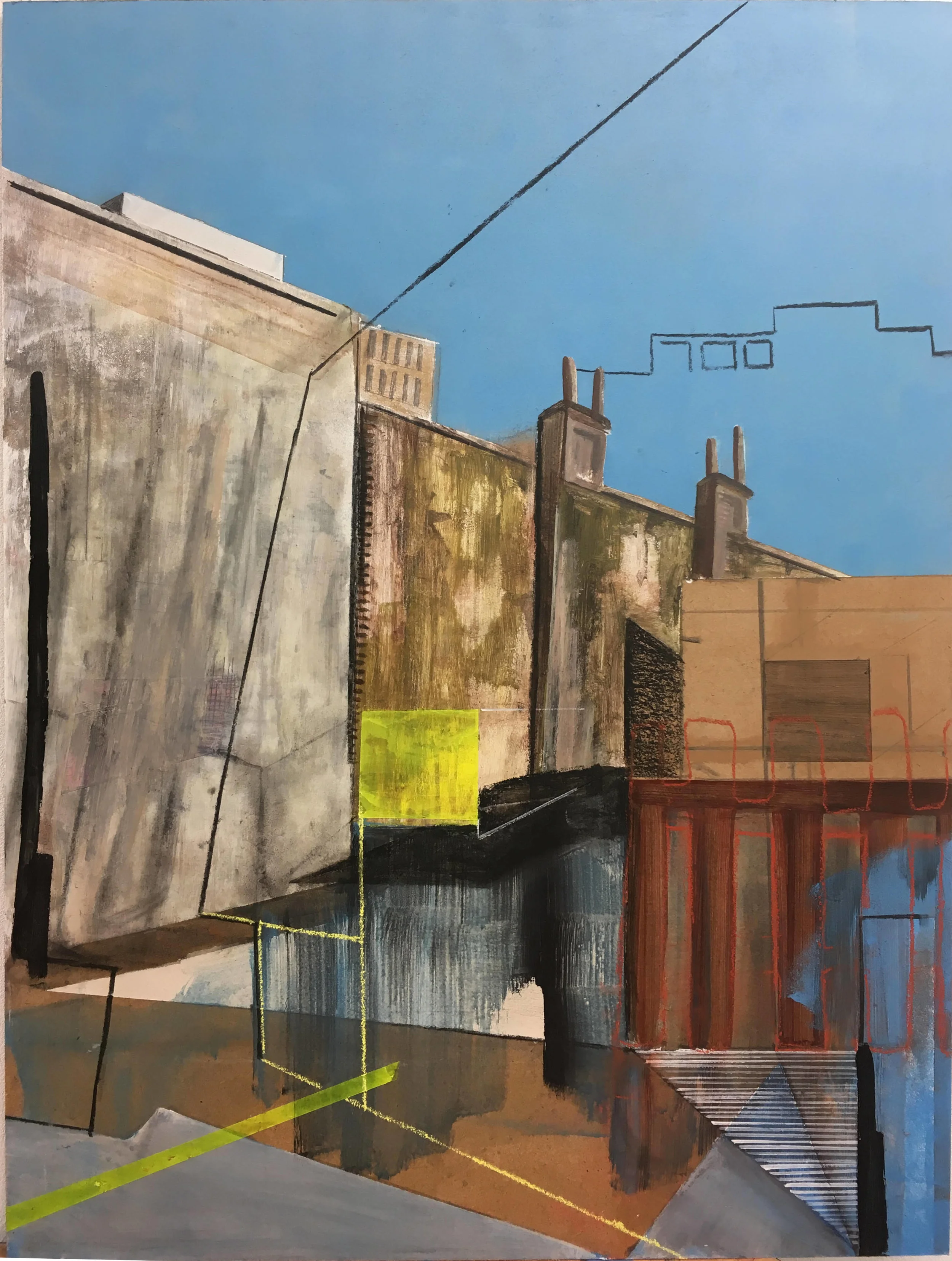
A wide landscape print can provide a horizontal foundation beneath several vertical pieces. A portrait-oriented artwork can create height beside a low console, sofa, or bed. For limited-edition artwork with a polished finish, browse curated print sources before building the arrangement around a piece that has the right scale.
The anchor does not have to be the largest frame. A small but visually bold work can perform the same role if it has strong contrast, saturated colour, or an expressive subject. Let the artwork’s visual weight guide your placement.
Balance Vertical And Horizontal Shapes
Portrait artwork naturally draws the eye upward, while landscape pieces encourage the gaze to travel from side to side. Use this contrast to shape the overall silhouette of the display. Several vertical frames in a row may feel narrow and formal, while a sequence of horizontal pieces can look low and spread out.
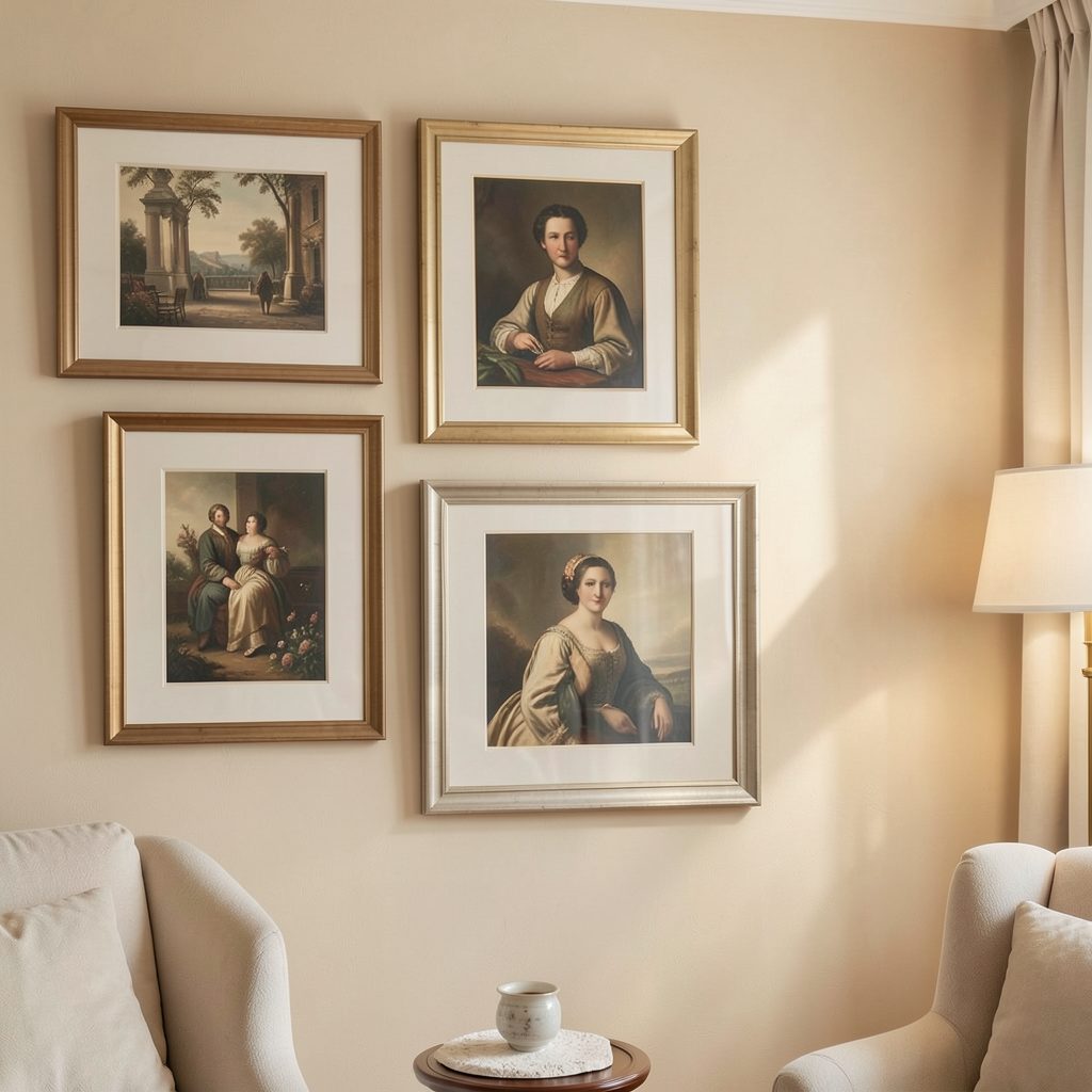
Try placing a portrait frame beside a landscape frame instead of grouping all pieces by orientation. This creates a conversation between shapes. If two works have similar colours or themes, their differing proportions can make the connection feel more deliberate.
A useful approach is to alternate orientations around the anchor while keeping the outer edges varied. The complete gallery wall should have an interesting outline, with some height, width, and small gaps rather than a perfect rectangle.
Use Frames To Create Continuity
Frames are the element that ties different artwork formats together. If the collection includes many colours and subjects, choose a restrained frame palette such as black, white, natural wood, or antique brass. Consistent frame finishes help landscape and portrait prints feel like part of one composition.
Matching every frame is not essential. A mixed-frame gallery wall can feel warmer and more collected when one material repeats at least twice. For example, pair slim black frames with one or two wider oak frames, then repeat those finishes across the arrangement.
Mat boards can also regulate differences in size. A small portrait image inside a generous white mount may have the same visual presence as a larger landscape print. This is especially helpful when combining photographs, art prints, and illustrations with different proportions.
| Artwork format | Best placement | Visual effect |
|---|---|---|
| Wide landscape | Beneath a cluster or beside a tall piece | Adds width and stability |
| Tall portrait | At the edge or near a low horizontal work | Creates height and direction |
| Small square | Between contrasting orientations | Acts as a transition |
| Panoramic print | Across the lower or upper row | Connects separate groupings |
| Small vertical print | Near a larger landscape | Adds rhythm without overpowering |
Plan Spacing Before Hanging
Lay the collection on the floor and arrange the frames as they might appear on the wall. Begin with gaps of around five to eight centimetres, then adjust according to frame size. Smaller works usually need tighter spacing, while large pieces benefit from a little more breathing room.
Cut paper templates for each frame and attach them to the wall with removable tape. This allows you to test the relationship between portrait and landscape orientations without making multiple holes. Stand several steps back and check the arrangement from the main entrance to the room.
Keep the central visual area close to eye level, particularly in hallways and living rooms. Above furniture, leave enough space for the display to relate to the object beneath it without appearing attached. A gallery wall should feel grounded by the room, not suspended randomly above it.
Create Rhythm With Repeated Details
Repetition makes a varied arrangement feel cohesive. Echo a colour from one landscape painting in a portrait photograph, or repeat a subject such as architecture, botanicals, travel, or abstract shapes. The relationship can be subtle; the artwork does not need to look like a matching set.
Small frames are useful for breaking up larger blocks of shape. Place a compact portrait between two wide works, or use a square image at a corner where the layout needs a visual pause. Avoid creating a predictable checkerboard pattern, since a little irregularity gives the display more character.
You can also add depth with a shallow shelf, a leaning frame, or a small sculptural object. Keep these additions limited so the orientation of the artwork remains clear. For a gallery-like interior, the arrangement should look edited rather than crowded.
Finish With Practical Display Details
Use secure picture hooks suited to the wall type and frame weight. Check that heavier pieces have proper anchors, especially above seating or in busy passageways. Before fixing anything permanently, confirm that doors, lamps, and furniture will not interrupt the display.
A small label can add a considered, exhibition-style touch to a personal collection. If you are displaying original work or want to identify artists and titles, these gallery label ideas can help you create a consistent format without making the wall feel overly formal.
Lighting also influences how orientation is perceived. Even, warm illumination will reveal the relationship between pieces, while a single harsh spotlight may exaggerate shadows and make the composition feel unbalanced. Picture lights, wall sconces, or adjustable ceiling fixtures can all work when positioned carefully.
A Simple Editing Checklist
Before hanging the final gallery wall, review the whole arrangement as one composition rather than judging each artwork separately. Remove anything that repeats a colour or shape too heavily, and leave space for the strongest pieces to stand out.
- Start with one dominant artwork and build outward from it.
- Alternate landscape and portrait formats without forcing a strict pattern.
- Repeat frame finishes, colours, or themes to connect the collection.
- Test the layout with paper templates before drilling into the wall.
- Keep spacing, lighting, and safety in mind once the arrangement is complete.
A successful display should feel collected, balanced, and personal. If you create or own artwork that would suit a curated home setting, you can submit your art for consideration and continue exploring ways to bring an editorial gallery feel into everyday rooms.
Subscribe to the Focus LDN email updates for more practical ideas on artwork display, apartment decorating, gallery openings, and stylish home living.