How to layer art on a floating shelf for a dynamic look
A floating shelf gives artwork a relaxed alternative to a traditional gallery wall. Instead of fixing every frame permanently in place, you can lean, overlap, and rearrange pieces as your collection grows. The result feels curated without becoming overly formal.
The most successful displays balance structure with movement. Different heights, frame finishes, paper textures, and small decorative objects create rhythm, while a limited colour palette keeps the arrangement visually calm.
Whether you are styling a narrow picture ledge in a bedroom or a deep shelf in a living room, the principles are similar: begin with one strong focal point, build supporting layers around it, and leave enough breathing room for every piece to register.
Start with the shelf and wall
Before choosing artwork, assess the proportions of the shelf. A long, shallow ledge suits a horizontal print series or several small frames, while a deeper shelf can support larger canvases, sculptural objects, and substantial frames. Keep the artwork visually related to the furniture below it so the display feels anchored.
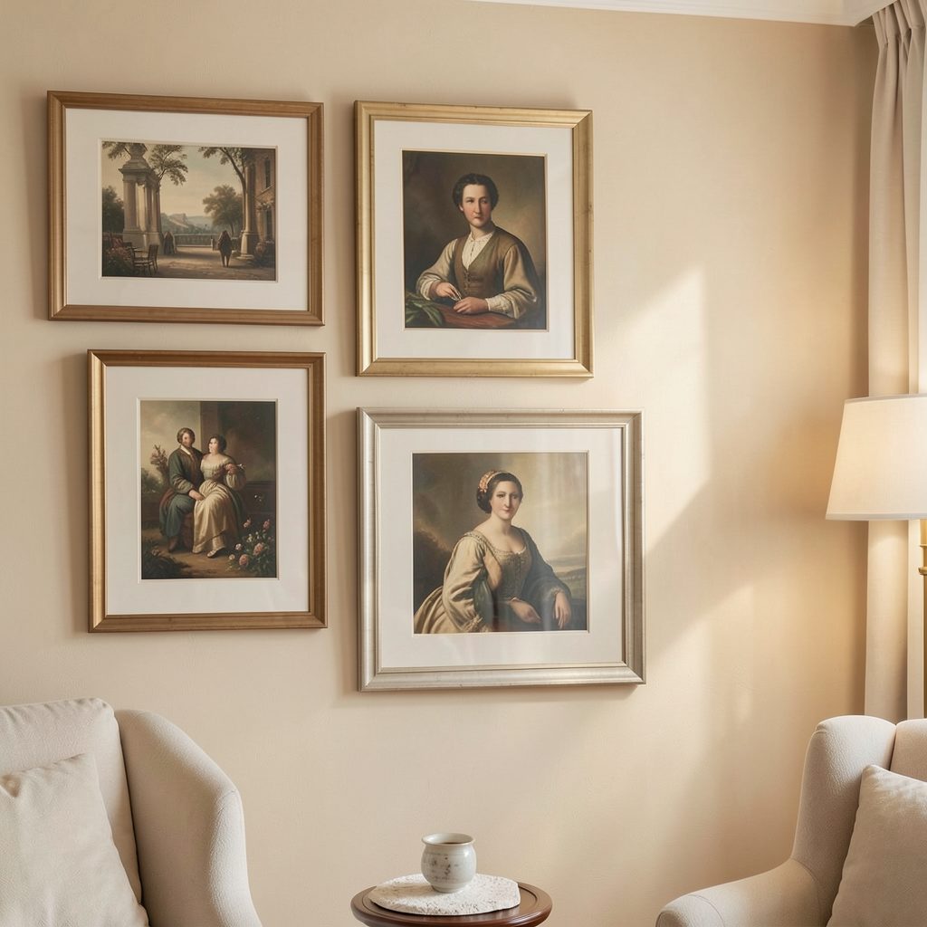
The wall colour also affects the energy of the arrangement. White or warm neutral paint creates a gallery-like backdrop, while a darker wall can make pale artwork and light frames stand out. If the shelf is above a sofa, console, or bed, aim for a composition that spans roughly two-thirds of the furniture’s width.
Establish a clear focal point
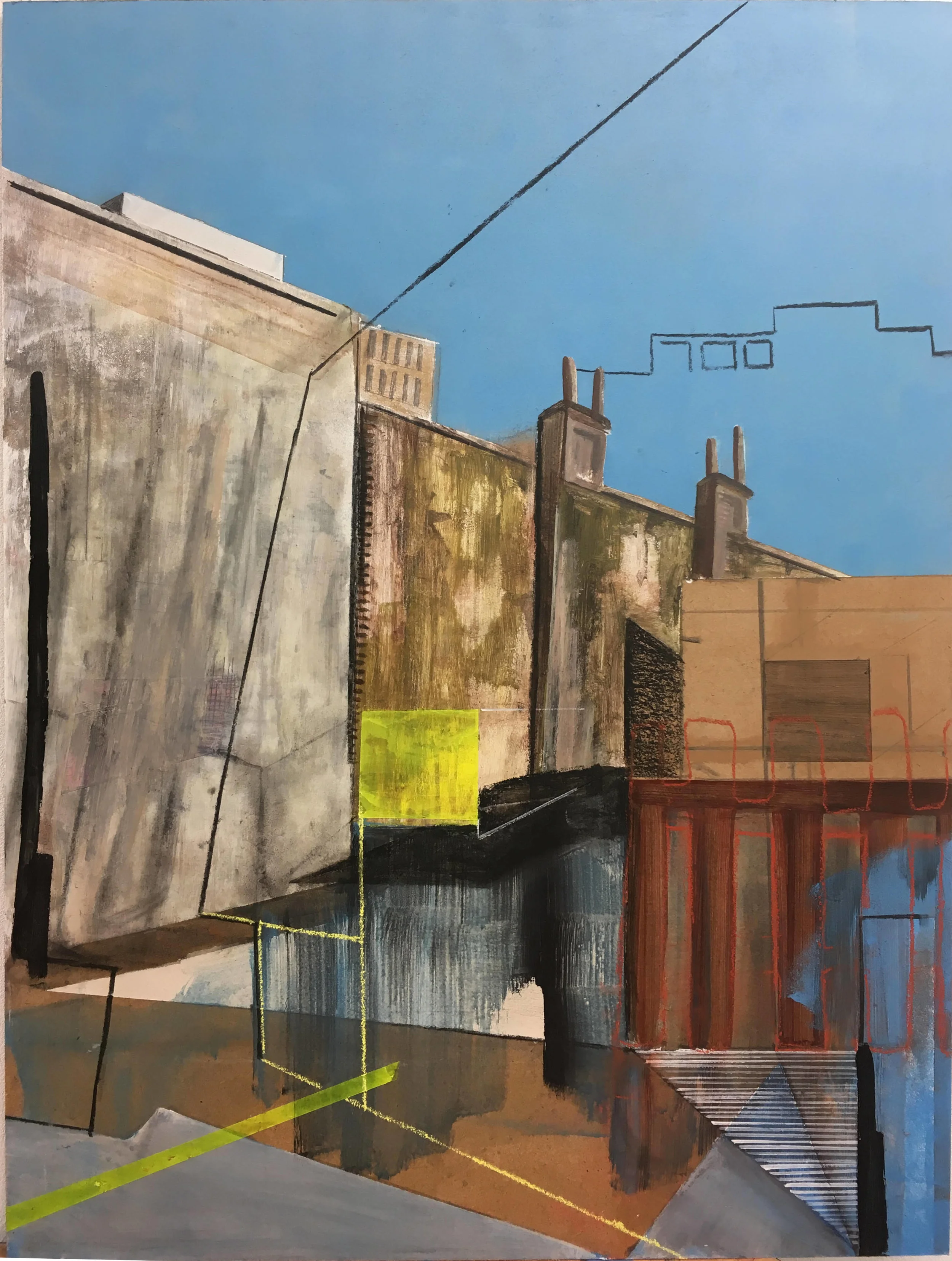
Choose one dominant work to act as the visual anchor. This might be a bold abstract print, a photograph with strong contrast, or a framed painting with an unusual colour. Place it slightly off-centre rather than directly in the middle, then balance its visual weight with smaller works on the opposite side.
A focal piece does not need to be the largest item. A richly coloured artwork can command attention even when it is modest in size. For ideas about using scale effectively, explore this oversized art guide, especially if your room has limited wall space and the shelf needs to carry a strong decorative statement.
Supporting pieces should echo one or two qualities from the main artwork. Repeat a colour, line, subject, or material without matching every detail. This creates cohesion while preserving the collected character that makes a layered shelf feel personal.
Mix frames, formats, and textures
A dynamic shelf display benefits from variation. Combine portrait and landscape orientations, small works with one medium-sized piece, and framed art with an unframed canvas or a mounted postcard. The contrast prevents the arrangement from looking like a rigid row.
Frame finishes can be mixed carefully. Light oak softens a monochrome print, black frames provide definition, and brushed metal adds a subtle contemporary note. If several finishes are used, repeat each one at least twice or keep the rest of the display restrained so the materials feel intentional.
| Display element | Visual role | Styling approach |
|---|---|---|
| Large artwork | Creates a focal point | Lean it behind the smaller pieces |
| Medium frame | Connects scale differences | Place it near the centre or beside the anchor |
| Small print | Adds detail and rhythm | Overlap it slightly with a larger frame |
| Ceramic or sculpture | Breaks up flat surfaces | Use it as a low, textural accent |
| Plant or branch | Brings organic movement | Keep the shape simple and avoid crowding |
Create depth through overlap
Layering works best when each item sits at a slightly different distance from the wall. Put the tallest frame at the back, lean a medium piece in front of it, and position a small print or object near the shelf edge. Even a few centimetres of overlap can make the display feel dimensional.
Avoid covering important faces, lettering, or focal details in the artwork. Overlap should suggest connection rather than concealment. A small gap between frames can also help separate busy patterns and prevent the composition from becoming visually dense.
Vary the angle of the frames subtly. A slight tilt can make a display feel informal, but too many angled pieces create disorder. Keep one or two frames straight to provide a quiet structure, then let the surrounding pieces introduce movement.
Tailor the arrangement to the room
In a bedroom, softer artwork and natural materials can support a restful atmosphere. Consider botanical prints, muted photography, linen textures, and pale wood frames. Leave some empty shelf space so the display does not compete with bedside lighting, textiles, or other calming details.
Bathrooms call for a more edited approach because humidity and limited surfaces can make accessories feel crowded. Choose sealed frames, moisture-resistant prints, and a few compact pieces. In a living room, you can use a richer mix of artwork and objects, especially when the shelf sits above a console or media unit.
For a polished apartment decorating reference, browse Focus LDN interiors for ideas on gallery-style rooms, frame combinations, and artwork placement. Let the room’s existing materials guide your choices: repeat timber tones, ceramic finishes, or accent colours already present in the space.
Keep the display easy to refresh
A floating shelf should evolve with your home rather than become a permanent installation. Rotate seasonal prints, postcards from exhibitions, travel photographs, or small works by emerging artists. Keeping a few pieces in storage allows you to change the mood without buying a completely new collection.
Use removable museum putty or discreet frame supports where necessary, particularly in homes with children, pets, or frequent movement. Test the stability of each frame before adding decorative objects, and avoid placing heavy artwork close to an unprotected edge.
A simple styling checklist can help maintain balance:
- Start with one focal artwork and build outward from it.
- Combine at least two artwork sizes and two orientations.
- Repeat a colour or material to connect different pieces.
- Use overlap for depth while keeping key details visible.
- Leave small areas of negative space between visual groups.
Step back from the shelf after every few additions. Assess it from the doorway and from the main seating position, since a composition that looks balanced up close may feel too concentrated from across the room. The final arrangement should have variation, breathing room, and a sense of movement without appearing accidental.
Refresh the display gradually, keeping the pieces that still feel meaningful and replacing anything that no longer suits the room. With a considered focal point, layered depth, and a restrained mix of frames and objects, your floating shelf can become a flexible art feature that changes naturally with your home. Explore more apartment styling ideas on Focus LDN and use your next shelf edit to give a favourite artwork the attention it deserves.