How to frame vintage maps for a study with dark walls
Framing vintage maps for a study with dark walls is less about creating a dramatic feature and more about controlling contrast. Cream paper, faded routes and small red seals can look rich against olive, navy or charcoal, provided each print has enough breathing room. The frame should support the map without competing with its age, texture and intricate details.
Many Sydney terraces and Melbourne apartments turn a spare bedroom or landing into a study, so scale matters as much as colour. A map group that feels generous in a showroom can overwhelm a compact wall; conversely, one small print can look lost beside a broad desk. Measure the available wall before deciding whether to display one chart or create a grouped arrangement.
Start by checking the condition of every map. Genuine antique charts may have brittle edges, old repairs or uneven cockling. A reproduction can be more practical if the original is fragile, but its colouring should remain restrained so it blends with authentic pieces rather than making them look faded.
Begin with the wall colour
Deep green walls complement the ochre and brown tones often found in antique cartography. Ink blue or charcoal works well with monochrome charts, while a dark aubergine can make muted reds and purples stand out. The palest map should act as the brightest element, creating a deliberate focal point against the surrounding colour.
Keep the frames related but not identical. Narrow frames in black, dark bronze or ebonised timber will disappear slightly into the wall, allowing the paper to provide the contrast. A slim warm-wood frame creates a gentler effect and brings out the cream tone of an aged map. When selecting additional artwork, the Focus LDN gallery art collection demonstrates how scale and subject can shape a display.
Choose a frame that respects the map
Avoid cutting down an original chart to fit a ready-made frame. Choose a frame with a deep rebate or shadow gap so the irregular edge remains visible, and use an acid-free mat to separate the map from the moulding. Wide cream mats suit faded charts, while narrow charcoal mounts create a more contemporary, graphic result.
Australian framing workshops commonly work in centimetres and stock standard A-series and museum sizes, but unusual antique maps usually need a custom fit. A timber or metal moulding should be deep enough to hold the map securely without pressing against its surface. Ask for conservation-grade hinges, acid-free board and UV-filtering acrylic or conservation glass rather than adhesive tape or ordinary glazing.
Plan for Australian daylight
Australian daylight can be particularly intense, and a north-facing study in Sydney, Melbourne or Adelaide may expose maps to strong ultraviolet light. Vintage pigments and paper fibres can fade or weaken over time, even when the colours initially appear vivid. UV-filtering glazing helps, but it should be combined with sensible placement and a blind or curtain that blocks direct sun.
Warm lighting also makes a dark study more inviting. Choose adjustable LED picture lights or desk lamps with a colour temperature around 2700–3000K and a high colour-rendering index. Aim for a soft pool of light across the map rather than several cool, bright beams. Brass and black fittings suit darker walls, while pale timber finishes bring a welcoming note to the room.
Arrange the maps as one composition
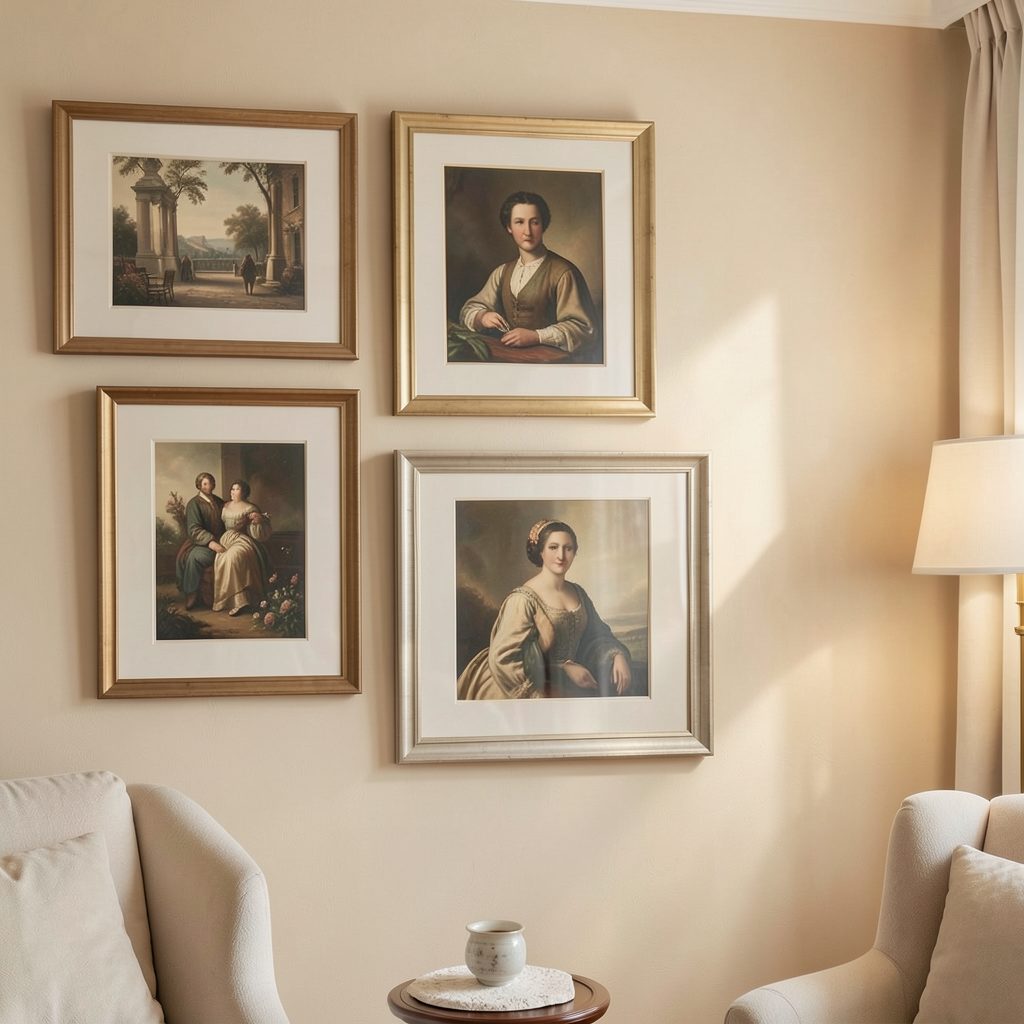
A single large chart centred above the desk creates the calmest result. For a smaller wall, arrange three to five maps as a loose grid, with the largest piece near the centre and smaller charts balancing either side. Keep the overall group at roughly two-thirds the width of the desk so the artwork feels connected to the furniture without crowding it.
Paper templates are useful for testing positions before hanging. Leave around three to five centimetres between frames and align either their outer edges or their mat openings, not both. If a chart is mounted above the desk, its lower edge can sit about 15–20 centimetres above the surface. Preserve some open wall space so the dark colour remains part of the design.
Add objects that support the room
Keep the desktop mostly clear so the wall remains the focal point. A closed notebook, a small tray and one tactile object, such as a brass compass or wooden box, are enough. The neatest arrangement uses just two or three colours beyond the maps, repeating details from their routes, seals or frames. For a calmer decorative scheme, Focus LDN’s guide to creating a serene study offers useful ideas for balancing artwork with restrained furniture.
Australian flea markets, charity shops and antique auctions often turn up folded charts, atlases and old travel maps. Light foxing, which appears as small brown spots, may add character, while tears, flaking ink or active mould need professional assessment. A paper conservator can unfold and stabilise a worthwhile chart. For a favourite map, a professional mount is safer than trying to flatten it at home with heavy books.
Finish with a scheme you will use every day
The strongest result comes from contrast, proportion and restraint. Let the oldest paper sit against the darkest wall, repeat one frame finish throughout the group and keep nearby objects quiet. Spend the largest share of the budget on proper glazing, an acid-free mount and secure hanging hardware, then adjust the lighting before adding more pieces.
Subscribe to Focus LDN for fresh decorating guides, thoughtful gallery ideas and practical techniques for displaying artwork in your home.