How to Create a Gallery Wall with a Unifying Color Palette
A gallery wall feels intentional when its individual pieces share a visual conversation. Color is one of the simplest ways to create that connection, whether you are arranging vintage posters, abstract paintings, family photographs, or small sculptural works. A consistent palette gives varied artwork enough cohesion to feel collected rather than chaotic.
The goal is not to make every frame and image identical. A successful display usually includes contrast in scale, texture, subject, and style. The unifying element might be a repeated terracotta tone, a quiet group of blue-gray shades, or a neutral foundation accented with one confident color.
Before choosing artwork, consider the room as a whole. Look at upholstery, rugs, curtains, wall paint, timber, and metal finishes. Your gallery wall should complement these existing details while adding personality and visual movement.
Start With the Room’s Existing Colors
Begin by identifying three or four colors already present in the space. One should be a dominant background shade, such as ivory, soft gray, beige, or muted green. A secondary color may come from a sofa, rug, or headboard, while a smaller accent can be borrowed from cushions, ceramics, or lighting.
This approach prevents the artwork from appearing disconnected. For example, a room with gray walls may benefit from charcoal, cream, ochre, and dusty rose prints. If you are working with a cool interior, this guide to warmth to gray walls can help you introduce richer tones without making the space feel visually heavy.
Build a Focused Palette
A restrained palette is easier to coordinate than a broad one. Choose one dominant color, one supporting shade, and perhaps a small accent. The dominant color might appear in half of the pieces, while the supporting shade can occur less frequently. Use the accent sparingly so it draws the eye instead of overpowering the arrangement.
Neutrals are valuable because they create breathing room between stronger images. White, cream, black, warm gray, and natural paper tones can act as visual pauses. They also make it easier to combine different art forms, such as line drawings, botanical prints, typography, and painted canvases.
| Palette style | Core colors | Suitable artwork | Room effect |
|---|---|---|---|
| Warm neutral | Cream, tan, rust, charcoal | Photography, ceramics, abstract prints | Relaxed and welcoming |
| Soft coastal | Blue-gray, white, sand, sage | Seascapes, line art, botanical studies | Calm and airy |
| Earthy modern | Olive, clay, ochre, black | Graphic posters, landscapes, textile art | Grounded and sophisticated |
| Tonal monochrome | Black, white, gray, one accent | Photography, typography, geometric art | Clean and gallery-like |
Select Artwork With Variation
A color palette should guide your choices, not limit them too strictly. Mix light and dark images, detailed compositions and open space, matte paper and glossy surfaces. These differences create rhythm and keep the wall from looking like a collection of identical prints.
Think about the visual weight of each piece. A large dark painting can anchor a grouping, while a pale sketch may work best beside it as a lighter counterpoint. Repeated color is often enough to connect artwork that differs significantly in subject or medium.
Consider including one unexpected item, such as a textile fragment, a small mirror, a pressed botanical specimen, or a found object in a shadow box. Its colors should relate to the main palette, but its texture can add depth and make the arrangement feel more personal.
Coordinate Frames Without Making Them Match
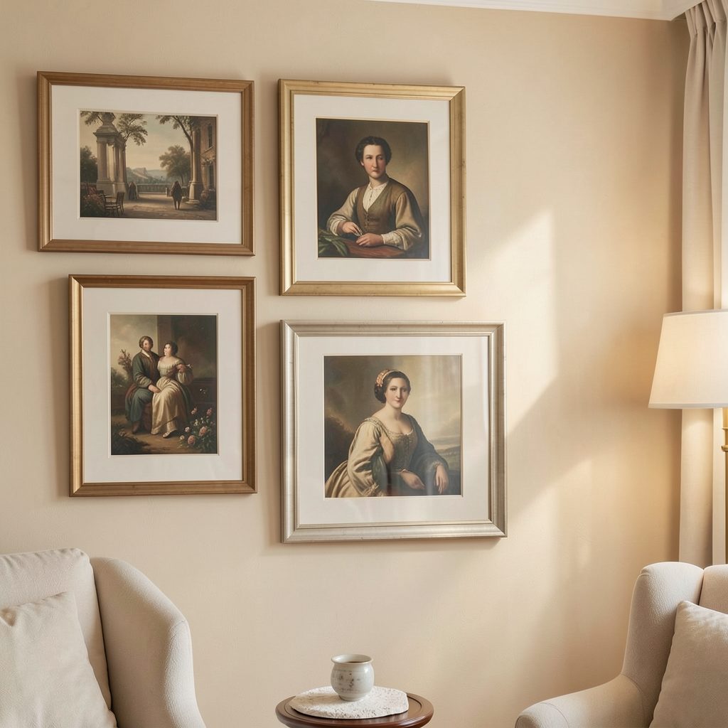
Frames should support the artwork and the architecture of the room. Black frames create definition and suit graphic or monochrome collections. Light oak and walnut bring warmth, while white frames can make pale artwork feel expansive. Metallic finishes work well as small accents rather than the dominant material.
Using one frame style throughout creates a polished, minimalist effect, but combining two or three finishes can look more collected. Keep one feature consistent, such as the frame depth, mat color, or overall tone. For example, black and natural wood frames can coexist when every piece uses an ivory mat.
The mount, or mat board, is especially useful for maintaining unity. A consistent border gives unrelated images a shared structure and prevents bold colors from competing too closely.
Plan the Arrangement Before Hanging
Lay the artwork on the floor and arrange it against a wall-sized outline made with painter’s tape. Start with the largest piece or central work, then place medium-sized pieces around it. Finish with smaller art that fills gaps and balances the edges.
Leave roughly two to three inches between frames for a compact display, or increase the spacing for a more relaxed gallery feel. The outer boundary should feel deliberate even if the internal arrangement is asymmetrical. Step back regularly to check whether color and size are distributed evenly.
A useful method is to repeat colors diagonally across the arrangement. If a deep green piece sits in the upper left, echo that shade in a lower-right print or small object. This creates movement and prevents the palette from becoming concentrated in one corner.
Adapt the Palette to the Space
The same color strategy can create different moods depending on the room. In a bedroom, softened hues and generous white space encourage a quieter atmosphere. In a hallway or dining area, richer colors and tighter spacing can provide energy without taking up valuable floor space.
Scale also matters. A small gallery wall above a bedside table should relate to the furniture beneath it, while a large living-room display can extend wider than the sofa. Keep the center of the arrangement near eye level, and align the display with nearby architectural features where possible.
For bedrooms, avoid adding so many decorative elements that the wall competes with the room’s restful purpose. A pared-back furniture scheme, such as the one described in this guide to minimalist bedroom furniture, gives a considered art collection more room to stand out.
Keep the Display Cohesive
- Repeat at least one color in three separate pieces.
- Use mats or mounts to create consistent visual spacing.
- Balance dark artwork with lighter prints or open wall space.
- Combine frame finishes carefully, limiting the selection to two or three.
- Test the entire arrangement before making permanent holes.
A unifying palette works best when it remains flexible. Colors may shift slightly between artworks, and that variation often makes the display look more authentic. The priority is to establish a recognizable atmosphere rather than enforce exact matching.
Once the wall is installed, live with it for a few days before making changes. Natural light, lamps, and surrounding furnishings can alter how colors appear throughout the day. Move one or two pieces if the arrangement feels weighted to one side, then add lighting that reveals texture and detail.
Choose your palette, gather artwork with personal meaning, and test the composition at full scale before hanging anything. With a thoughtful balance of repeated color, varied artwork, and complementary frames, your gallery wall can become the defining feature of the room.