How to Create a Cohesive Look with Art from Different Eras
A home becomes more personal when its walls hold artwork from different moments in history. A geometric modern print can sit beside a romantic landscape, while a carved antique frame adds weight to a simple contemporary photograph. The result feels collected rather than copied from a showroom.
The key is not to make every piece match. Cohesion comes from finding relationships between artworks through colour, scale, subject, framing, or placement. When those connections are intentional, contrasting styles can share a room without creating visual noise.
Think of your collection as a conversation between periods. A Victorian botanical illustration may echo the organic shapes in a mid-century abstract, while a muted palette can bring together paintings made decades apart. With a few practical decisions, an eclectic art display can feel calm, stylish, and distinctly yours.
Begin with a visual thread
Choose one quality that will appear throughout the arrangement. It might be a restrained colour palette, repeated black frames, warm wood tones, or a shared feeling such as quiet, playful, or dramatic. This visual thread gives varied artwork a common language.
Colour is often the easiest place to start. Look for two or three tones that occur across the collection, even if they appear in different proportions. A deep green in an old oil painting can connect with green lettering in a contemporary poster, while cream, rust, or charcoal can soften the transition between them.
You do not need every piece to contain the same colours. Repetition works best when it is subtle. A small accent repeated across several artworks can be enough to make a salon wall feel considered rather than accidental.
Balance contrast with scale
Different eras often come with different visual weights. An ornate nineteenth-century portrait may feel heavier than a delicate line drawing, while a bold abstract canvas can dominate several smaller works. Arrange these differences so that the eye moves comfortably around the wall.
Place larger or darker pieces near the centre or lower portion of the composition, then use smaller works to create rhythm around them. If every large artwork sits together, one side of the arrangement may feel dense. Spread visual weight across the display instead.
Before hanging anything, lay the pieces on the floor and photograph several arrangements. Try a loose grid, a salon-style cluster, and a central anchor with smaller works around it. Leave enough breathing room for each era to remain recognisable while keeping the overall group connected.
Use frames as the unifying layer
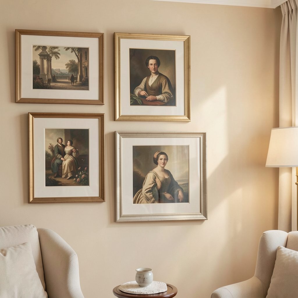
Frames can either bridge different periods or exaggerate their differences. A consistent frame finish, such as slim black metal or pale oak, gives mixed artwork a gallery-like quality. This approach works particularly well when the images themselves vary dramatically.
A more layered scheme can also be successful. Combine ornate, painted, and minimal frames, but repeat one feature across the collection. Similar matting, matching outer tones, or a shared warm finish will stop the display from becoming visually fragmented.
Allow the frame to suit the artwork’s character. A delicate etching may need a mount and narrow profile, while a substantial oil painting can hold its own in a deeper wooden frame. Cohesion does not require identical treatment; it requires a deliberate relationship between treatments.
| Artwork combination | Helpful connection | Framing approach | Best placement |
|---|---|---|---|
| Antique portrait and modern photograph | Similar neutral tones | Ornate frame with a simple black frame | Portrait as the anchor |
| Botanical print and abstract painting | Repeated organic shapes | Pale wood or soft white | Side by side with equal spacing |
| Vintage poster and minimalist line art | Shared accent colour | Matching slim frames | Staggered vertical arrangement |
| Ceramic relief and textile artwork | Tactile surface | Shadow box or deep-set frame | Lower row or console display |
| Classical landscape and graphic print | Similar horizon or directional lines | Mixed frames with matching mounts | Balanced across the wall |
Connect artwork by subject and movement
A thematic link can be more powerful than a shared style. Pair images of architecture, figures, plants, or landscapes from different eras to create a visual exchange. The connection should feel open-ended rather than overly literal.
Movement matters too. A figure looking left can direct attention toward an abstract work, while a sweeping landscape may balance the vertical lines of a poster. Notice where subjects face and where lines travel, then arrange the pieces so those gestures lead into the collection instead of out toward the edge.
For a quieter bedroom, choose artwork with related moods: soft portraits, faded botanical studies, and restrained abstract forms. In a bathroom or hallway, brighter graphic pieces can create energy, especially when their colours relate to tile, paint, or textiles.
Give the arrangement room to breathe
Spacing is one of the simplest ways to make an eclectic grouping feel polished. Begin with a consistent gap between frames, usually around five to eight centimetres, then adjust according to scale. Smaller works often need tighter spacing, while oversized pieces benefit from more generous margins.
A gallery wall should relate to the furniture beneath it. Keep the lower edge close enough to a console, sofa, or headboard that the artwork feels anchored rather than floating. For a collection displayed above furniture, use the furniture’s width as a guide and avoid allowing the art to extend too far beyond it.
If you are building a collection gradually, a gallery wall starting point can help you establish proportions before committing to a large arrangement. Begin with the most important piece, then add supporting works around it rather than filling empty space at random.
Mix old and new with intention
The most convincing combinations usually include a point of tension. A highly refined antique frame might sit beside a raw canvas, or a traditional still life could share a wall with a crisp typographic print. This contrast gives the room character and prevents the display from feeling overly coordinated.
Repeat that tension elsewhere in the space through materials and furniture. Pair an old painting with a contemporary lamp, or place a modern sculpture near a vintage sideboard. When the wider room supports the dialogue between eras, the artwork feels integrated into the interior rather than treated as a separate installation.
Keep the surrounding decoration relatively edited. Too many competing patterns, finishes, and accessories can weaken the artwork’s effect. A simple plant, textured throw, or sculptural object is often enough to connect the wall to the rest of the room; ideas for combining greenery with artwork appear in this guide to styling art and plants.
Practical choices for a polished display
Before drilling holes or ordering frames, use these checks to refine the composition:
- Select one dominant visual thread, such as colour, material, or mood.
- Place the largest or darkest artwork first and balance it with supporting pieces.
- Repeat a framing detail without forcing every frame to be identical.
- Keep spacing consistent, especially around smaller works.
- View the arrangement from the doorway and from the main seating position.
- Leave a little room for future finds instead of filling every available section.
Take time to live with the arrangement before deciding it is finished. A piece that seems unusual on the floor may become the element that gives the collection personality once it is placed correctly. Art from different eras should retain its individual voice while contributing to the atmosphere of the room.
Start with one wall, one anchor piece, and a clear visual thread. As you rearrange, photograph each version and notice which grouping feels most natural in the space. With thoughtful framing, measured spacing, and a willingness to mix periods, your home can become a cohesive gallery of work that reflects both history and personal taste.