How to create an abstract gallery wall with framed fabric samples
Creating an abstract gallery wall with framed fabric samples turns offcuts, swatches and small textile pieces into a layered focal point. The appeal comes from contrast: soft weave beside a rigid frame, muted linen beside a saturated print, and irregular edges made neat by a careful mount. It can feel expressive without turning a small apartment into a busy craft display.
Begin with the wall, not the shopping list. Measure its width, note nearby furniture and check how daylight moves across it. In compact Sydney, Melbourne and Brisbane homes, vertical space is valuable, so the arrangement should feel generous while preserving breathing room and an easy path through the room.
Plan the composition for a compact Australian interior
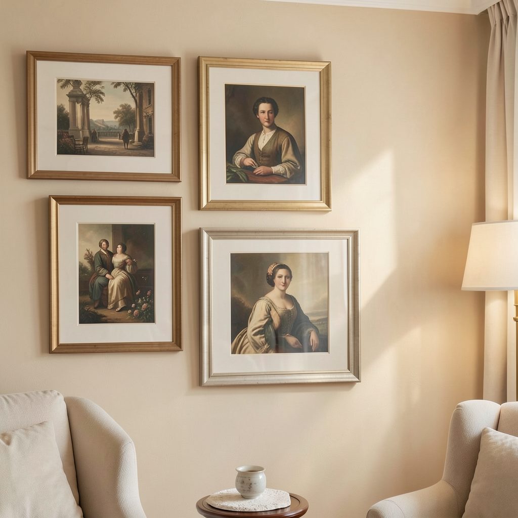
Sketch the proposed arrangement at actual scale on tracing paper, then move the outline around the wall. Start with one large piece and build an asymmetrical group around it; three, five or seven frames often settle naturally, though the final count matters less than visual balance. Keep the outer edges uneven enough to feel collected, but protect one clear gap so the grouping has room to breathe.
Work out what reaches the sofa or bed before fixing anything. In rental properties, state Residential Tenancy Acts and the lease may affect permanent fixings, while apartment owners should check body-corporation by-laws before drilling into common walls. A lease or by-law check prevents damage to waterproofing, shared areas or the security bond, and the wall can still be styled with removable supports where those are permitted.
Choose textiles and frames with care
Source fabric with a story and check its composition before framing. Australian makers, local craft markets and remnant suppliers offer linen, cotton, wool and printed cloth suited to the light and relaxed character of many local interiors. For works by Aboriginal artists, buy licensed pieces and display the artist’s attribution as directed.
Textile samples
- A plain linen or cotton swatch for visual calm
- A graphic print to provide one clear accent
- A coarse weave for texture and shadow
- An embroidered remnant for a small focal detail
Keep the palette narrower than the number of frames suggests. Pull two accent colours from the room, then use cream, charcoal or warm timber as supporting neutrals. The same principle applies to the joinery: repeating one frame finish ties varied textiles together more effectively than buying a perfectly matched set.
Frame and glazing options
- Black or white frames for graphic contrast
- Natural timber frames for warmth and softness
- Thin shadow-box frames for dimensional depth
- UV-filter acrylic for bright or coastal rooms
Choose the glazing before the frame profile, because it changes the depth and colour of every textile. Test each swatch behind its proposed frame, and compare it under daylight and evening lamps. A fabric with a cream ground can look yellow beside warm timber, so make the final decision in the room rather than at the framing shop.
Create a restrained visual story
Treat the wall as one composition rather than a sequence of individual pretties. The largest sample can hold the strongest pattern, with quieter pieces stepping down in scale. Repeat a colour at least twice to link the group, then vary texture and shape to stop it feeling repetitive. Leave the area directly above a bed or sofa calmer, allowing the textiles to become the accent rather than compete with every object nearby.
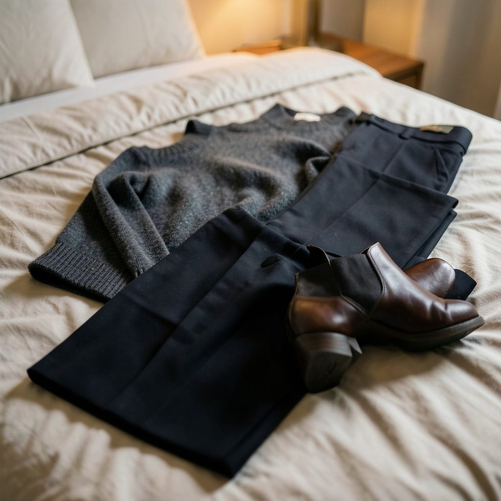
View the arrangement from the doorway, then from the seat you use most often. The first view tests the overall shape; the second reveals whether one dark or heavily patterned piece pulls all the attention. When you want the grouping to read like a curated exhibition, the discipline behind gallery-opening attire offers a useful parallel: both depend on proportion, one clear focal area and restrained supporting colours.
Protect the fabric and hang securely
Australian conditions need to shape the frame specification. Strong UV can fade dyes and weaken fibres, while humidity in coastal homes and Brisbane can encourage mould or condensation around vulnerable cloth. Ask for archival-quality backing and matting, keep fabric clear of the glazing, and use UV-filter acrylic where sunlight reaches the wall. Avoid direct afternoon sun, and check cotton, wool and linen care labels before choosing a bathroom or laundry position.
Hang the group so its visual centre sits around eye level, roughly 140 to 150 centimetres from the floor, then level it carefully with a laser or long spirit level. Use security fittings and two-point mounting for valuable pieces, especially in earthquake-prone areas. Give frames breathing space so they can be cleaned without scratching one another, and anchor weight-appropriate hooks into studs, masonry or the correct wall plugs rather than relying on adhesive strips alone.
Make the display part of daily life
Let the wall grow with the room. Swap one seasonal textile for a lighter or darker piece, rotate small frames above a desk, and keep the spacing generous enough for the change. In an open-plan apartment, repeat one fabric colour in cushions or a throw nearby so the display feels connected to daily life, not installed for a photograph and forgotten.
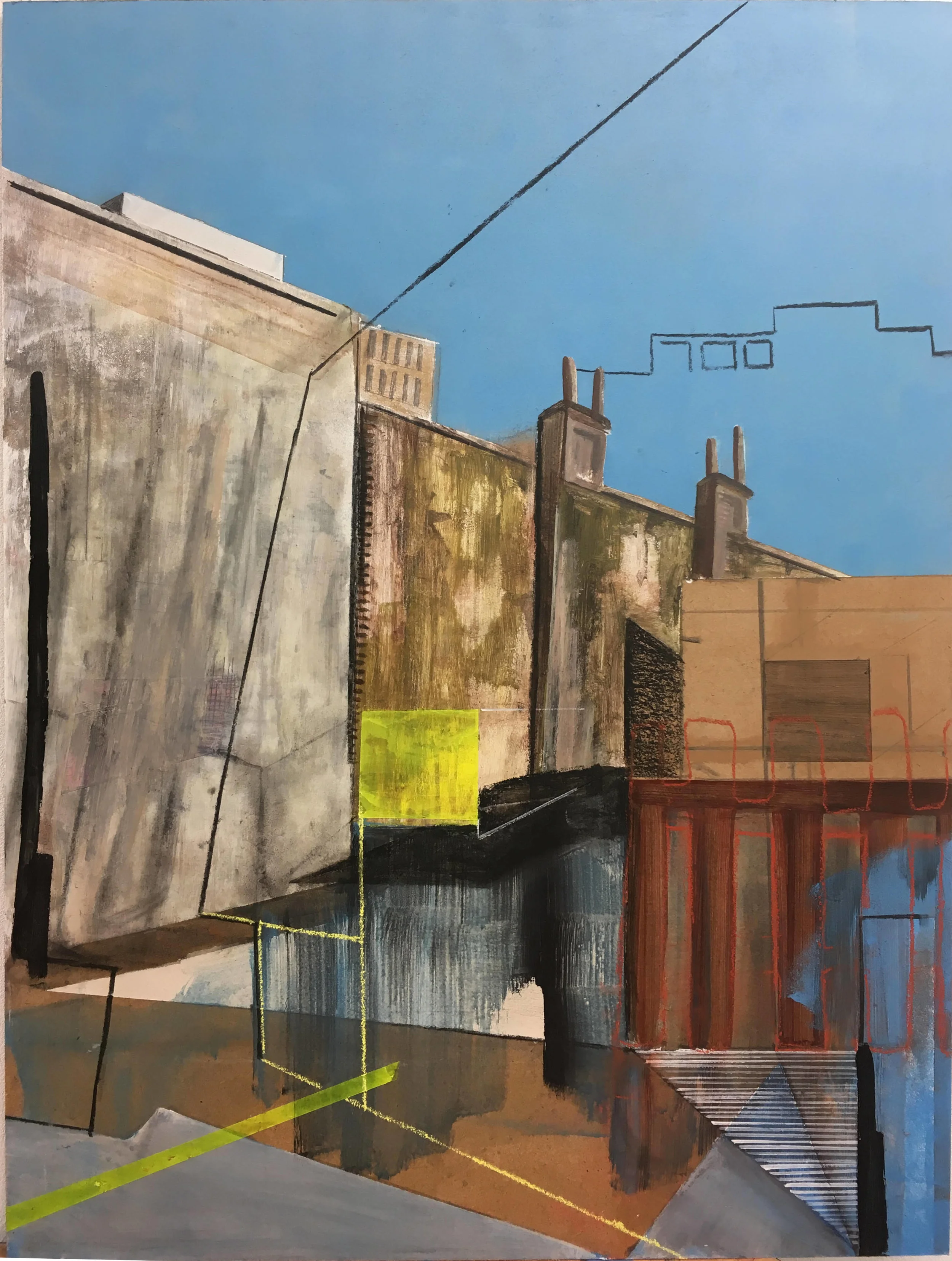
If the arrangement is the first step toward collecting more work, start an art gallery with one coherent group and add pieces only when they improve the balance. Keep a record of each frame’s dimensions and hanging height, so future additions can be measured against the existing composition. This approach also makes moving house simpler because the group can be copied from a single photograph before the wall is dismantled.
Subscribe to the Focus LDN email for fresh apartment-decorating ideas, gallery-wall guidance and practical display techniques.