How to Build a Gallery Wall That Grows Over Time
A gallery wall should feel collected rather than completed. The most appealing arrangements often combine artwork gathered across different seasons of life: a print from a local exhibition, a family photograph, a small painting found while travelling, or a handwritten piece that carries personal meaning.
The secret is to create a strong visual foundation without filling every available space at once. With a flexible layout, compatible frames, and a little empty room, your display can evolve while still looking intentional.
A growing art wall also gives your home a sense of movement. Instead of treating decorating as a one-time project, you can let the collection respond to new rooms, changing tastes, and the artwork you discover next.
Start With A Flexible Foundation
Choose the wall carefully before selecting individual pieces. A hallway, stair landing, living room, or bedroom wall can all work, but the arrangement should relate to the furniture beneath it. A gallery above a console usually needs a clear horizontal centre, while a stairwell may suit a more vertical flow.
Measure the available area and mark its outer limits with painter’s tape. This creates a visual boundary without forcing you to commit to exact positions. Leave enough breathing room around the arrangement so that future additions can fit without making the display feel crowded.
A useful starting point is one substantial anchor piece. It might be a large photograph, a colourful abstract work, or a vintage poster. If you are still developing your taste, explore starting an art gallery for ideas on building a collection with greater intention.
Select A Mix Of Artwork
A gallery wall becomes more interesting when the pieces vary in scale, texture, and subject. Combine framed prints with paintings, line drawings, photographs, textiles, mirrors, or small sculptural objects. The collection does not need a single theme, but it should have a visual thread.
Colour is one of the easiest ways to create cohesion. You might repeat warm neutrals, echo a particular shade found in the room, or use mostly monochrome artwork with one or two vivid accents. Similar subject matter can also connect varied pieces, such as botanical studies, architectural images, or portraits.
Avoid buying several pieces simply because they are the same size. Uniformity can make future additions difficult. A combination of large, medium, and small works gives you more options when the wall expands.
Create A Frame Language
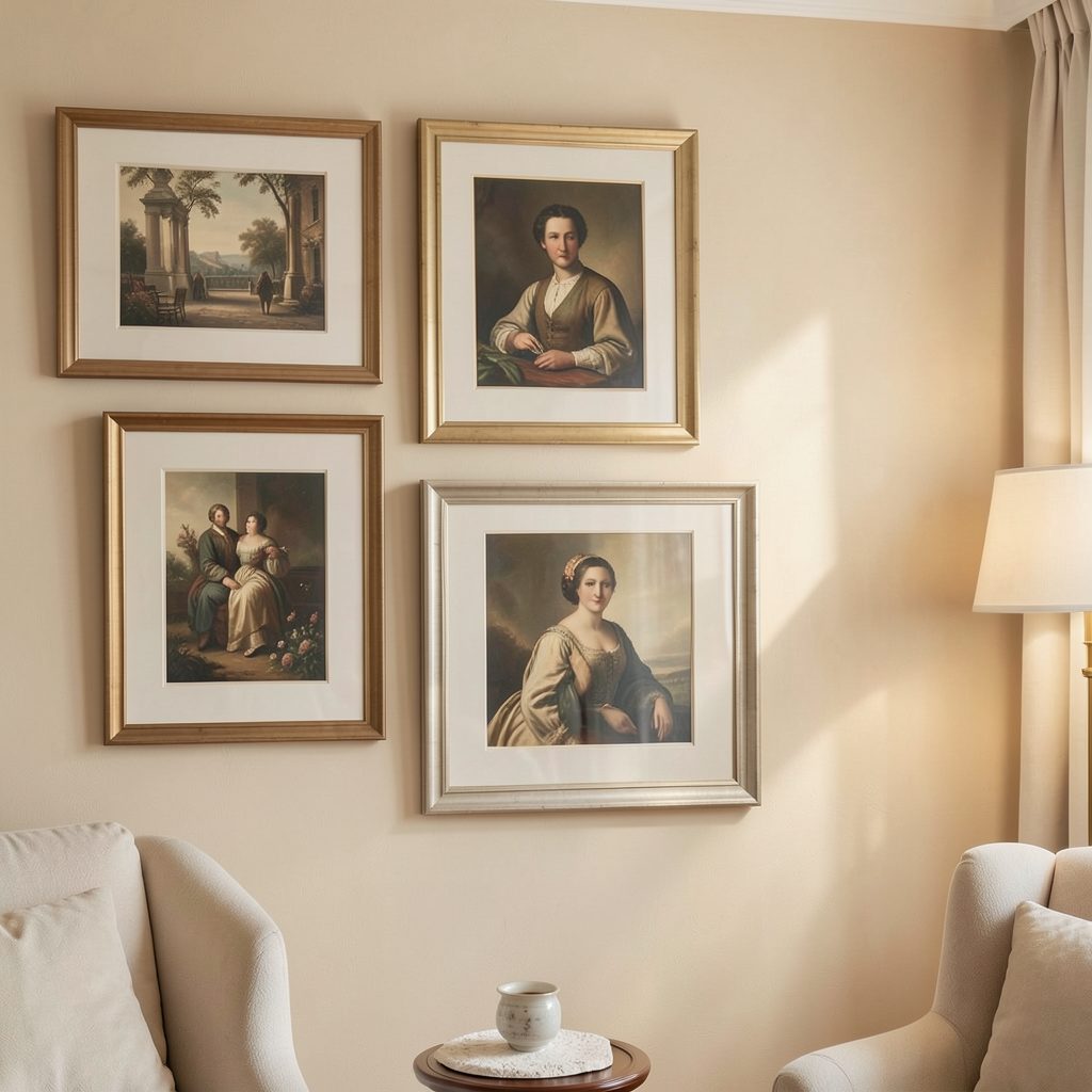
Frames do not need to match exactly, but they should look as though they belong to the same conversation. Black, white, natural wood, brass, and brushed metal can work together when repeated thoughtfully. Keeping one dominant frame finish helps a varied collection feel edited.
Consider the architecture and furnishings of the room. Slim black frames suit a contemporary interior, while oak or walnut can soften a minimalist space. Ornate frames may add character to a traditional home, especially when balanced with simpler borders elsewhere in the arrangement.
Mat boards are equally important. A generous white or ivory mount gives smaller images presence and creates visual pauses between stronger colours. If you are mixing frame styles, consistent mat tones can provide the unifying effect.
Plan The Layout Before Hanging
The easiest way to test a composition is to cut paper templates to match each frame. Arrange them on the floor or tape them to the wall, keeping the gaps consistent. Stand back several times and assess the whole shape rather than judging one piece at a time.
For a collection that will grow, avoid pushing every frame into a tight grid. A gap of roughly five to eight centimetres between pieces often provides enough structure while leaving room for another work later. Keep the overall outer edge relatively stable, even if the interior changes.
Here are several layout approaches and how well they support future additions:
| Arrangement | Visual character | Best for growth |
|---|---|---|
| Tight grid | Ordered and architectural | Moderate; new pieces need matching dimensions |
| Organic cluster | Collected and relaxed | High; varied sizes can be added easily |
| Central anchor | Balanced and artwork-led | High; smaller works can gather around the centre |
| Linear row | Clean and restrained | Moderate; works best along narrow walls |
| Salon-style arrangement | Eclectic and layered | Very high; ideal for expanding collections |
Use the floor plan as a guide, not a rigid formula. A slightly uneven arrangement can feel more natural than perfect symmetry, particularly when the artwork has different visual weights.
Let Empty Space Do Some Work
Leaving blank areas is essential when you expect the display to expand. Empty space prevents the wall from looking unfinished because it gives the current pieces room to breathe. It also creates a clear opportunity for future finds.
Rather than reserving a conspicuous empty rectangle, distribute potential growth areas around the existing arrangement. A small gap beside a medium frame, a low space beneath a photograph, or an open corner near the outer edge can all accommodate additions naturally.
Keep the relationship between the art and the rest of the room in mind. An expanding gallery should not overwhelm a bed, sofa, or bathroom mirror. For a smaller room with decorative potential, consider how unexpected bathroom art can bring personality to an overlooked wall without requiring a large collection.
Add New Pieces With Intention
When you find new artwork, do not hang it immediately just because there is an empty patch. First place it beside the current collection and assess its scale, colour, and frame. The best addition may belong at the edge of the arrangement, or it may balance a visually heavy piece on the opposite side.
Photographing the wall after each update can help you notice changes that are difficult to see in person. Keep a simple record of frame dimensions and placement, especially if you plan to rearrange the collection later. Removable picture-hanging strips can be useful for lightweight pieces, while heavier works should be fixed securely into suitable wall anchors.
Collections also benefit from occasional editing. If one work no longer suits the room, move it elsewhere rather than forcing it to remain. Rotate seasonal prints, introduce a new frame finish gradually, or group several small pieces together to create the presence of one larger work.
Keep The Collection Personal
The most successful gallery walls reveal something about the people who live with them. Include work made by friends, children’s drawings, inherited photographs, exhibition cards, or small objects with a story. A polished arrangement does not need to look impersonal.
Think about viewing height as well as composition. The centre of the display should generally sit near eye level, but artwork above a console or bed can be positioned in relation to the furniture. In a bedroom, softer images and quieter colours may encourage a calmer atmosphere, while a hallway can support bolder contrasts.
Before finalising the arrangement, walk past it at different times of day. Notice reflections on glass, shadows from nearby lighting, and how the colours relate to adjacent walls. These practical details make the collection feel integrated rather than simply attached to the surface.
Begin with one meaningful piece, give it a considered frame, and build outward as new artwork earns its place. With a flexible layout and room for discovery, your gallery wall can become a living record of your taste, travels, and changing home.