How to Arrange Art Around a Corner in an Open Space
Corners can be difficult to decorate because they sit between two visual zones. In an open-plan apartment, however, that turn is also an opportunity to connect the living room, dining area, hallway, or kitchen with a deliberate art display.
The most successful arrangements treat the corner as a continuous composition rather than two unrelated walls. Repeated frames, a shared colour palette, and carefully controlled spacing can guide the eye around the angle while keeping the room feeling calm.
Before hanging anything, study the architecture, furniture scale, natural light, and sightlines from nearby rooms. A gallery wall should support the way people move through the space, not interrupt it or compete with the main furnishings.
Read The Architecture First
Begin by marking the corner’s dimensions with painter’s tape. Note where the walls meet, how high the ceiling is, and whether doorways, shelves, switches, or furniture will affect the artwork arrangement. This simple outline helps reveal how much space is genuinely available.
A corner display usually works best when the visual centre sits slightly away from the exact turn. Placing one strong piece on the primary wall and allowing smaller works to travel toward the adjacent wall creates a natural transition. For a quieter look, begin the arrangement at the same height on both sides and use consistent outer margins.
Open spaces need displays that can be appreciated from several directions. Check the composition from the sofa, dining table, entryway, and any connecting corridor before making permanent holes.
Choose A Visual Anchor
Select one piece to act as the anchor: a large photograph, expressive painting, textile, mirror, or framed print. It should have enough presence to establish the mood without overwhelming the corner. In a compact room, a portrait or vertical artwork can emphasise height; in a wide room, a landscape may better connect the two planes.
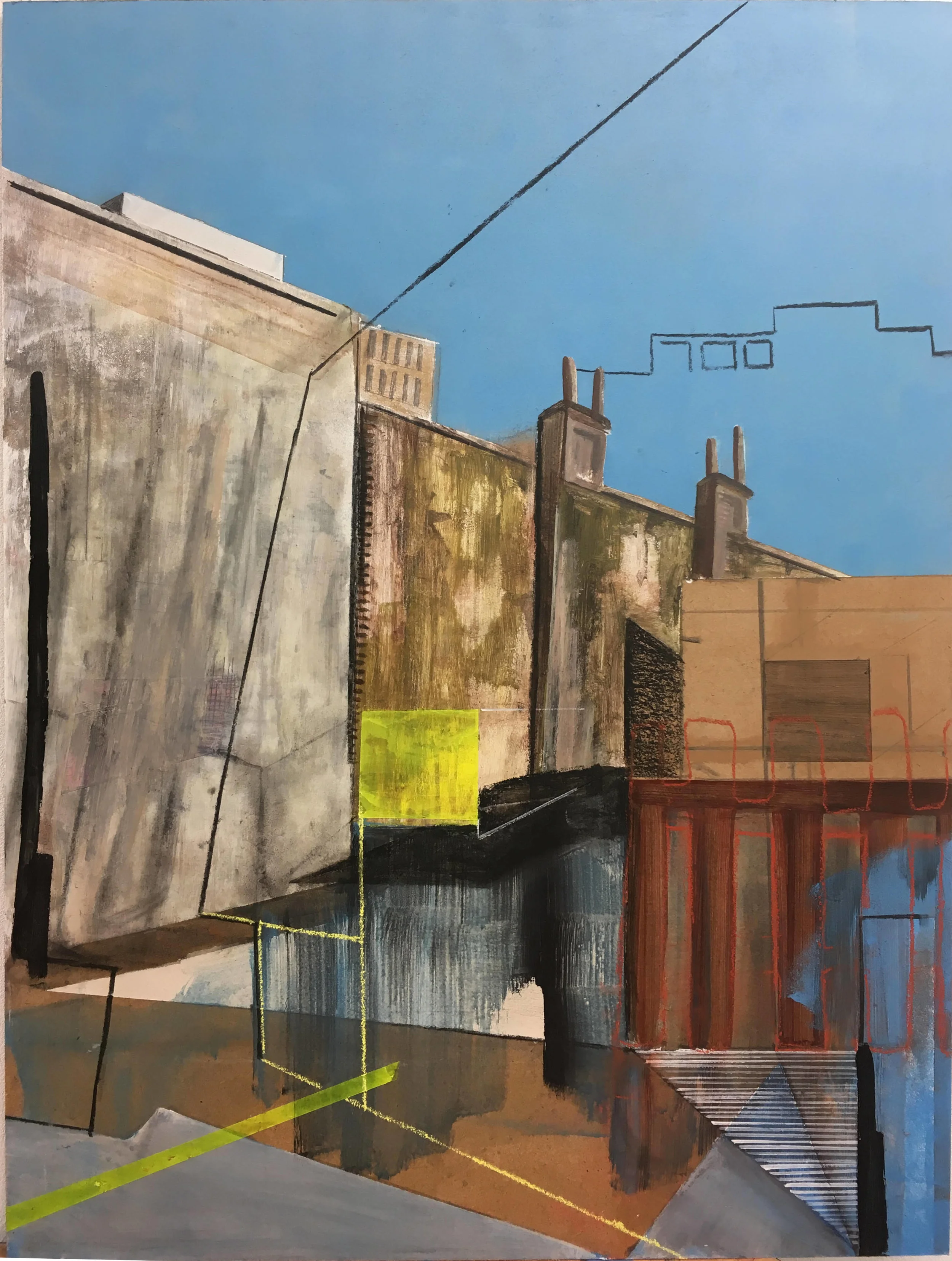
The supporting pieces should relate to the anchor through colour, subject, line, or frame style. They do not need to match perfectly. A neutral abstract can sit comfortably beside photography when both share a warm tonal range or similar visual weight. For more guidance on combining different mediums, explore these mixed-media display ideas before finalising the collection.
Avoid making every work equally dominant. A clear hierarchy gives the eye somewhere to rest and keeps the display from feeling like a random collection of objects.
Build A Composition Around The Turn
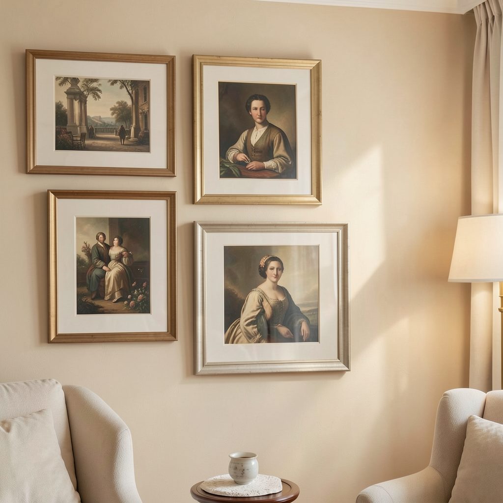
There are several effective layouts for art around a corner. A wraparound grid uses matching frames and aligned rows, creating a crisp architectural effect. A salon-style arrangement feels more collected, with varied sizes and modest shifts in height. A single vertical line on each wall offers a minimalist solution when the corner is narrow.
For a relaxed gallery wall, use the largest work closest to the main seating or circulation zone, then reduce the scale as the display approaches the corner. This creates a visual taper and prevents the turn from becoming too heavy. Keep the lowest works safely above furniture and avoid placing fragile frames where passing shoulders may catch them.
| Arrangement style | Best for | Recommended spacing | Overall effect |
|---|---|---|---|
| Wraparound grid | Modern open-plan rooms | 5–8 cm | Structured and architectural |
| Tapered gallery | Mixed art collections | 6–10 cm | Relaxed and connected |
| Vertical pair | Narrow corners | 8–12 cm | Minimal and elegant |
| Continuous ledge | Renters or frequent updates | 3–6 cm between works | Flexible and layered |
Use paper templates to test the complete layout. Tape each shape to the wall, step back several metres, and view it from the room’s main approaches. Templates are especially useful when an open space has unusual angles or when the corner is visible from multiple rooms.
Balance Scale Colour And Texture
A corner display should echo the room without simply repeating every colour in the upholstery and accessories. Choose one or two connecting tones, then allow a few contrasting pieces to create rhythm. Black frames can sharpen pale artwork, while oak or walnut frames bring warmth to white walls and contemporary furniture.
Texture also helps the arrangement feel layered. Pair glossy photography with a matte print, a linen-covered work, or a subtle relief piece. If the collection contains many bold images, use restrained frames and generous wall space. If the art is mostly monochrome, a sculptural frame or a softly coloured mount can provide depth.
Consider the lighting throughout the day. Artwork opposite a strong window may suffer from glare, while a dim corner can benefit from a picture light or adjustable track lighting. Warm, directional illumination makes the collection feel intentional without turning it into a display case.
Make The Frames Do The Connecting
Frames are one of the easiest ways to unify art across two walls. Matching frames create continuity even when the artwork varies in subject and size. Alternatively, choose a controlled mix, such as black, natural wood, and brushed metal, while keeping the mount colour consistent.
The gap at the corner deserves particular attention. A frame placed too close to the turn can look cramped, but too much distance may break the relationship between the walls. A practical starting point is to leave the same margin used between nearby frames, then increase it slightly if the corner is sharply angled or visually crowded.
In long circulation areas, the rhythm of repeated frames can guide movement through the home. These hallway gallery layouts offer useful ideas for keeping artwork aligned when a display extends beyond one room or turns into a passage.
Keep The Display Comfortable To Live With
Art around a corner should enhance daily life rather than make the room feel overworked. Leave breathing room around major furniture, maintain a clear walking route, and avoid hanging pieces where they will be touched regularly. In a dining area, secure frames carefully and choose surfaces that are easy to dust.
A small corner does not require a large collection. Two or three related works can have greater impact than ten competing pieces. For a softer apartment decorating scheme, combine one framed artwork with a ceramic object, a narrow picture ledge, or a sculptural wall light.
Before drilling, photograph the taped arrangement in both daylight and evening light. The image often reveals uneven spacing, an overly dominant frame, or an awkward visual stop that is harder to notice in person.
Practical Rules For A Polished Corner
Keep these principles close while planning and installing the display:
- Anchor the composition on the wall most visible from the main seating area.
- Repeat at least one element, such as frame colour, mount tone, or artwork subject.
- Use paper templates to test scale, spacing, and sightlines before hanging.
- Let the arrangement taper or breathe as it approaches the corner.
- Light the artwork evenly and secure every frame, especially near busy walkways.
A successful corner gallery feels connected to the entire room. It can define a dining zone, soften a passage between spaces, or give a blank architectural turn the character of a small private exhibition.
Gather the artwork, map the walls, and begin with the piece you most want the room to remember. With a measured layout and a restrained visual thread, an overlooked corner can become one of the most memorable details in an open-plan home.