How to Arrange Small Frames into One Cohesive Display
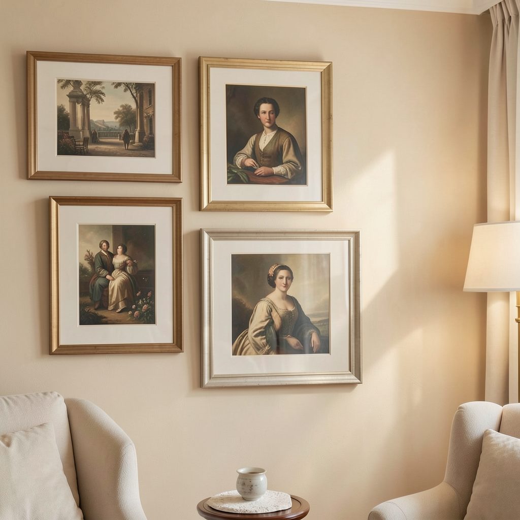
A collection of small frames can look deliberate and architectural when each piece contributes to one larger outline. The aim is not to make every frame identical, but to make the arrangement read as a unified silhouette from across the room.
This approach works in hallways, bedrooms, stairwells, bathrooms, and compact living spaces where a large artwork might feel overwhelming. Several modest prints can provide greater flexibility while still creating the presence of one substantial wall feature.
Before hanging anything, gather the frames, measure the available wall, and decide whether the composition should feel symmetrical, organic, or gently geometric. A little planning prevents the display from becoming a scattered cluster.
Start with the outer silhouette
Think of the entire collection as one shape before considering individual pictures. A rectangle is the easiest format to control, while an arch, diamond, cross, or stepped outline can make a narrow wall feel more tailored. Lightly mark the intended edges with painter’s tape.
The perimeter matters because the eye usually registers the overall form first. Keep the top and bottom edges relatively consistent, even if the interior frames vary slightly. A strong outline makes different artwork styles feel related.
For a relaxed arrangement, use a soft oval or asymmetrical shape, but give it an invisible boundary. Without that boundary, small gaps and uneven edges can make the display appear accidental rather than collected.
Create a repeatable spacing system
Spacing is the quiet detail that turns separate frames into a gallery wall. For most small formats, a gap of 5 to 8 centimetres creates enough breathing room without breaking the visual connection. Use the same measurement wherever possible.
If the frames are very small, narrow gaps can produce a denser, mosaic-like effect. Larger gaps feel more contemporary and allow each image to stand alone. Avoid changing the distance randomly; variation should be intentional and repeated in a pattern.
Lay the frames on the floor using the wall measurements as a guide. Photograph the arrangement from above, then adjust the gaps and edges before transferring it to the wall. This simple mock-up is especially useful when working around sockets, switches, shelves, or door trims.
Balance proportion, colour, and weight
A single visual shape needs equilibrium. Place the darkest, busiest, or largest-looking frames near the centre or lower half of the arrangement, then distribute lighter pieces around them. This keeps the composition grounded instead of making it appear top-heavy.
Colour can connect artwork that has very different subjects. Repeat one or two tones across prints, mats, or frames, such as black, warm oak, muted blue, or antique brass. A restrained palette helps a mixed collection feel edited.
Frame finish also affects visual weight. Thick black frames create a crisp graphic outline, while pale wood softens the display. Combining finishes can work, but repeat each finish at least twice so that no single frame looks like an unrelated addition.
| Arrangement style | Best shape | Spacing approach | Overall effect |
|---|---|---|---|
| Structured grid | Rectangle or square | Equal gaps throughout | Calm and architectural |
| Loose cluster | Organic oval | Small variations with repeated alignment | Collected and relaxed |
| Stepped layout | Stair or zigzag | Consistent horizontal or vertical intervals | Dynamic and directional |
| Central feature | Diamond or cross | Tighter around the centre | Focused and decorative |
| Narrow vertical group | Column or arch | Even side margins | Elegant in compact areas |
Use alignment to make variety feel intentional
When frame sizes differ, align one feature consistently. You might keep the centre lines level, line up the top edges of selected frames, or create a central vertical axis. These invisible rules give the eye a path through the composition.
A useful method is to begin with two anchor frames: one near the centre and one toward an outer edge. Build outward while checking that the group remains balanced. Avoid placing identical sizes in a perfectly mirrored arrangement unless a formal, symmetrical look is your goal.
Artwork orientation can provide rhythm. Alternate portrait and landscape pieces, or use a repeated sequence such as portrait, square, landscape. The pattern should be noticeable enough to create order but subtle enough to avoid looking mechanical.
Give the collection a visual narrative
A group of small frames becomes more engaging when the contents share a loose story. Botanical drawings, architectural studies, monochrome photographs, handwritten pieces, and abstract shapes can coexist when they relate through subject, tone, or era.
You can also add context through small captions or location details. In a travel-inspired arrangement, gallery labels can help identify places, artists, or dates without interrupting the clean appearance of the wall. Keep the typography consistent and use modest scale.
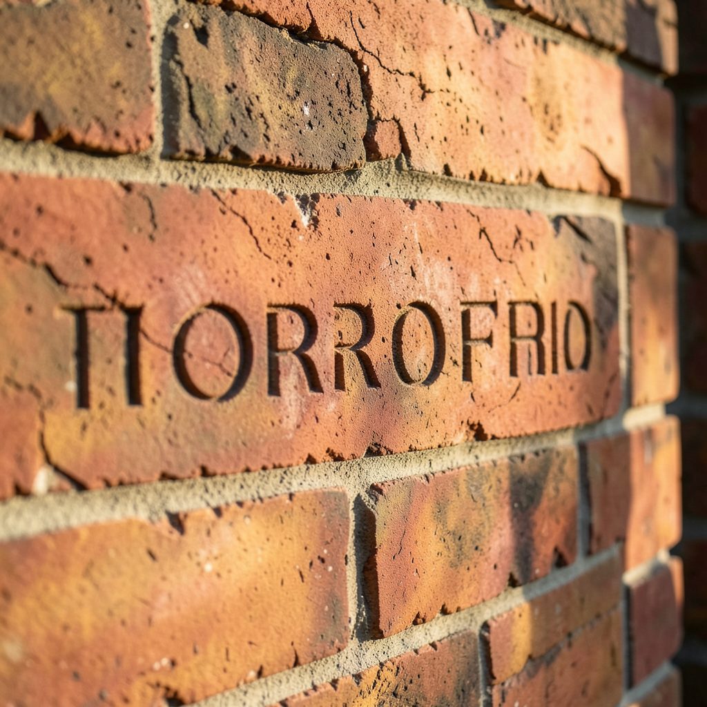
For a tactile interior, mix printed artwork with small plaques, relief pieces, or engraved details. A meaningful brick engraving can bring texture to an otherwise paper-based composition, especially in an entryway or industrial-style room. Treat dimensional pieces as visual anchors and leave slightly more space around them.
Hang the shape with confidence
The centre of the complete arrangement should usually sit around eye level, approximately 145 to 155 centimetres from the floor, though furniture changes the calculation. Above a sofa, console, or bed, leave enough clearance for the furniture to feel connected without touching the lowest frame.
Transfer the floor plan to the wall with paper templates cut to each frame’s size. Mark the hanging point on every template, tape them in place, and step back from several angles. Check the arrangement from the doorway, adjacent rooms, and normal seated positions.
Use appropriate wall fixings rather than relying on a single small nail for every frame. Heavy frames may need anchors, while lightweight pieces can use picture hooks. Once hung, adjust only when there is a clear reason; constant small changes often weaken a carefully planned outline.
Practical checks before you drill
A few final decisions can protect the balance of the display and make installation faster.
- Measure the full wall area and the furniture beneath it before choosing the number of frames.
- Select one dominant frame finish, then repeat any secondary finish at least twice.
- Keep the gap between frames consistent unless a deliberate transition requires more space.
- Test the layout with paper templates and view it in both daylight and evening lighting.
- Photograph the finished arrangement so future changes can follow the same alignment and spacing.
The best small-frame compositions feel flexible but never random. Start with an outer shape, repeat a few visual rules, and let colour, spacing, and alignment connect the individual pieces. With those decisions in place, even an assortment of modest frames can become a polished focal point that suits the room around it.
Bring your chosen frames together, map the arrangement on the floor, and turn your empty wall into a considered gallery-style display.