A Continuous Line of Small Frames for Hallway Style
A hallway often has enough wall space for personality but not enough depth for bulky furniture. A continuous line of small frames turns that narrow passage into a considered gallery, giving the eye something to follow from one room to the next. The arrangement can feel crisp and architectural or relaxed and collected, depending on the frames, artwork, and spacing.
This approach works especially well in entrance halls, stair landings, and long corridors where a single oversized piece may feel too dominant. Small prints create rhythm without making the walkway feel crowded, while a shared alignment keeps the display connected.
The most successful hallway gallery walls are planned around movement. Art should be visible as you pass, secure enough for a busy household, and proportioned to the wall rather than selected as a series of unrelated favourites.
Find The Hallway’s Visual Rhythm
Begin by studying the hallway from both ends. Notice doorways, light switches, radiators, and changes in floor level. These fixed features determine where the line can start and finish. A display that runs between two door casings usually looks more intentional than one that stops abruptly beside a thermostat.
A straight horizontal arrangement is ideal for a narrow corridor because it reinforces the length of the space. For a more relaxed effect, allow the outer frames to sit slightly lower or higher while keeping the central area aligned. The variation should be subtle; a continuous line depends on a strong visual baseline.
Use painter’s tape to mark the proposed length before hanging anything. Stand several steps away and check whether the artwork feels connected to the hallway’s architecture. The display should guide movement, not compete with it.
Choose Frames That Read As One
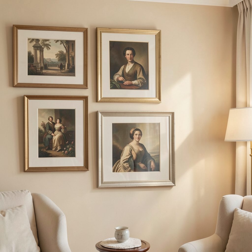
Small frames do not need to be identical, but they should share at least one clear quality. Matching finishes create a minimalist gallery effect, while a controlled mix of timber, black, or brass frames gives the hallway a more collected character. If you mix materials, repeat each finish at least twice so the arrangement feels deliberate.
Frame depth also matters. Slim profiles suit tight corridors because they project less into the walking space. Glazing with a low-reflection finish can be useful opposite windows or strong lamps, where glare might obscure the artwork.
For a cohesive line, keep the outer dimensions similar even if the prints vary. A set of frames with consistent heights is particularly easy to align. If you prefer different shapes, place the most distinctive frame near the centre and use simpler designs around it.
Set Heights And Spacing
A comfortable viewing height is generally around eye level, but a hallway display may need to respond to furniture or skirting boards. The centre of each image can sit roughly 145 to 155 centimetres from the floor, with the lower edge lifted above console height if one is present. In a family home, slightly lower placement can make the artwork easier for children to enjoy.
Spacing controls the character of the arrangement. Gaps of 5 to 8 centimetres create a neat, continuous band, while wider gaps make each frame feel more independent. Measure from the outside edges of the frames rather than the artwork inside them, and use a template to transfer positions accurately.
A useful method is to cut paper shapes in the exact size of every frame and tape them to the wall. Live with the arrangement for a day, checking it in daylight and at night. This simple step exposes awkward gaps before drilling and makes it easier to accommodate switches or uneven walls.
| Hallway Style | Frame Approach | Spacing | Artwork Direction |
|---|---|---|---|
| Minimalist | Matching black or white frames | 5–6 cm | Monochrome prints, line drawings |
| Warm And Collected | Repeated timber finishes | 6–8 cm | Botanical studies, vintage illustrations |
| Contemporary | Slim metal frames | 5–7 cm | Abstract shapes, graphic photography |
| Family-Friendly | Durable acrylic glazing | 7–9 cm | Colourful prints, personal images |
Balance Colour, Subject, And Scale
A continuous row looks stronger when the artwork has a quiet relationship between pieces. You might use a single palette, such as soft neutrals and muted greens, or repeat one accent colour across otherwise different prints. This gives the eye a thread to follow without making the display feel overly matched.
Vary the subject matter carefully. A row of botanical illustrations feels calm and unified, while a mix of photography, typography, and abstract art can add energy. Keep the visual weight balanced by distributing darker or busier images rather than placing them all at one end.
Small artwork benefits from generous breathing room inside the frame. Wide mounts can make modest prints feel more substantial and polished, particularly in a minimalist hallway. They also create a consistent border when the image sizes differ.
Make The Arrangement Practical
Hallways are high-traffic zones, so safety and maintenance should shape the design. Use appropriate wall fixings for the surface, and choose lightweight frames if the wall is plasterboard. Security strips or concealed brackets can prevent frames from shifting when doors close or people brush past.
Avoid placing delicate originals where coats, bags, or shoes regularly collide with the wall. For homes with changing humidity near a bathroom, select stable materials and consider the advice in this guide to humidity-safe artwork. The same principles are useful in an entrance hall that becomes damp after wet weather.
Lighting can make a narrow gallery feel larger. Picture lights, directional ceiling spots, or soft wall sconces will reveal texture and colour, but avoid placing bright bulbs directly above reflective glazing. Warm white light usually complements paper, timber, and neutral interiors more comfortably than a cool blue-white tone.
Keep The Collection Personal And Flexible
A hallway line does not have to be assembled all at once. Start with a core group of three or four pieces, then add frames as you find work that genuinely suits the home. Leave a little room at one end if you expect the collection to grow, but keep the initial composition balanced on its own.
Personal images can sit comfortably beside art when they share a visual treatment. Black-and-white family photographs, for example, can bridge colourful prints without making the arrangement feel like a separate photo display. For a household with children, ideas about art that grows can also inform choices for a shared landing or family corridor.
Details That Keep The Display Cohesive
- Repeat one frame finish throughout the line, or use a clear pattern when mixing materials.
- Keep the centre points aligned unless the hallway architecture requires a deliberate adjustment.
- Use mounts, borders, or a shared colour palette to connect different artwork styles.
- Leave enough clearance around doors, switches, and furniture for comfortable daily movement.
- Recheck the arrangement seasonally and replace only pieces that no longer feel relevant.
A continuous line of small frames works best when it feels edited rather than filled. Give each piece enough room to be noticed, keep the installation secure, and let the hallway’s proportions guide the final decisions. With a measured layout and a personal selection of artwork, an overlooked passage can become one of the most polished displays in the home. Browse your existing prints, map the wall with paper templates, and begin building a hallway gallery that rewards every walk through it.