Creating a Gallery Wall Entirely with Abstract Prints
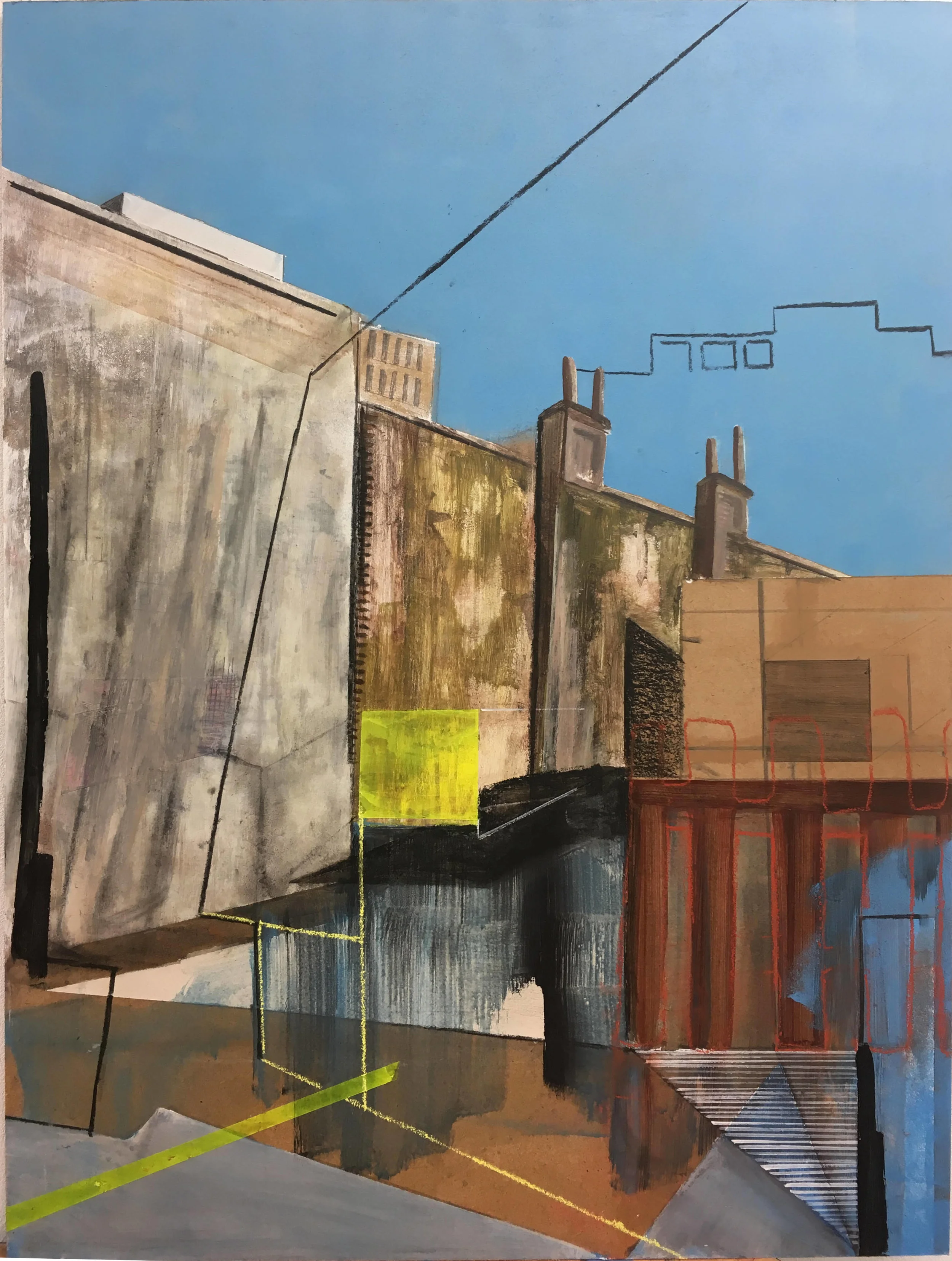
An abstract gallery wall brings movement, color, and personality to a room without relying on recognizable figures or scenery. Shapes, brush marks, layered textures, and unexpected color relationships can create a display that feels curated while remaining open to interpretation.
The strongest arrangements balance freedom with structure. A collection of abstract prints may include bold geometric artwork, soft painterly compositions, monochrome studies, and graphic line drawings, provided they share a visual thread.
Before choosing individual pieces, consider the room’s atmosphere, existing furniture, and natural light. A quiet bedroom may benefit from muted tones and generous spacing, while a living room can support larger artwork, stronger contrasts, and a denser salon-style arrangement.
Choose A Visual Language
Start by identifying two or three qualities that should connect every print. This might be a restrained palette, repeated organic shapes, visible paper texture, or a preference for fine lines over heavy blocks of color. The artwork does not need to match exactly; it needs to feel as though it belongs to the same conversation.
Color is often the easiest unifying element. Select one dominant shade, one supporting neutral, and one accent that appears sparingly throughout the collection. A palette of rust, cream, charcoal, and faded blue can feel cohesive without looking overly coordinated.
The wall behind the arrangement will influence those choices. A warm white backdrop softens saturated artwork, while a deeper neutral can make pale prints appear brighter. For further guidance, explore these gallery wall colors before committing to paint or paper.
Build Rhythm Through Scale
Varying the dimensions of abstract prints creates rhythm and prevents the display from looking like a row of identical posters. Combine a dominant central piece with medium-sized companions and a few smaller works that act as visual pauses.
A useful arrangement often includes one or two large prints, three to five medium pieces, and several small accents. The exact number depends on the wall, but variation in scale should be visible from across the room. If every frame is the same size, the composition may feel static; if every size is different, it may appear scattered.
Pay attention to the visual weight of each image. A dense black composition can balance a larger area than a pale pencil study, even when both prints have identical dimensions. Place heavier designs lower or toward the center, then use lighter pieces to create breathing space around them.
Select Frames That Support The Art
Frames should give the collection a common architectural edge without overpowering the artwork. Slim black frames suit graphic, high-contrast compositions, while pale oak introduces warmth to a softer, earth-toned set. White frames can make colorful prints feel airy and contemporary.
Using one frame finish throughout creates a polished gallery effect, but a carefully controlled mix can feel more collected. Try pairing black and natural wood, or brushed metal with white, while keeping the profiles similar. Consistency in frame depth and mount style will help different materials sit together.
Mounts are especially useful for abstract prints with strong color or complex marks. A generous white border gives each work room to breathe and separates neighboring compositions. For smaller prints, matching mounts can also make a modest collection feel more substantial.
| Artwork style | Frame direction | Best spacing | Ideal placement |
|---|---|---|---|
| Bold geometric print | Slim black or white | 5–8 cm | Central anchor |
| Soft painterly artwork | Pale wood or natural oak | 8–12 cm | Beside lighter pieces |
| Monochrome line study | Black, charcoal, or metal | 4–7 cm | Upper or outer edge |
| Textured abstract collage | Deep profile frame | 8–10 cm | Lower balance point |
| Small color study | Matching frame and mount | 4–6 cm | Filling visual gaps |
Plan The Layout Before Hanging
Lay every piece on the floor and arrange the prints within the approximate dimensions of the wall. Begin with the largest work, then place supporting pieces around it. Photograph several versions from a standing position so you can compare the overall balance rather than judging each print individually.
A paper template system is useful for complex compositions. Trace each frame onto kraft paper, cut out the shapes, and attach them to the wall with low-tack tape. Adjust the gaps, edges, and center point before making holes. This approach is especially helpful above a sofa, where the arrangement should relate to the furniture below.
Keep the bottom edge of the gallery wall visually connected to the furniture, usually with a gap of roughly 15 to 25 centimeters above a sofa or console. In a hallway or open passage, center the display at eye level and allow the surrounding wall to remain uncluttered.
Create Contrast Without Losing Calm
Abstract artwork can become visually intense when every piece uses saturated color or heavy texture. Balance energetic prints with quiet works featuring open space, delicate marks, or limited tones. This contrast gives the eye somewhere to rest.
Repetition can create cohesion in subtle ways. Look for recurring arcs, blocks, grids, brushstrokes, or imperfect edges. A small terracotta shape in one print may be echoed by a larger rust-colored field elsewhere, creating a connection that feels considered rather than obvious.
The surrounding decor should support the art rather than compete with it. Keep nearby accessories simple, repeat one or two colors in cushions or ceramics, and avoid placing busy patterns directly beside the most detailed print. A gallery wall should feel integrated into the room’s styling.
Display And Maintain The Collection
Lighting has a major effect on abstract artwork. Adjustable picture lights, directional wall sconces, or ceiling spots can reveal paper grain and layered pigment. Avoid strong direct sunlight where possible, since prolonged exposure may fade delicate inks and alter colored paper.
Consider the viewing distance when choosing print detail. Fine line work rewards close inspection in a corridor or reading corner, while large blocks and expressive marks work well in open-plan rooms. For more inspiration about presenting artwork throughout the home, browse these artwork display ideas.
A gallery wall can evolve over time. Keep spare prints, mounts, and hanging hardware together so a damaged piece can be replaced without disrupting the whole arrangement. Rotating one or two works seasonally also keeps the display fresh while preserving its overall visual language.
A Practical Hanging Checklist
The final review should focus on proportion, alignment, and how the artwork feels from different parts of the room. Step back regularly, check the arrangement in daylight and evening light, and make small adjustments before tightening every fixing.
Use this checklist before treating the display as finished:
- Choose a shared palette or recurring visual motif.
- Mix large, medium, and small abstract prints.
- Test frames and mounts against the wall color.
- Keep spacing consistent while allowing deliberate variation.
- Center the arrangement in relation to nearby furniture.
- Install secure fixings suited to the wall surface.
Once the prints are mounted, resist the urge to fill every empty space. Negative space gives an abstract collection its composure and allows individual pieces to remain legible.
Make The Wall Feel Intentional
The most successful abstract print arrangements combine instinctive choices with a clear structure. Let one artwork provide energy, let another create stillness, and use framing, spacing, and repeated color to connect the entire display.
Gather your favorite prints, test the layout on the floor, and begin with the piece that best expresses the mood you want in the room. With a thoughtful edit and careful hanging, even an inexpensive collection can become a distinctive focal point.