Choosing art for sloped ceilings and attic walls
Choosing art for a room with a sloped ceiling or attic walls starts with reading the architecture, not treating every surface as an empty rectangle. A sloping plane can make a well-chosen picture feel generous, while a mismatch can leave it looking cramped or precariously placed. Learn more about Gallery Art.
Converted lofts and attic apartments common around Sydney, Melbourne and Brisbane often feature low walls, exposed beams and compact roof spaces. The right artwork should complement those proportions, the room’s natural light and everyday activity rather than compete with them.
Measure the room before you shop
Begin by recording the usable dimensions. Note where the roof plane meets the wall, and mark doors, windows, vents, lights, access panels and other fixtures. Measure the wall at floor level and at furniture height, since a small difference in width can change the most practical layout.
Tape paper templates of your preferred frame sizes directly to the wall. This inexpensive test reveals whether one large work will feel balanced or whether several smaller pieces would create a better rhythm. It also lets you check the arrangement without drilling holes that may not suit the final artwork.
Use a visual centre around 145–155 centimetres from the floor as a starting point, then adjust for the furniture below. On a strongly pitched ceiling, a level frame often looks calmer than one that copies the roof angle. Leave breathing room above a console, bed or sofa while keeping the composition connected to the room.
Match the artwork to the slope
The steeper the pitch and the narrower the usable wall zone, the better a tall portrait may work. Vertical proportions echo the rising line of an angled ceiling and give a low or irregular wall more height. A shallow slope can accommodate landscape work, while a square piece often suits a broader wall with a gentle pitch.
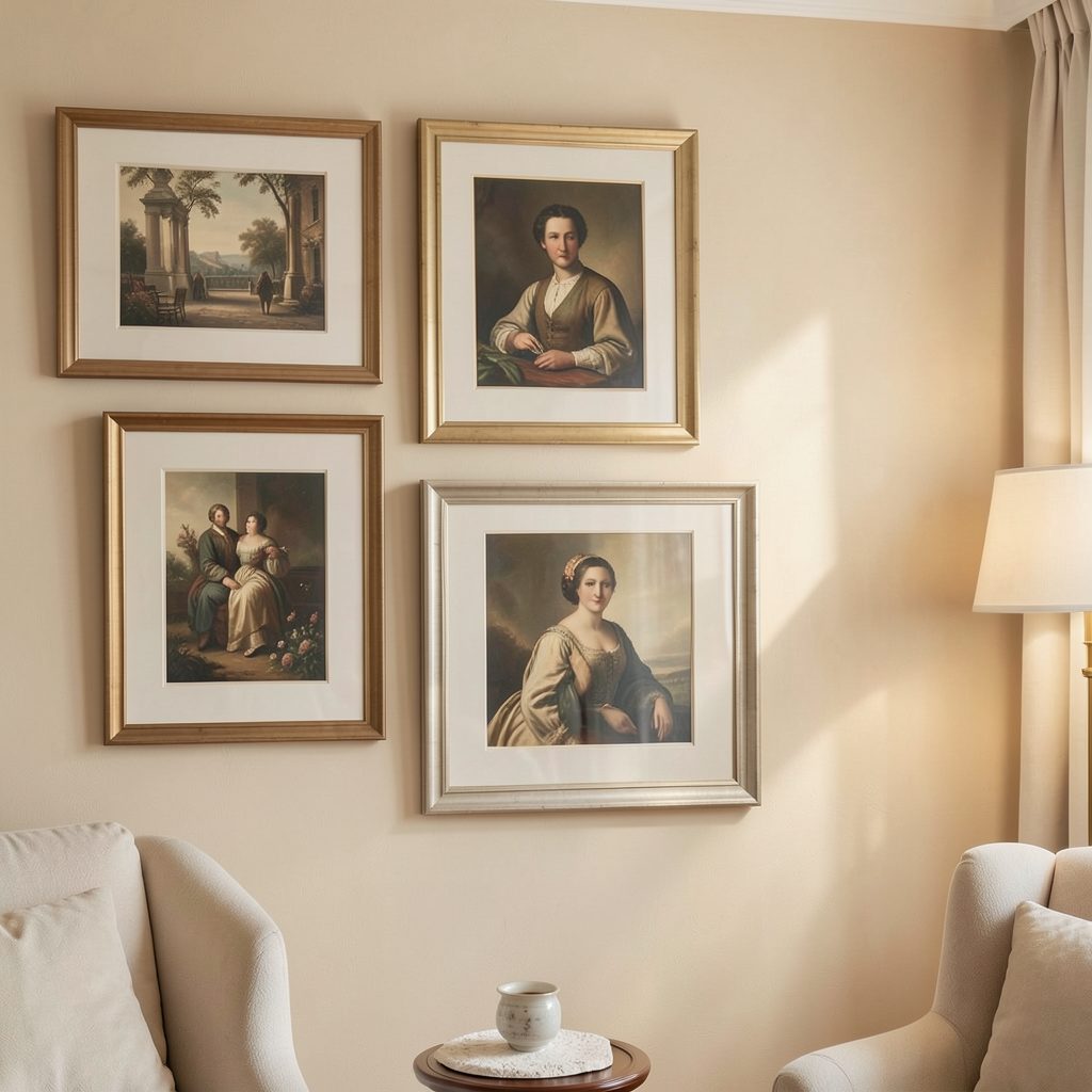
Attic knee walls open up several display options. A single oversized frame leaning against the wall can create a strong focal point, while a row of medium-sized works hung above it can resemble a compact gallery wall. Freestanding frames should have secure non-slip supports, particularly in homes with children or pets.
Compact attic ensuites need especially careful coordination between artwork, tiles, mirrors and cabinetry. Focus LDN’s bathroom styling guide offers useful context for balancing these elements. Keep prints and paper-based pieces away from the splash zone, and consider a glazed work if steam or condensation is frequent.
Choose a frame that feels settled
A frame should contain the artwork without becoming a second architectural feature. Slim profiles suit narrow or busy walls, while deeper frames can add presence to a large blank area. Black frames create definition, natural timber warms a pale wall, and painted frames can blend into a monochrome scheme.
Australian conditions make the choice of glazing and mount important. Strong sunlight through east- and west-facing windows can fade photographs, textiles and watercolours, while seasonal heat and humidity may cause paper to cockle. UV-filtering glazing, archival mounts and suitable backing materials provide useful protection without changing the appearance of the work.
Allow enough mount or space around the image so the artwork does not feel boxed in. This is particularly valuable on a sloping wall, where a narrow border can exaggerate the angle. Before committing to pale matting, check its colour under the room’s warmest and brightest natural light.
Balance light, furniture and scale
Observe the wall at several times of day. A frame that looks rich beside a shaded window may disappear in a patch of midday sun, while glare can make a glazed piece difficult to see. Adjustable blinds or a light-filtering curtain can control glare while preserving the room’s brightness.
Scale should relate to both the furniture and the people using the space. A single substantial work often suits an open wall above a long sofa, whereas several smaller pieces can make an awkward recess feel intentional. Follow the room’s proportions rather than applying a fixed rule, and make the arrangement readable from the main entrance.
Consider what sits opposite the display as well. Brick, greenery, a television or a bright doorway may compete with small details. Repeating one or two colours from the room in the artwork or frames can tie the display together, while a contrasting piece can establish a deliberate focal point.
Account for Australian homes and buying
Apartment living adds practical considerations to any display plan. Ask the landlord, building manager or strata committee before fixing artwork to a balcony wall, entrance or communal area, and obtain written approval for changes to a rental property. Avoid penetrating walls that may contain wiring, ducting or fire-safety systems, particularly in high-rise buildings.
Original Australian work can be bought directly from artists, through galleries, at art fairs and through auction houses. Compare the artist’s reputation, the condition of the piece, framing, delivery and installation costs before paying. For purchases from an Australian gallery operating in trade, the Australian Consumer Law generally provides consumer guarantees, including acceptable quality and compliance with the description; check the written sale terms and report damage promptly.
Long-distance freight is another important consideration, particularly for works on paper travelling between coastal cities, the interior and warmer northern regions. Ask about protective packaging and insurance during transit. Artists whose work responds to local light, landscapes or domestic spaces can also submit their practice through Focus LDN’s submit your work page.
Bring the arrangement together
Test the final layout with paper templates, then photograph it from the doorway and from seated positions. Leave consistent gaps between frames, approximately 5–8 centimetres for many gallery-style groupings, and check that the display still feels balanced when the room is dim. Remove any piece that depends entirely on one narrow sightline.
Use hanging hardware suited to the wall material and the weight of the frame. Position fixings away from roof edges, vents and lighting tracks, and have the work levelled before tightening everything into place. Valuable originals may also benefit from discreet security fixings and a suitable insurance policy.
Once the arrangement feels right, select one artwork as the visual anchor and allow the remaining pieces to support its colour, scale or subject. The result should make the architecture easier to appreciate, not disguise the room’s character.