Best art subjects for a calming bedroom gallery wall
A bedroom gallery wall should support rest rather than compete with it. The most successful arrangements use imagery with gentle movement, restrained colour, and enough visual space to let the eye settle. Subject matter matters as much as frame style, especially in a room designed for sleep.
Calming artwork does not have to be bland or entirely neutral. A muted landscape, a softly painted botanical, or an abstract composition with quiet layers can add personality while preserving a peaceful atmosphere. The key is to choose images that feel easy to live with every day.
Before buying a collection, consider the mood already established by the bedding, wall colour, lighting, and furniture. Artwork should echo those elements through tone and texture, creating a connected scheme rather than a group of unrelated pictures.
Botanical studies for a natural mood
Leaves, branches, seed heads, and delicate flowers are reliable choices for a tranquil bedroom. Botanical prints introduce organic shapes without the visual drama of busy patterns. Monochrome drawings work especially well above a bed, while faded greens, dusty blues, and warm ochres can soften a white or neutral room.
Look for artwork with generous negative space and fine, uncomplicated lines. A set of related herbarium prints or pressed-flower illustrations can create rhythm across the wall without feeling overly decorative. Keep the palette consistent, even when the individual subjects vary.
For a more contemporary effect, combine one detailed botanical image with two simpler studies. This prevents the display from appearing too symmetrical or formal. Natural subjects also pair comfortably with wood, linen, rattan, and other tactile bedroom materials.
Landscapes that create visual breathing room
Quiet landscapes can make a bedroom feel spacious and grounded. Misty hills, still water, open fields, distant coastlines, and soft cloud studies all offer a sense of depth without demanding immediate attention. Images with a low horizon or broad sky are particularly effective in compact rooms.
Choose scenes with subtle tonal transitions instead of high-contrast travel photography. A hazy woodland may feel more restful than a dramatic mountain peak, while a calm shoreline can reinforce a coastal-inspired bedroom without becoming thematic.
A landscape gallery wall can also bring a gentle colour story into the room. Pale blue, sand, sage, stone, and charcoal are versatile shades that sit comfortably beside cream bedding and natural timber. Browse gallery artwork for ideas on selecting pieces that feel considered and connected.
Abstract art with a restrained palette
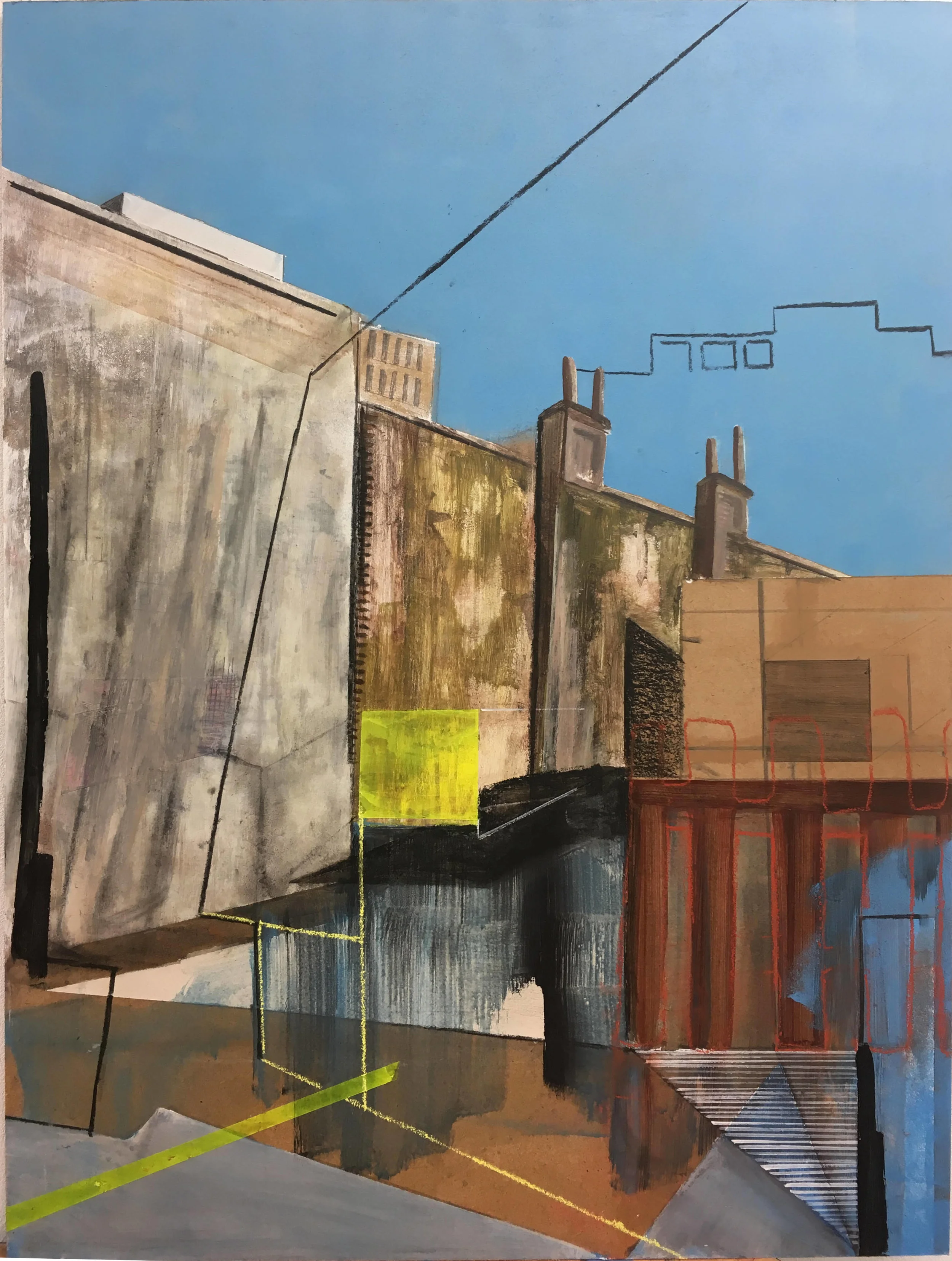
Abstract artwork suits bedrooms when its shapes and colours are composed rather than aggressive. Look for soft brush marks, layered washes, curved forms, and imperfect lines. These details add interest at close range while maintaining a calm impression from across the room.
A limited palette is easier to live with than a collection of unrelated bright colours. Two or three main tones, supported by white, beige, grey, or black, will make several abstract pieces feel like part of the same visual language. Repeated shapes can create cohesion without requiring matching prints.
Texture can be just as important as colour. Paper with visible grain, subtle pencil marks, or lightly raised ink gives the gallery wall depth. If the room already contains patterned curtains or bedding, select quieter abstract work with broad areas of open space.
Personal images with a quieter quality
Personal photography can make a bedroom feel intimate, provided the chosen images carry a calm emotional tone. Consider a favourite architectural detail, a shadow across a wall, an empty beach, a family garden, or a close-up of natural texture. These subjects feel meaningful without adding visual noise.
Avoid filling every frame with faces or highly active scenes. A gallery wall made entirely of portraits can feel stimulating, while a mix of one personal image with landscapes or still-life studies often feels more balanced. Black-and-white photography is useful when you want emotional depth without introducing additional colour.
For a polished result, edit personal photographs with similar brightness and contrast. A consistent treatment helps different moments sit together, even when they were taken in different places or seasons.
Subjects that work together
The strongest bedroom displays usually combine related themes rather than repeating one image several times. A botanical print, a quiet landscape, and a simple abstract can coexist when they share a palette or similar visual softness. Think of the wall as a small collection with a common atmosphere.
Use the guide below to compare the mood and styling potential of popular art subjects:
| Art subject | Mood created | Ideal palette | Best styling partner |
|---|---|---|---|
| Botanical studies | Fresh, grounded, gentle | Sage, cream, faded green | Linen, timber, woven textures |
| Misty landscapes | Spacious, restful, reflective | Blue-grey, sand, taupe | Minimal furniture and soft lighting |
| Quiet abstracts | Modern, balanced, contemplative | Oat, charcoal, muted clay | Sculptural lamps and plain bedding |
| Still-life artwork | Intimate, settled, collected | Terracotta, olive, warm white | Vintage details and ceramic accents |
| Architectural photography | Refined, structured, calm | Black, white, stone | Simple frames and clean-lined furniture |
Keep the largest or most detailed piece near the centre, then position quieter works around it. This creates a visual anchor without making the arrangement feel heavy. A little variation in scale is helpful, but every frame should have enough breathing room to remain legible.
Frames and placement for a restful display
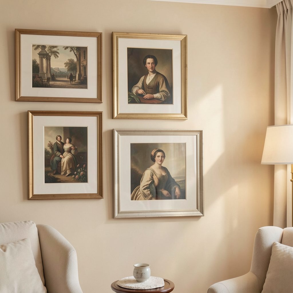
Frame material changes the character of the artwork. Pale oak and ash add warmth, black frames provide definition, and white or natural mounts create a lighter appearance. A restrained combination of finishes can look collected rather than overly matched. These frame styling ideas are useful when several pieces need to work together.
Place the gallery wall where it can be viewed comfortably from the bed, but avoid positioning fragile or heavy frames directly above the pillows unless they are securely fixed. A low arrangement beside the bed, opposite the headboard, or on a short wall can be equally effective.
Leave a consistent gap between frames, usually around five to eight centimetres, and measure the overall arrangement before making holes. Paper templates taped to the wall make it easier to judge the scale and adjust the composition.
A simple editing checklist
A calming display benefits from deliberate editing. Too many subjects, frame finishes, or accent colours can make even beautiful artwork feel restless. Step back from the arrangement in daylight and again in the evening, when bedroom lighting changes the mood.
Use these recommendations before finalising the wall:
- Choose three or four related colours and remove pieces that introduce a competing accent.
- Mix artwork sizes, but keep one clear focal piece to anchor the composition.
- Repeat a subject, texture, or shape at least twice so the collection feels connected.
- Leave generous space around the gallery wall and avoid crowding nearby shelves or lamps.
The final test is emotional as well as visual: the artwork should make the room feel more settled when viewed from the bed. If one piece appears unusually loud, glossy, dark, or complicated, replace it with a quieter image rather than trying to balance it with more decoration.
Build the collection slowly, beginning with one image that captures the atmosphere you want. Add complementary pieces over time, using soft subjects, thoughtful spacing, and dependable framing to create a bedroom gallery wall that feels personal, peaceful, and complete.